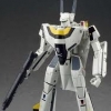
Darotower Posted September 25, 2022 Posted September 25, 2022 On 9/25/2022 at 6:59 PM, 505thAirborne said: @Darotower Now that is one impressive collection! All you're missing is an Alaska Base VF and you'll be solid. The All the grey VF-1A is the VF-X correct? Expand Yeah, you're right the grey VF-1A is the VF-X Quote
Darotower Posted September 25, 2022 Posted September 25, 2022 On 9/25/2022 at 6:37 PM, ValkAddict said: Wow, nice collection @Darotower EDIT: Is that a custom grey low-viz in the middle, 2nd last row? I thought Yamato only released that in 1/48 scale? Expand Thanks! No, the grey VF-1A is the VF-X Quote
505thAirborne Posted September 25, 2022 Posted September 25, 2022 (edited) On 9/25/2022 at 11:10 PM, Darotower said: Yeah, you're right the grey VF-1A is the VF-X Expand Nice! Sure wish Arcadia would do reissues of Valkyries like the VF-X, Cavaliers & Roy's Low-Vis VF-1S. Edited September 25, 2022 by 505thAirborne Quote
ValkAddict Posted September 26, 2022 Posted September 26, 2022 On 9/25/2022 at 11:11 PM, Darotower said: Thanks! No, the grey VF-1A is the VF-X Expand Thanks! and you as well @505thAirborne - appreciate the help! Quote
ValkAddict Posted September 26, 2022 Posted September 26, 2022 On 9/25/2022 at 11:25 PM, 505thAirborne said: Nice! Sure wish Arcadia would do reissues of Valkyries like the VF-X, Cavaliers & Roy's Low-Vis VF-1S. Expand ^ Ditto Quote
SodaPopinski Posted September 29, 2022 Posted September 29, 2022 Just some Toynamis and Matchbox Zentrans. Quote
MKT Posted November 9, 2022 Posted November 9, 2022 Reposting couple of SV-262Hs pics.. Thanks to @no3Ljm for the edit Quote
MKT Posted November 9, 2022 Posted November 9, 2022 Iron Man landing pose? Black Widow heroic stance? No, its Roy saying "Oof! Slipped on some oil & nearly fell flat, lucky I didn't damage the pitot!" Quote
no3Ljm Posted November 11, 2022 Posted November 11, 2022 On 11/9/2022 at 5:02 PM, MKT said: Reposting couple of SV-262Hs pics.. Thanks to @no3Ljm for the edit Expand You're welcome! On 11/11/2022 at 11:07 AM, MKT said: Revisiting GNU YF-19.. Expand I regret not getting YF-19 and YF-21 from this line. Quote
Lolicon Posted November 28, 2022 Posted November 28, 2022 On 11/27/2022 at 2:59 AM, Angesdad said: Expand Fantastic! Quote
no3Ljm Posted November 28, 2022 Posted November 28, 2022 On 11/27/2022 at 2:59 AM, Angesdad said: Expand Love the mood cast lighting. Quote
MacrossJunkie Posted November 28, 2022 Posted November 28, 2022 On 11/27/2022 at 2:59 AM, Angesdad said: Expand Oh nice. You put the double stripes on the non-centered head lasers too and even managed to get the curved line on the circular part. The whole thing looks great with the extra decaling. 👍 Quote
Lolicon Posted November 29, 2022 Posted November 29, 2022 On 11/28/2022 at 11:49 PM, MacrossJunkie said: Oh nice. You put the double stripes on the non-centered head lasers too and even managed to get the curved line on the circular part. The whole thing looks great with the extra decaling. 👍 Expand I know, right? All Bandai had to do was print a few more (major imo) details and it would have really made the HMR 0S stand out. Quote
Angesdad Posted November 29, 2022 Posted November 29, 2022 On 11/28/2022 at 11:49 PM, MacrossJunkie said: Oh nice. You put the double stripes on the non-centered head lasers too and even managed to get the curved line on the circular part. The whole thing looks great with the extra decaling. 👍 Expand Good catch @MacrossJunkie! Thanks to your idea I managed to get some more details in.😉 Quote
nightmareB4macross Posted November 30, 2022 Posted November 30, 2022 That HMR color looks far too pale compared to the anime. Quote
nightmareB4macross Posted November 30, 2022 Posted November 30, 2022 On 11/30/2022 at 9:34 PM, sh9000 said: @nightmareB4macross that's the DX. Expand 🥸guess I need look at the picture better. Either way, the colors do look washed out. Quote
sh9000 Posted November 30, 2022 Posted November 30, 2022 On 11/30/2022 at 9:47 PM, nightmareB4macross said: 🥸guess I need look at the picture better. Either way, the colors do look washed out. Expand Yeah I usually brighten up the pics. Here it is less brightened. Quote
nightmareB4macross Posted November 30, 2022 Posted November 30, 2022 On 11/30/2022 at 10:37 PM, sh9000 said: Yeah I usually brighten up the pics. Here it is less brightened. Expand That does look better. Nice posing. Quote
Slave IV Posted November 30, 2022 Posted November 30, 2022 A perfect example of not trusting any image you see on the internet to judge colors of anything.😉 Unless you know how the image was processed and have a properly calibrated monitor for that image, it won't do anything but frustrate people who are particular about color matching. Quote
nightmareB4macross Posted November 30, 2022 Posted November 30, 2022 On 11/30/2022 at 10:55 PM, Slave IV said: A perfect example of not trusting any image you see on the internet to judge colors of anything.😉 Unless you know how the image was processed and have a properly calibrated monitor for that image, it won't do anything but frustrate people who are particular about color matching. Expand I hear that. Quote
Big s Posted December 1, 2022 Posted December 1, 2022 On 11/30/2022 at 4:00 AM, sh9000 said: Expand The other issue is the colors in the anime. The darker colors are the shadow and if you look at the areas where it’s lighter it matches better. Anime and comic lighting ccolors are pretty confusing and Bandai probably matched the lighter orange rather than the darker. The tan parts should be less yellow and more gray brown though Quote
nightmareB4macross Posted December 1, 2022 Posted December 1, 2022 On 12/1/2022 at 12:38 AM, Big s said: The other issue is the colors in the anime. The darker colors are the shadow and if you look at the areas where it’s lighter it matches better. Anime and comic lighting ccolors are pretty confusing and Bandai probably matched the lighter orange rather than the darker. The tan parts should be less yellow and more gray brown though Expand That doesn’t match. I was using the lighted areas as a reference. Quote
no3Ljm Posted December 1, 2022 Posted December 1, 2022 On 11/30/2022 at 10:55 PM, Slave IV said: A perfect example of not trusting any image you see on the internet to judge colors of anything.😉 Unless you know how the image was processed and have a properly calibrated monitor for that image, it won't do anything but frustrate people who are particular about color matching. Expand No offense, but this is not applicable to Arcadia's VF-0D, right? Quote
nightmareB4macross Posted December 1, 2022 Posted December 1, 2022 On 12/1/2022 at 2:28 AM, no3Ljm said: No offense, but this is not applicable to Arcadia's VF-0D, right? Expand 😅 Color is always a hot topic at MW aside from lineart accuracy and perfect transformation. 🤪 Quote
Slave IV Posted December 1, 2022 Posted December 1, 2022 Yeah, it's just always funny to me that people are using different monitors, differently lighted subjects and different frames of animation or other source material with no idea what processing or degradation there is to those sources to compare or often criticize the color of some toy. Its just a peeve of mine since properly calibrated monitors and reference source material is a basic need for any significant color criticism. I just like to enjoy cool pics like above and leave the color issues to color scientists with the proper resources. Quote
Lolicon Posted December 1, 2022 Posted December 1, 2022 I prefer to have the actual toy in hand to make a worthwhile evaluation of the color and anything else. Quote
Slave IV Posted December 1, 2022 Posted December 1, 2022 Having the toy in hand is pretty key. But at that point, I'd rather just enjoy the toy than try to match its colors with uncertain and inconsistent source materials. Quote
Recommended Posts
Join the conversation
You can post now and register later. If you have an account, sign in now to post with your account.