-
Posts
799 -
Joined
-
Last visited
Content Type
Profiles
Forums
Events
Gallery
Everything posted by chillyche
-
Yeah, I was sorta thinking of those double-buses. That's so funny, that toothbrush ad that has the flexible handle over the flexi-part of the bus.
-
Cool. I dig the model. My VF needs new hands. It had TV style hands but I replaced them with DYRL style hands. I just haven't rigged and animated them yet. I'm really putting that off for some reason. I also want to tweak my animation presets to work with a VF-1 with Strike Pack (slightly different leg position). The model also looks pretty good in that animation test.
-
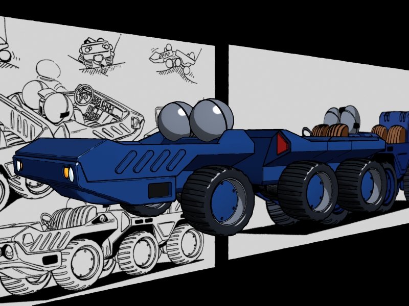
Another interesting design question. From the specs, we know that the trailer section is free to pitch and roll independent of the cab. We don't know if it also yaws independently. Regardless, looking at the connection between the two halves, what the heck is going on. It's not a circle, so, how exactly is it rotating? In fact, no joints are visible. It's possible that we're looking at some sort of flexible sheathe which covers are more traditional coupling assembly. Or perhaps the relevant connection is obscured in the image. Any ideas? I'm going with the flexible sheathe theory for now -- some kind of protection against dirt, dust, and foreign objects from getting mixed into the works.
-
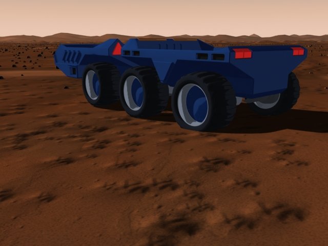
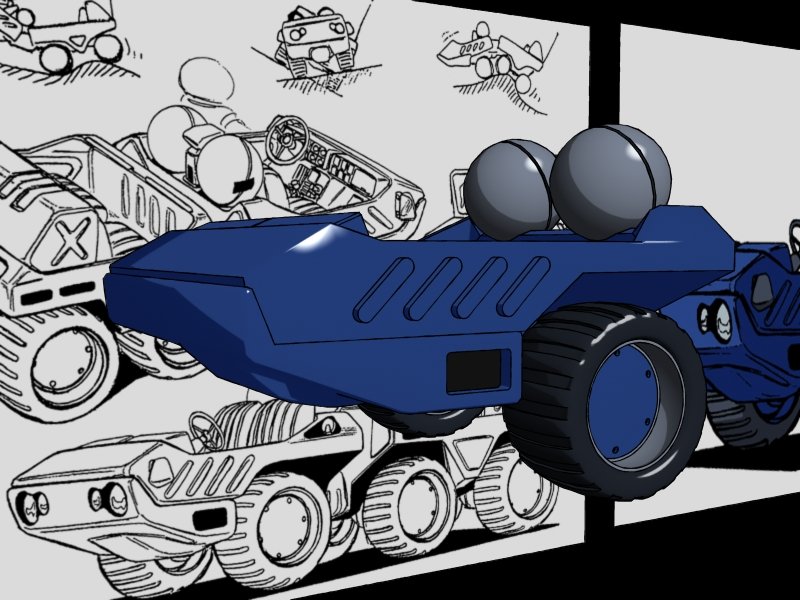
Yeah, don't front, Mr. March. Your coloring is awesome. Very crisp. Very cel. Here's a random shot of the unfinished rover on an unfinished alien landscape.
-
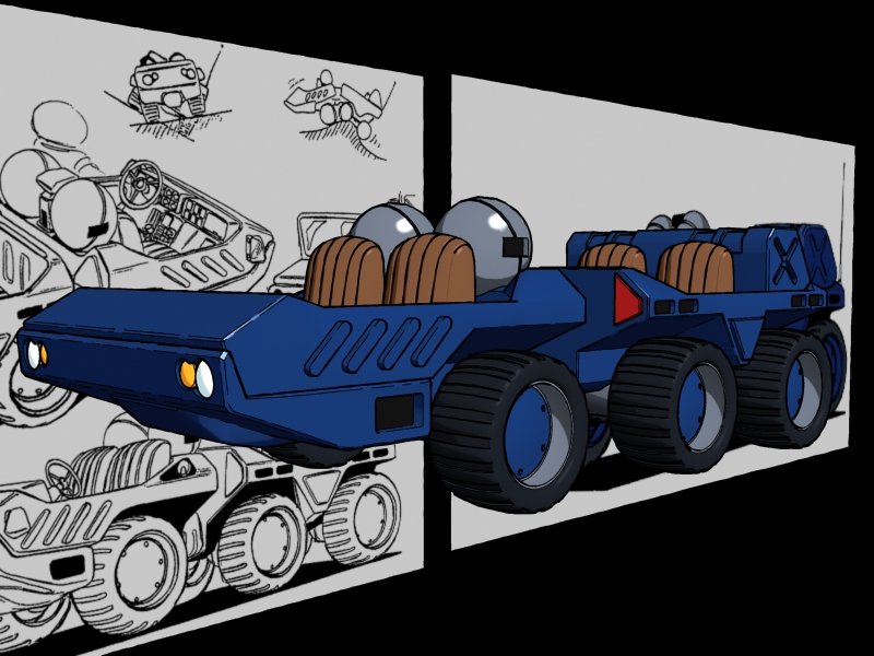
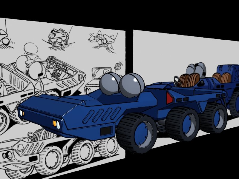
Man, these animated gifs are such a tease. Anyway, here's an update of my WIP. Don't mind the weird random lines on the trailer section. That's just because I have some crazy creases in the model.
-
I think the model itself is pretty impressive. I'm curious about the rigging. Is it rigged in such a way that animating Battroid is natural like animating a human? AND does that same rig transform? Or are you swapping models for transformation, or swapping rigs? I'm thinking a combo IK/FK system would be ideal for an all purpose model. Even still, IK when you're dealing with non-standardized joints (like the multiple joints on the thigh or arm of a VF) can be kinda wonky. But to chime in with the others, I think the bump mapping is my main concern with the realism of the model. The bump texture is HUGE, and as a result, it makes it look like the model is smaller. Also, in my opinion, some of the specular highlights are making the thing look like a glossy plastic rather than painted metal. I'm not really any good with textures, so I wouldn't have a concrete suggestion on how to fix that. I'm really anxious to see some animation.
-
Still going, shadow! Keep it up!
- 622 replies
-
- Video games
- Homeworld
-
(and 2 more)
Tagged with:
-
The user profile pic? The coloring/shading on the left arm and the helmet are SICK. Darrtallion: Really TWO other models of that thing? Crazy. It's going to appear fairly distantly where I'm using it, so maybe I should have searched for game-level models before I started this puppy. Oh well. This is sort of a nice way to jump back into modeling, which I think I'll be doing a lot of in the next couple of months. Mr. March: Using finalToon by cebas. It's probably my favorite cel shading option, although it annoyingly is missing a few features of Illustrate! 5.whatever. I swear, if they just combined the best parts of each of those packages, they'd have something amazing. Although, SoftImage seems to have some rad toon-shaders built in. Hmm.
-
So, I'm modeling a vehicle which gets no fan-model love. The GN XM-3002 rover. Now, as cool as this thing looks, it's a major offender in the anime magic category. First of all, it's got to have some kind of TARDIS technology, because it's clearly bigger on the inside than the outside. From the outside view, one has to wonder where the bottom of the seats are stored, and where the drivers keep their legs. In addition, one would expect there to be a lot more clearance between the wheels and the vehicle body. I mean, this thing is for roving over tough terrain, right? And hey, speaking of wheels... where exactly are we keeping those shock absorbers. Who knows? So, I'm basically combining the line art with just me making stuff up to try to make something that can exist in three dimensions. Oh well, I'll keep y'all updated.
-
Awesome, dude! Those are classic and epic works of fan dedication and skill.
-
You, my friend, have noticed something that's been bothering me for a bit. As you point out, going in chronological order of past/present/future is the smoothest way to present the tagline. However, one of the central themes of Aria will be "living for the present" which is why it is presented as the final directive there. One would assume that the big fight is the fight for the future, and while that is the big external fight, I think the bigger, internal fight if you will, is to be here, now. I dunno. I'll mull it over, because I agree that the bam bam bam quality of past present future is a lot stronger. Truth be told the tagline was invented for our project launch teaser, way back in late 2008, which really had very little content. It was designed just to get people excited about the prospect of working on an original piece. Maybe I'll post that thing someday.
-
The CAG flies with the Rapiers. We also have a squadron that figures prominently in the 2nd episode, Phoenix. As far as design rules... well, Apollo has a pretty basic looking logo. As does Skull. It's possible that there is a more detailed crest somewhere, but for simplicity's sake they use the readily identifiable icon-type logos on planes and badges. I dunno. It might be cool to see a more complex logo, but I wouldn't want to upstage the Apollo logo, which is the primary squadron of the game. That doesn't give you much to go on. Who knows, perhaps we have to update the Apollo logo, while maintaining the essence of its design? Sort of the way the SMS Skull is a reference to the original Skull, but with more elements and colors. Incidentally, though it might not even make sense, I wanted the UNS ARMD-08 Pegasus to have a logo that was a valk girl (like an actual valkyrie, but with hints of the VF) riding on a pegasus. I thought that would be cool.
-
I was very determined from the beginning to make sure these things felt like real fatigues, to give them zippers, pockets, rugged boots. But maintaining those Macross shoulders was crucial. Cannon_Fodder took my descriptions and really nailed the suits. He also took the initiative and invented the "bomber jacket" that The CAG and Alex are wearing over their jumpsuits. Very cool. I made the shoulders on those yellow as an obvious link to the flight suit shoulder pads. The color schemes are directly taken (slight RGB value differences, of course) from DYRL. The Apollo Squadron logo is actually canon, appearing in the SDFM PS2 game. Fun fact, though, the CAG does not fly with Apollo, but rather with Rapier Squadron, and therefore he actually needs a new logo. I was sort of hoping I could get some MWers to come up with some designs for the other squadrons' logos and paint schemes.
-
Okay, since I'm giving the live action project grief for not being more open... Presenting the cast of Macross Aria as drawn by Cannon_Fodder674 and colored by me. This is a flats version, meaning they're not shaded yet. WIP. I'd just like to note how happy I am with the jumpsuits. For Aria, as a fan production, I wanted to be very faithful to the universe, faithful to canon, but still be able to create something new. I wanted to maintain the classic look of DYRL while modernizing it slightly. Aria takes place between 2014 and 2015, so conceivably, the uniforms HAVE changed. But I also wanted to reconcile the design of DYRL which is often considered canon with the more realistic design found in Macross Zero. When we started, there were very few images of Macross: The First circulating, other than Hikaru's revised flight suit, Minmay's dress, and Misa's uniform. In a way we had the same task -- modernize, update, synthesize, while maintaining respect for the original. I'm impressed by how the M:1st designs incorporate both SDFM and DYRL style cues, but I really like our more M:0+DYRL+CF674's imagination look.
-
Holy crap. Your work is so fantastic, man. Really, really great stuff. The choreography of the stop motion is fantastic. And I have to say, when I saw that teaser at the end... I just about lost my shizz. You are a hero.
-
Hahaha. Okay, very well. I guess I'll just have the be the change I wish to see... perhaps this means we'll be seeing something more substantial from team ARIA in the near future...
-
Nice looking models. What software? What's your poly count? Let's see some behind the scenes stuff! (says the guy who has been VERY secretive about Macross Aria)
-
Awesome. Happy Holidays and Merry Christmas and Deculture Kwanzaa......
-
Did you see that movie I sent you? The "Modern Times" one? They pulled that off with some budget stuff. Kind of shocking, really. I don't think there's any excuse anymore for not doing some sweet live action stuff.
-
Aha... I might need that. Vinnie had been tweaking the proportions to make a transformable VF-4 that looked respectable in Battroid mode, but I have bits and pieces that he did before his last deployment.
-
The QF3000.
- 622 replies
-
- Video games
- Homeworld
-
(and 2 more)
Tagged with:
-
Hey, chthonic... do you still do textures? I have this sweet medium-poly Ghost model that has no texture. And just looking for somebody to do a nice Toon texture for it. I'm sure the original author, Akt_M would like to see it in-game, as well as in-movie, so I'm sure we could trade.
- 622 replies
-
- Video games
- Homeworld
-
(and 2 more)
Tagged with:
-
Yeah, me too, actually....
- 622 replies
-
- Video games
- Homeworld
-
(and 2 more)
Tagged with:

