mechaninac
-
Posts
4237 -
Joined
-
Last visited
Content Type
Profiles
Forums
Events
Gallery
Everything posted by mechaninac
-
Edit: Never mind... PS.: Not related to above post. 8 still available
-
Wait... What?
-
Indeed. Please elaborate.
-
As of 1:25 PM EST, the preoder is still open. I did not go for it as I already have one reserved with HLJ, but I did preorder Alto's Fast Pack set and Ozma's Armored Pack set. Their prices are very competitive, their choices of shipping methods are comprehensive, and they only invoice you when the item is within 2-3 weeks of release, at which time I'll PayPal them. Now, I just hope they come through...
-

Star Wars: Clone Wars animated series
mechaninac replied to BoBe-Patt's topic in Anime or Science Fiction
The first of the season finale episodes has done absolutely nothing to make me warm up to the idea of bringing back Darth Maul. Don't get me wrong, it wasn't a bad episode, just kind of pointeless to me. And somebody call RA Salvatore, this episode's writers totally "borrowed" his Drider concept... -
Armarauders-Toy Line with Comics
mechaninac replied to Valkyrie Hunter D's topic in Anime or Science Fiction
Hmm... interesting/promissing... I'm going to keep an eye on this. -
Great idea Graham. I've got a couple of phrases to add: "Tried to preorder a Bandai VF-171EX but all I got was this lousy T-Shirt!" "If I had a Dollar for every "Order Stop" I ran up against I could afford to buy a VF-171EX off Ebay..."
-
Err... You're showing the feet thrusters for the VF-1; of course Yamato got it right on all their versions, so did Bandai and Toynami, for that matter. The problem is that according to available animation (DYRL?), CG (games), and line art, the VF-4 does not share the same feet design as the VF-1 series... the feet thrusters of the VF-4 are unique, with a paddle-like design that may prove too delicate to pull off in 1/60 scale. If Yamato keeps the VF-1 style feet on the VF-4 I can unequivocally state that they are getting it wrong. They may have their reasons to go this rout, and may even have Kawamori's blessing on doing so, but it would still be incorrect based on all available sources.
-
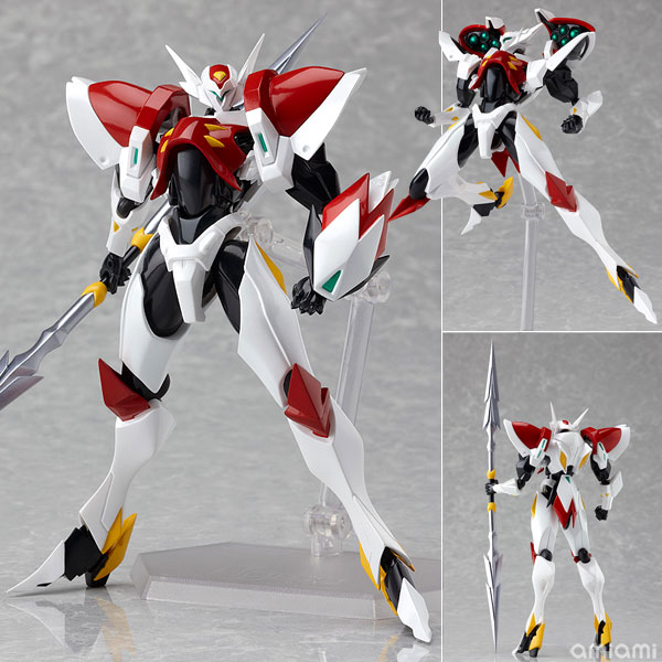
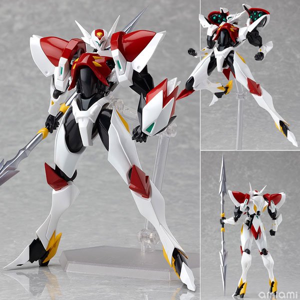
Tekaman Blade is out for pre-order at AmiAmi

-
Officially Figmas are non-scale but most work out to around 1/12. Robocop is about 5 3/4" and Roger Smith is just shy of 6", so that should give you an idea of what height to expect; however, since I don't own any of the Bandai figures I have no idea how they'll compare. And it's out for Pre-order at AmiAmi
-
After pretty much giving up on getting this I was finally able to place a pre-order with HLJ... would've preffered AmiAmi's 26% off but 8% isn't too shabby, all things considered. Thanks so much all of you who kept scouring all the usual haunts and posting the links. Edit: ...and order confirmation e-mail received, so I think it's truly official!
-
What Current Anime Are You Watching Version v4.0
mechaninac replied to wolfx's topic in Anime or Science Fiction
Currently watching Shikabane Hime for the first time; I'm half way through and loving it. The title 'Corpse Princess' made it sound like it would have been just another cutesie girl-centric* anime, but that's the furthest thing from the case. *Sure, the hero fighters are all girls, but so far there has been no fan service, love triangles, school life hijinks, harem shenanigans, yelling out of absurdly named special attacks, or any other similar cliches. -
Star Wars: Clone Wars animated series
mechaninac replied to BoBe-Patt's topic in Anime or Science Fiction
I think the little 'thank you' she receives towards the end, coupled with the whole situation presented before her and how it relates, however slightly, to her own personal history, kind of opened her eyes to new possibilities (it gave me the impression that it made her feel somewhat "noble"... she had a look of peacefull satisfaction watching the centipede mount walk away with its occupants, and blissful optimism walking away from Bosk and the others). To answer your question, if good or evil are judged by one's deeds then she did good while still looking out for her own self interests, so does that make her good or just not-evil? Overall, I really enjoyed this Ventress-centric two parter. -
I thought that's exactly what we've been collectively doing for the past several pages... I keed, I keed....
-
As Indy put it: "It's not the years, it's the mileage..."
-
Exactly. I was more than willing to pre-order this sucker, even at near full MSRP, but Bandai's under production/under supplying of retailers means I'll be saving myself around $200+ that I can spend on other stuff or just not spend at all.
-
Great news, indeed! Although I understand why they're releasing Alto's scheme first I wish they had gone with the Teal CF version; after all, that is the first VF we see in the MF series. Regardless, I can't wait for the pre-orders to be up and hope they don't close within minutes of doing so.
-
Star Wars: Clone Wars animated series
mechaninac replied to BoBe-Patt's topic in Anime or Science Fiction
You're right. I stand corrected... it is Darth Maul! At the time I made my reply I had not watched the extended trailer. I'm not sure I like the idea of bringing Maul back from the dead, specially considering the way he met his end in TPM; but I since bringing the dead back as un-dead has already been stablished as a Dathomirian thing, Palps mentioning Darth Plagueis having the ability of actually restoring life to the dead, and that SW technology can sustain life even to just a brain and some vital organs as a sentient being as evidenced by Grievous, having Maul as an upper torso with droid lower half is within the stablished rules. But I still don't think I like it... it cheapens the climatic ending of TPM's awesome light saber battle (the best of all the prequal movies, IMO). I think it would have been much better if they had made it so that Palpatine, or one of his agents, had smuggled Maul's remains or portions of it off Naboo to extract genetic material from which a clone of Maul could be made and inbued with his memories by means of Dathomirian magic. I'll have a better idea about how I feel about the whole thing once I've had a chance to watch the episode next Friday; but either way, it should be fun. -
Star Wars: Clone Wars animated series
mechaninac replied to BoBe-Patt's topic in Anime or Science Fiction
Darth Maul, apesar de ter exposição limitada no Phantom Menace, foi o personagem mais memorável dos últimos três filmes. O problema é que, estando morto, a única maneira de têr ele no show teria que ser em um flash back ou como um Fantasma da Força... mas ele não era poderoso o suficiente pra fazer como o Obi-One, Yoda, ou até o Anakin. [For the non Portuguese readers] Darth Maul, despite having limited exposure in the Phantom Menace, was the most memorable character in the last three movies. The problem is that, being dead, the only way to have him in the show would be in a flash back or as a Force Ghost... but he wasn't powerful enough to do like Obi-One, Yoda, or even Anakin. -
Star Wars: Clone Wars animated series
mechaninac replied to BoBe-Patt's topic in Anime or Science Fiction
I find myself thouroughly enjoying any episode featuring Asaj Ventress, her character's journey from Dooku's underling to trajic "heroine" has been one of the true bright spots in Clone Wars. -
Wow, that really narrows it down...
-
Yamato 1/60 VF-17 Nightmare Diamond Force
mechaninac replied to charger69's topic in Hall Of The Super Topics
Those are some seriously cool fast packs, but can't say I care for the color. I hope they're just test shots 'cuz ducks egg blue... -
Wow, that being the case, then whoever designed the molds at whatever tool-shop Bandai uses, and whoever at Bandai approved them, should be taken out back and given a proper beating. It's one thing to do what they're doing if there are no other molds with the proper coordinated parts, but if those exist then this is just bone headed stupid indeed... to do so much right with the renewal version only to then goof up on something so unnecessary. I still want an Ozma, Michael, Luca, and CF (if they make one), though... I guess I'm just a sucker for having glaring WTF errors/questionable decisions stare me in the face.
-
Yeah, Banday likely had the tooling done so that many of the parts share a single mold, thus injected together with the same plastic at the same time. It appears that both left and right halves of the wing gloves were put on the same tool, and if this tool is also shared with a number of other parts there is next to zero chance that the factory would swap plastics just so a few components could be shot in the correct color... once a production run is started they'll run it until the quota is met with very little extra, hence why they'll continue to paint certain parts, bottom wing gloves included, to make them art work correct instead of incurring the extra cost of scrapping a lot of unused pieces just so they can have a few parts molded in the right color plastic for any particular VF-25. I'm sure this must have been a cost cutting measure as having as many parts as possible share the same injection tool saves on machine cycle times, material procurement and storage, factory floor space (one injection molding machine instead of two for any particular run -- this excludes all the dark gray parts that share their own tool, and labor (someone hired for a painting operation is cheaper to employ than a qualified injection machine operator). On the VF-25F this wasn't a problem (all white as it is), but it will be a recurring issue from the 25S onwards; we'll just have to accept this compromise or not buy the toys if this is a deal breaker, there really are no other choices... lamenting it won't change a thing.
-
Star Wars: Clone Wars animated series
mechaninac replied to BoBe-Patt's topic in Anime or Science Fiction
"What're you lookin' at? It's a nice hat..." Gotta love Cad Bane