-
Posts
1392 -
Joined
-
Last visited
Content Type
Profiles
Forums
Events
Gallery
Everything posted by Phyrox
-
Transformers: Age of Extinction - in theaters June 27, 2014
Phyrox replied to taksraven's topic in Anime or Science Fiction
1) Bay's track record so far I think indicates this is a good idea 2) Star Wars trilogy all directed by different people 3) If you aren't already prepared for crap, you should be- 950 replies
-
- Transformers
- movies
- (and 9 more)
-

Mo-Suu-Pii-Dah Inbitoh in 1/48--Part Deux!
Phyrox replied to captain america's topic in Anime or Science Fiction
If we get that protector inbit project as well I'll be in Mospeada nirvana. -

Medicom/Hot Toys and all 1/6 scale figures
Phyrox replied to EXO's topic in Anime or Science Fiction
These sculpts are pretty, eh...interesting...but my mom is selling some female 1/6 bodies on ebay that might be fodder for conversions or something. She said she'll remove the listing and sell to any individual who uses me as a reference. I don't know anything about figures, but I know lots of my MacrossWorld brethren do. If you're interested. She buys toys/figures in large lots for her collectios (mostly Barbie and Sindy horses and cars), and gets lots of weird stuff like this that she just wants to give a good home. http://www.ebay.com/itm/Lot-of-1-6-DOLLSFIGURE-Female-Action-Figures-w-Extra-Feet-EXCELLENT-/121284781058? -
My family experience with VWs in general is that they are maintenance monsters. I've never had one be rock solid for longer than a year or two. Usually not mechanically, but the electronics seem like they'd be more appropriate for an '80s Jaguar. Fun cars though, so it may be worth it
-
I disagree. No need to drag another series into this freak scale. Besides, I don't know of any macross models in 1:60.
- 848 replies
-
- Super Dimension Century
- toys
-
(and 3 more)
Tagged with:
-
1/60? No thanks. I don't want no wacky-scale models. 1/35 to go with my armor, or 1/48 to go with some planes, or if cheap is the goal, 1/72 to go with just about everything. Gundams and Macross toys can keep 1/60 to themselves
- 848 replies
-
- Super Dimension Century
- toys
-
(and 3 more)
Tagged with:
-
- 848 replies
-
- Super Dimension Century
- toys
-
(and 3 more)
Tagged with:
-
I think the Gallardo he based it on is a pretty boring looking car, so the project makes sense to me...but the rear fascia is horrible. The rest of the project looks really well done, but that rear end is looks like it was done in a day. An interesting idea though. I'm all for people making their cars their own...even if their taste doesn't match mine. That's a well-done build, more power to 'em.
-

Mo-Suu-Pii-Dah Inbitoh in 1/48--Part Deux!
Phyrox replied to captain america's topic in Anime or Science Fiction
I'm in for 1, but I'll get two if the project greenlight seems iffy. -
That's gonna work.
-

Mo-Suu-Pii-Dah Inbitoh in 1/48
Phyrox replied to captain america's topic in Anime or Science Fiction
Whatever, I'm in...this has been on my top-3 most wanted kits for over 20 years. C'mon people, it's this, or your 8th VF-1 repaint... -

Mo-Suu-Pii-Dah Inbitoh in 1/48
Phyrox replied to captain america's topic in Anime or Science Fiction
Holy crap, Captain! Do eet! I'm so in. -

Mo-Suu-Pii-Dah Inbitoh in 1/48
Phyrox replied to captain america's topic in Anime or Science Fiction
Just looking at the instructions it looks like it goes on the bottom of the "feet" between the front and rear talon parts. -
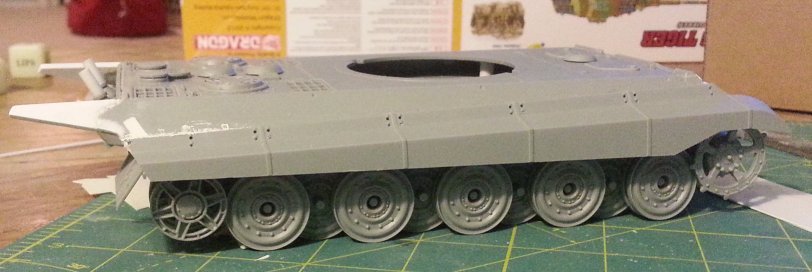
My Tiger 2.5 turret is nearly there. All the hull and turret fiddly bits need to be attached still, and obviously the running gear and tracks are just being test-fit here to get a feel for the final arrangement. Ended up just heavily modifying the Henschel turret rather than totally scratch-build it.
-

Gundam Build Fighters/Build Fighters Try
Phyrox replied to VF-15 Banshee's topic in Anime or Science Fiction
Perceptive, this one.- 971 replies
-
- gundam
- mobile suit
- (and 8 more)
-
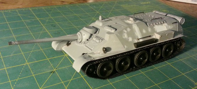
1/72 custom zimmerit? That is impressive. Most impressive. I used to build 1/72 tanks, as I like everything to be in scale together...but for customs and kitbashing 1/35 is just so much more forgiving. Those hull extensions on that (A)SU-85, a mm of measuring error would have been really noticeable in 1/72. Here it's nothing some filler or some sanding can't fix.
-
Nice Ki-61. One of the more elegant fighters from the war, and certainly looks like you are doing it justice. For my part, I'm working on two fake but plausible AFVs: Turret may need to be scratchbuilt To complete my WWII phoney TD trilogy
-

Gundam Build Fighters/Build Fighters Try
Phyrox replied to VF-15 Banshee's topic in Anime or Science Fiction
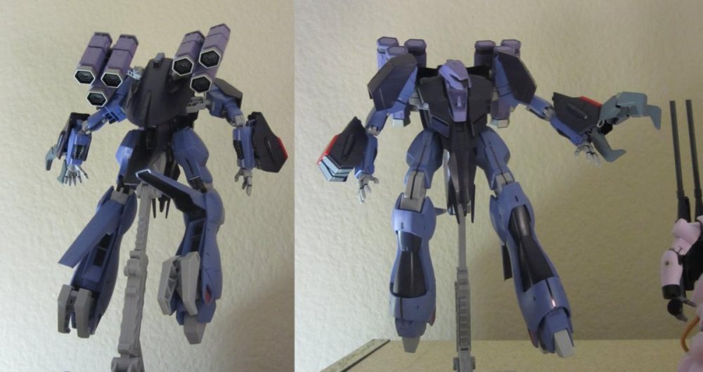
That looks like Zeong upper body with Bound Doc skirt and legs...odd.- 971 replies
-
- gundam
- mobile suit
- (and 8 more)
-
Lets get a larger version of that in here: And a paintshop I did to turn it into a desktop background, back when we had smaller, lowrez screens:
- 14379 replies
-
None of this does anything to save Elysium from being a crap movie.
- 135 replies
-
- Neill Blomkamp
- Matt Damon
-
(and 5 more)
Tagged with:
-

Gundam Build Fighters/Build Fighters Try
Phyrox replied to VF-15 Banshee's topic in Anime or Science Fiction
- 971 replies
-
- gundam
- mobile suit
- (and 8 more)
-
I'm waiting for the "why." It looks nice. It doesn't look anywhere near nice enough to justify that figure. Am I missing something?
- 8535 replies
-
Give me. Not a fan of the headlights, but otherwise, I like. A lot.
-
This has been the best half a year for Gundam kits ever. HGUC Messala and Gerbera Tetra, and now MG Turn X? Saweet!
- 8535 replies
-
Is that a Deperdussin on the undersides? That's pretty cool. Nice homage.
- 6 replies
-
- Angel Birds
- paint scheme
-
(and 1 more)
Tagged with:

