Lolicon
-
Posts
7342 -
Joined
-
Last visited
Content Type
Profiles
Forums
Events
Gallery
Everything posted by Lolicon
-
You can add blue food coloring to the purple ink + Future mix to get the shade you like since acrylic ink is often way too purple.
-
Detailed 1/72 fighter mode and battroid mode-only kits would be nice. And what happened to the 1/48 scale model?
-
Thank you so much for the in-depth review! I didn't hear about May'n and Megumi being at AX until only a few weeks ago, so I was quite perturbed that I wouldn't get to go. Luckily, I'll be in Japan in July/August and I had the fortune of getting tickets to see May'n; having never been to a concert in Japan I had no idea what to expect. So thanks again for the detailed write-up. I do envy the bastards who will get to meet them and get their autographs at AX.
-
I wouldn't mind a business suit Grace. But then again, not everyone shares my perversions.
-
Heheh yeah you can hide a bit of bluetac between the arms and inner leg and it won't be visible. Quite ghetto, but it works. I've never transformed my 27. I built two of them in different modes. I think the 27 is probably the most hideous of the model kits if assembled unpainted. Please paint it!
-
Hey mickyg, are you planning on any modifications to help keep the legs up? I can't help but think that the extra weight of the super parts are going to eventually make them sag.
-
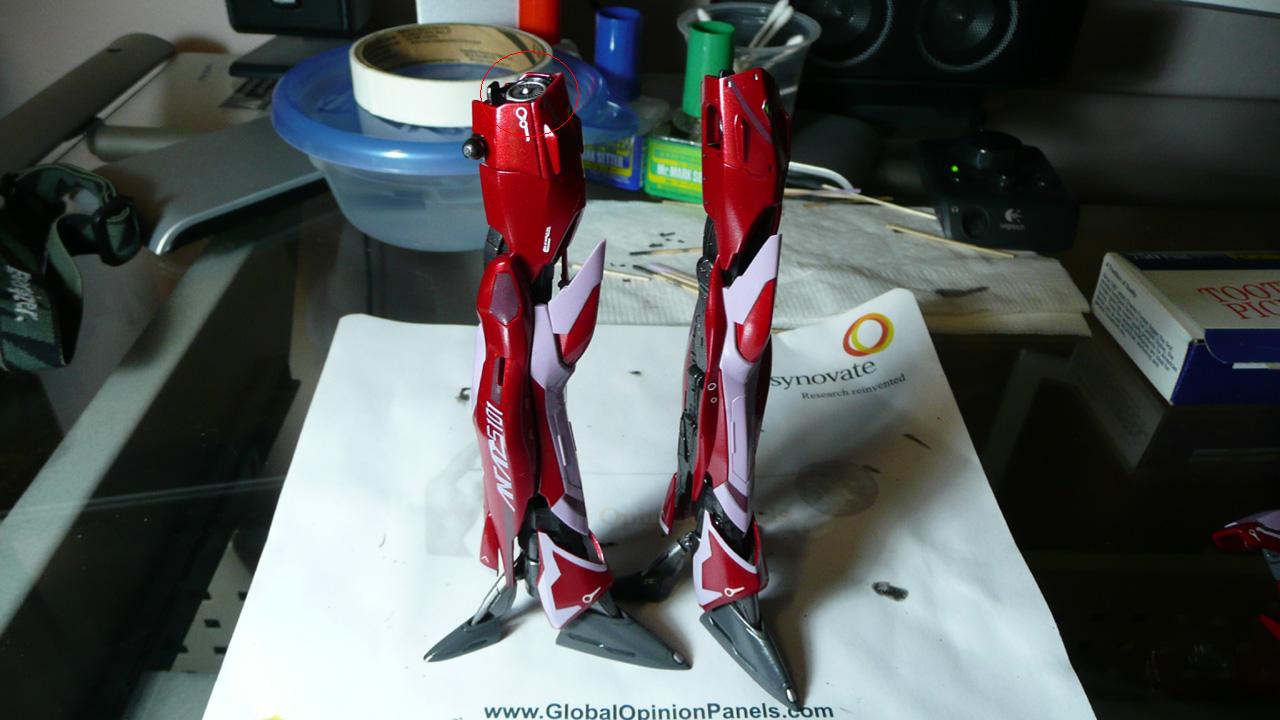
Hehehehe welcome to the wonderful world of VF-25 modeling! Mr. Cheng pretty much said it all; I'm of the mind that Bandai intended these "models" to be toys that you have to put together yourself with minimal effort. And they're great for that purpose, but if you want it to look good, it's going to take a lot more effort, even more so than any gunpla kits (I've assembled a few Gundams in the past). Anyway, your 25G is looking fantastic! I (almost) can't wait to get into mine now! As for that leg gap, you should be able to push the lower leg upwards towards the thigh so it sits flush. You'll have to fiddle with it to get it to sit more or less upright and in place. Try not to wear the leg joints out though, because that joint friction is the only thing keeping the leg up! I stuck a bit of bluetac between the leg and arms to help keep it up... The VF-27 has tabs that lock the legs and wings into place, so once you've gotten it fully assembled everything is super tight and you can woosh it around all you like. Getting it assembled is another story; the parts fit is much tighter and I had a far harder time getting everything in place on the 27! I even snapped off the head antenna during assembly.
-
Two amazing SDF-1 Macross models in one week! *head explodes*
-
That is the greatest model I have ever seen. This ought to be featured in Hobby Japan or something. You know what? I would definitely pay $500 for something like this, if Yamato had mass produced it at that price (though I'm sure it wouldn't be quite as awesome!).
-
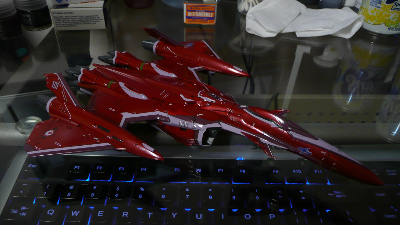
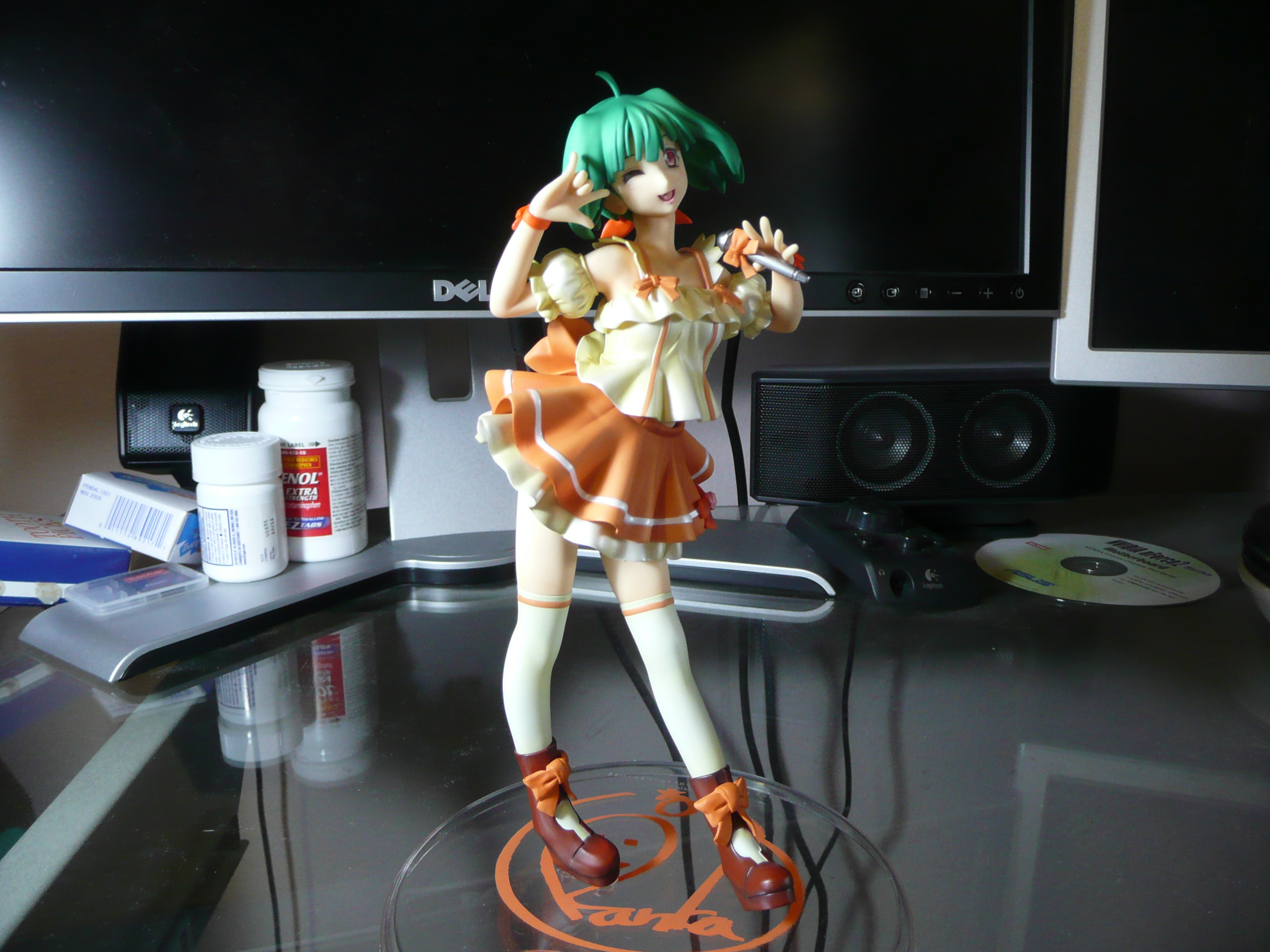
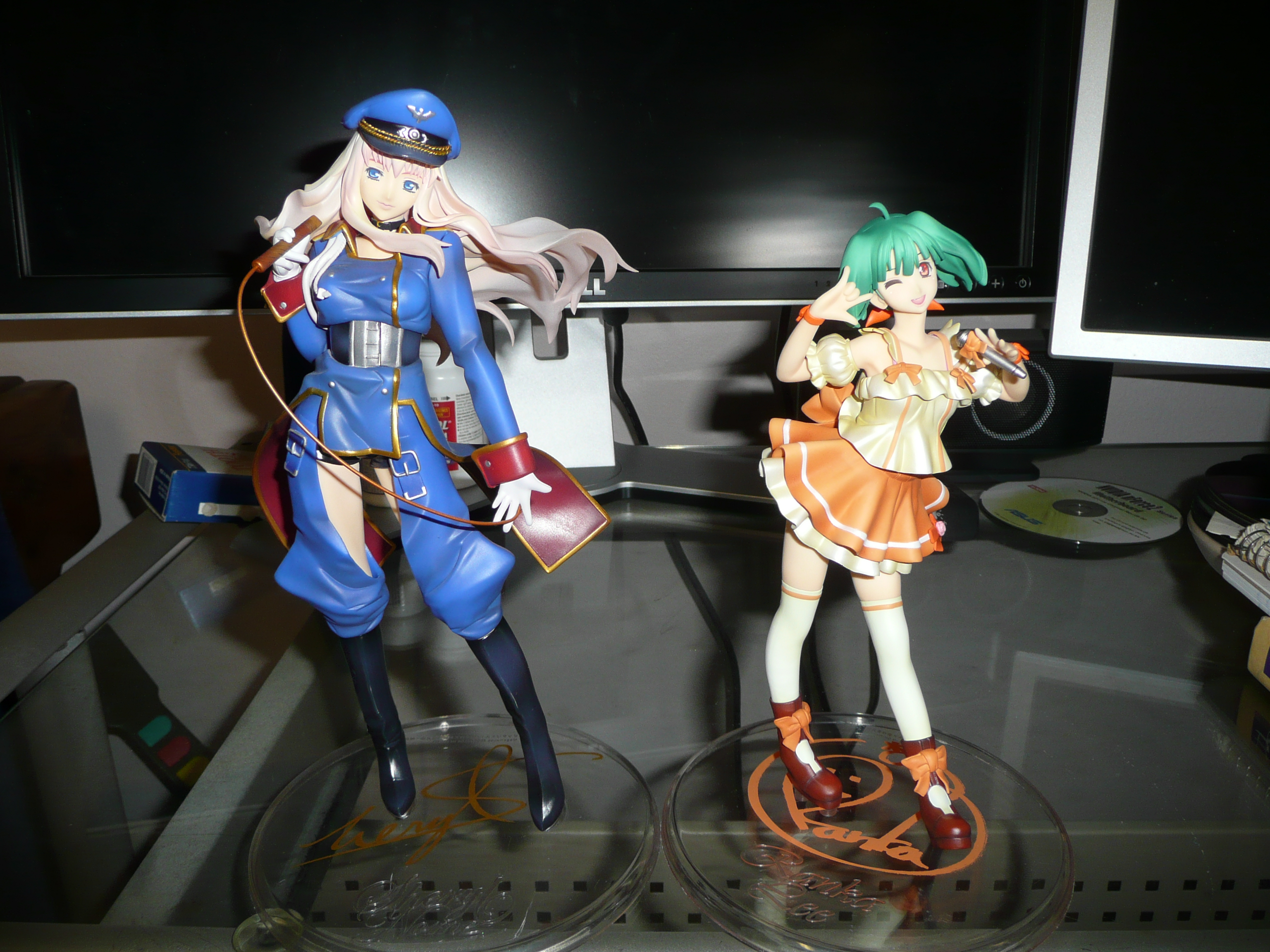
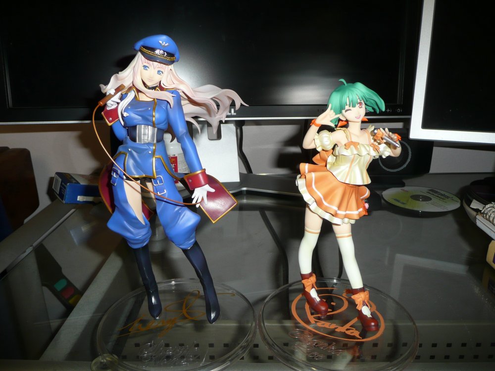
Super Dimension Cinderella Ranka finally arrived. Glad I passed on the subpar Banpresto release. Sorry for the large size; did a recent reformat and don't have any of my imaging software installed. Together with the Galactic Fairy! Now where's my final episode Sheryl, Bandai?!


-
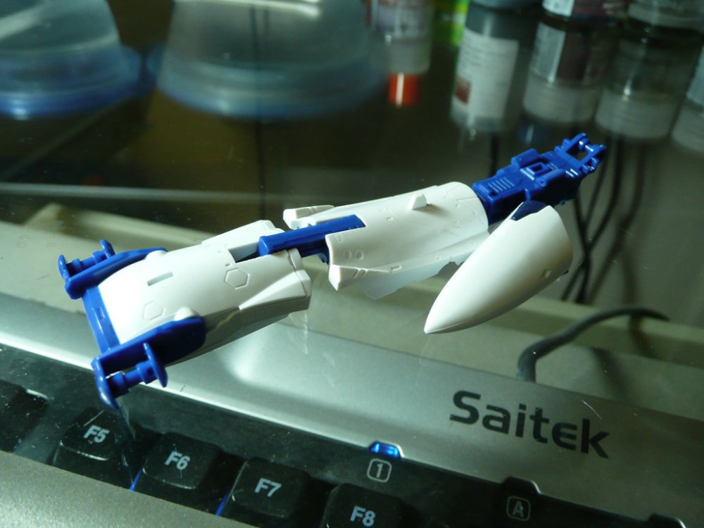
I bought the Ranka Deculture VF-25F a few months back and if I recall correctly it does not come with the original decals (at work atm so I can't just take a look). The kit looks to be identical to the regular VF-25F, except the red "mohawk" part of the head is molded in green plastic. EDIT: Got home and checked the box. You only get the Deculture decals.
-
Whoa those painted on stripes look pretty pimp. I bet they were easier than trying to line up Bandai's messed up decals.
-
I know you're trying to spend as little as possible on extra supplies and materials, but since you're hand painting everything, I highly recommend getting a bottle of GSI's Mr. Retarder Mild. It slows down the drying of paint and makes hand painting and hiding brush strokes way easier. A bottle only costs something like 300 yen and will last awhile, depending of course on how much paint you're using. I use a 90/10 mix of paint to retarder when I have to brush paint something. I used to completely dread anything I had to brush by hand in the days before I started using it. Now I'm only slightly intimidated.
-
Only 3 more? Not going to build anything outside of the SMS Skull Squadron?
-
I can tell what decals were added! When it comes to nightmarish decals on the Frontier models, the VF-27 takes the cake, in annoyance factor and sheer quantity. I've built two of them, and because of that I've had to take a break from any modeling... for the next several months. The worst decals were the canopy. I've found that Mr. Mark Softer works fairly well on Bandai's decals, so long as you use a brush to spread out the liquid and keep it from beading up until it's absorbed by the decal. If you let it bead up it'll often leave an ugly pock mark on the decal (though usually not noticeable unless you're looking really closely). Though I trimmed the excess film on the majority of the 27's decals, I found that the Mark Softer will actually melt the carrier film itself but leave the pigment/markings intact, which is good for large solid decals, but death for all the tiny little white markings that are found all over. Since I'm softly brushing to prevent beads, I end up sloughing off the carrier film. I use as little Mark Softer as possible, but it still beads up and I don't dare try to soak it up for fear of touching and messing up the decal. It really does absorb so slowly on Bandai's decals. There were also a couple of instances where in order to get a decal to fit into a recess, I would use the tip of my knife to put in a tiny slash or puncture; this would allow me to press down and squeeze out any liquid more easily. The puncture would be invisible. I generally don't use any water at all except the water that adheres to the decal when I pull it out of the water dish. I just put a small amount of Mark Setter where the decal will go, and then just lay the decal over it and adjust as needed. If the decal is being particularly troublesome, then I may have to add a drop or two to continue adjustments (since Mark Setter actually does what it says!). Something about the Mark Setter just pulls the decal into place better for me. It's a slip and slide game when I use water. Not particularly professional, but it's worked for me so far.
-

MickyG's Yamato VF-1S Unpainted, Unassembled Kit Build
Lolicon replied to mickyg's topic in The Workshop!
Really? Damn I wish I could get mine so bright and even. -
MickyG's Yamato VF-1S Unpainted, Unassembled Kit Build
Lolicon replied to mickyg's topic in The Workshop!
Tinting clear parts myself was my favorite thing about working on the VF-25. I assume it was left untinted so people could go wild with their customs. -
MickyG's Yamato VF-1S Unpainted, Unassembled Kit Build
Lolicon replied to mickyg's topic in The Workshop!
Hmmm I've been wondering about these Yamato, err, model kits. So is it just an unassembled, unpainted VF-1 with decals, etc.? Is it molded in the same kind of plastic as the completed toys, or is it made out of the same kind of plastic like other plamo kits? (I'm not even sure if they're any different or just thicker; but the toys certainly feel heavier and more sturdy!) I'm looking forward to seeing what you do with this. For me personally, I wouldn't build a VF-1 that's available as a completed toy (being able to paint and fill in seams and such is not enough incentive for the time and effort involved). But a custom... maybe I can finally put those Deculture Campaign decals to use. Hmmm are you going to want to transform it after completion? Even though it'll be sturdy as a completed version, I'm thinking that even the sturdiest paint job is going to be scratched up after a couple of transformations. And the decals! -
That's looking fantastic. On the red parts, did you just paint it straight on or did you need to use a silver or other undercoat? @Maxtype Hey if you can handle a MG Gundam kit, you can handle a Frontier kit. They're about the same in terms of complexity. The real trick is lining everything up in fighter mode without totally scratching up the paint and decals... the VF-27 fighter mode nearly broke me...
-
Let's see some progress pics! I want to see your completed work before I start on my 25G. Here, I'll post all the progress I've made on mine since February.
-
Bandai 1/72 Scale Macross Frontier Model Kit Thread Ver.3
Lolicon replied to azrael's topic in Hall Of The Super Topics
I wish Bandai would've released fixed mode fighter and battroid kits of their Frontier line. Cheaper to produce and easier to build. What could be better? No one who wants to preserve their work is really going to transform them. -
Bandai 1/72 Scale Macross Frontier Model Kit Thread Ver.3
Lolicon replied to azrael's topic in Hall Of The Super Topics
It's because Bandai hates you. Unless you plan on painting it, it's better to go with the DX anyway, because the model looks crappy if stuck together "right out of the box". I would've picked up the DX if it didn't have such a weak paint app. Now I'm busy working on a second model so I can keep one in fighter mode. -
Bandai 1/72 Scale Macross Frontier Model Kit Thread Ver.3
Lolicon replied to azrael's topic in Hall Of The Super Topics
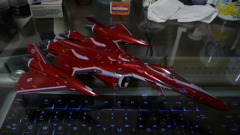
Yeah that's the kicker. The 27 uses all new parts for the crotch/hip bar. The nose does look pretty long in the battroid pics, though I like it in fighter mode. The big air intake covers and upper legs are what mar the fighter looks. In fighter profile, it's a fat bulge in an otherwise sleek profile. Bandai probably could've tooled it a bit more to get the proportions better... but that costs money! If there's a task that must be done, Don't turn your tail and run, Don't pout, don't sob, Just do a half-assed job! If... you... cut every corner It is really not so bad, Everybody does it, Even mom and dad. If nobody sees it, Then nobody gets mad, It's the American Bandai way! If... you... cut every corner, You'll have more time for play pay, It's the American Bandai waaaaay!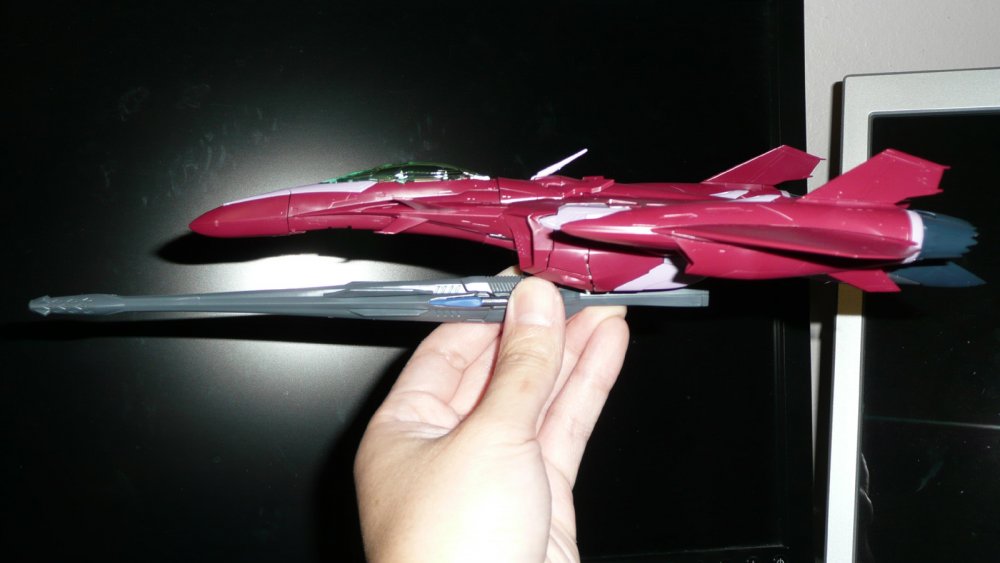
-
Bandai 1/72 Scale Macross Frontier Model Kit Thread Ver.3
Lolicon replied to azrael's topic in Hall Of The Super Topics
VF-27 has a virtually identical transformation to the VF-25, so Bandai recycled quite a few parts from the 25 design, including the lower hip placement, which looks pretty low. The air intake covers are problematic too (the actual air intakes remain on the leg; why would anyone separate the air intakes from the engines?) because they look kinda elongated on the model, but shortening them would also mean having to make the upper legs thinner, and shrink or squash the air intake fans to accomodate it. I'm unsure how else one could get around it. I haven't bothered doing a freeze frame comparison to see just how big they're supposed to be in the anime.
-
Official Bandai 1/60 Scale DX Toy Thread Ver.6
Lolicon replied to Duke Togo's topic in Hall Of The Super Topics
Yamato releases a toy with manufacturing flaws? They suck! I'll never buy a Yamato again! Bandai releases a toy with manufacturing flaws? It's perfect! Yamato could learn a thing or two from them! Damn shame about the weak paint app and chipping problems on what is otherwise a great looking toy. It still boggles me that that's an issue in this day and age. The 27's price approaches the high end Yamato items, and though I don't have exact production figures, I can't really see the price per unit skyrocketing past Yamato's stuff if they switched to a flat finish plastic instead and got rid of the mold release or whatever that residue is.