Anubis
-
Posts
4852 -
Joined
-
Last visited
Content Type
Profiles
Forums
Events
Gallery
Everything posted by Anubis
-
The new international version seems interesting. Wonder what they added for the extra 20 minutes? The TV series, I've skimmed through a couple eps of. Seems interesting as well. Not as violent as the original of course though. The fansubs stopped coming as well, so I never got past ep. 8 or so downloaded.
-
Simple.
-
I have added a slew of pics in my new test pic bin in the test forum. Here's the link to those. Here's the thread with the previous pics. These I have bigger and better than the small verison I posted. Feel free to work out of these to create some serious box idea pics. Here's one more I cooked up. The lineart box. Doesn't get much simpler than this one. Takes a que from the Animeigo box kinda. This is it for me today.
-
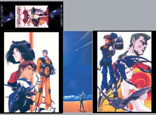
The bloodshed combining Images from the 3 shows into one box would be unimaginable. Best bet would be to have Paul custom you a case for yourself using the Mikimoto Illustration and Innocence books. I would be open to a Macross 7 box as well. To do that we need to make custom keepcase covers as well though, so I don't know if we can get enough interest for that. Wouldbe interesting though. As for Macross II, like in the pic I posted earlier, I thinpak'd my Macross II and 20th anniversary discs, and I put all 13 discs in the SDF box. I'd recommend that so MII is not left all alone.
-
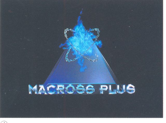
I have that logo scan at 1316x975 @600dpi I was just worried about the color is all.
-
Very good.
-
How's this top. Extract and insert the logo over this maybe?
-
Shot in the dark, newtest5 with a different 19/21 pic.

-
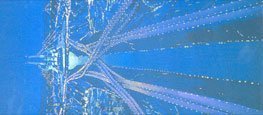
This is the best M+ logo I could get out of the book. Think we need a better one off of a CD cover?
-
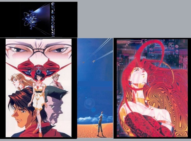
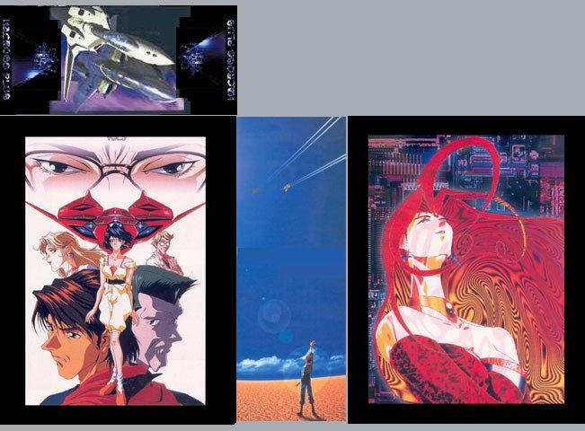
To recap, here's where we are so far today. So far I like 4 and 5 the best. It seems now the top is decided on for the most part based off of the feedback: Blue logo on the top alone. The spine remains the desert shot as it has been. All that remains is the side images to settle on. newtest1 newtest2 newtest3 scrapped. newtest4 newtest5 More to come.
-
Actually she would come out pretty shiny I think. The silver metal the white translates to really worked well on the SDF Macross Boxes. For the sharon "circuitry" pic, it might work pretty good. The newtest4 would be uber shiny though with that white background. Paul could probably do some kind of matching effect for the both sides as well. There is good potential there.
-
Pre-order it like everyone else!! Hobby Search or HLJ. Ask Neova too probably.
-
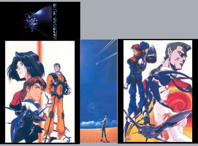
Newtest5. A very simple design.
-
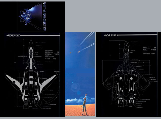
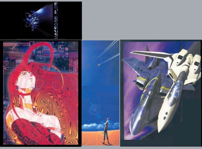
Here's newtest4 with the blue logo top. I do have to say this one looks pretty good like this. Has the core characters, very nice 19 and 21 renditions, and the two sides came from the same release line, so they match.

-
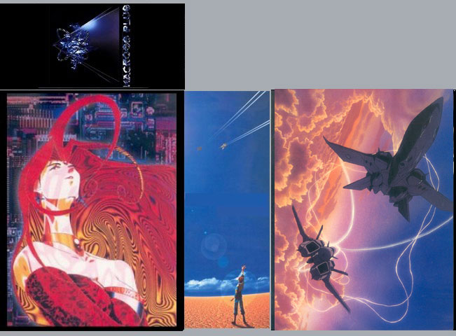
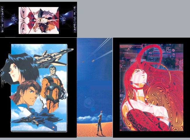
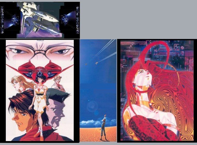
Here's newtest2 with the blue logo top.

-
That's the problem/question. Do we just do the blue logo on top? Simple, yes, but there is wasted space that could be graced with another image. Just the side pics and the spine is hard to balance and get everything you want to see on the box. Fighters, characters, sharon. Difficult to do with just two side pics since the spine has been reserved since day 1. However I am willing to bend. I like the idea of 3 pics, but simpler designs can also work so if you guys want the box top simpler then cool. Edit: simplified post big time.
-
Another sign that the world is going to hell. One Piece has been picked up by 4Kids. Now they have another show to completely butcher and bastardize. I wanted to see this show too. Heard good things about it. Guess it's on to HK discs and or Fansubs. Has any group been subbing One Piece? I haven't seen it anywhere. from AnimeNewsNetwork:
-
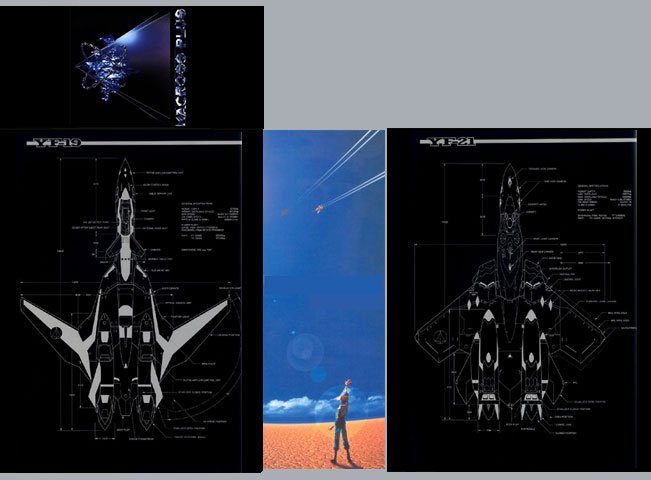
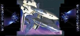
The VF-4, VF-14, and VA-3 as well.
-
I'll post those tonight after class.
-
Newtest1 modified. With the nature of the sky collage pic, there either has to be the big black border or the sky must be extended. With the border, the pic on the other side has to have the big border as well for it to look right. One reason why I like newtest2 a lot better than this one, and there are more characters that get to appear on the box.

-
Bumped the image size on newtest2. It really is much better this way. This is my favorite so far.
-
internation version artwork box tweaked
-
On a box. Looks pretty good like this I think. To fit an image on the top you have to shrink it pretty small, leaving space on the sides. Adding the logo there fills that space pretty nicely.
-
New idea: For the top, how about a center image with the blue logo on each side facing outward? This way we can get another image on the box, and still stylishly use the extra space and get the blue logo on there as well. Of course the logo would be cleanly extracted unlike this example.
-
I would love to hear a Haro quote Samuel L. Jackson. Where can one of these guys be located, BTW?