

PointBlankSniper
-
Posts
493 -
Joined
-
Last visited
Content Type
Profiles
Forums
Events
Gallery
Everything posted by PointBlankSniper
-
That photo does kinda show how whale goo could turn it into the Kai's face
-
Here's another crazy idea. What if it was the 25G rifle, with the two rows of quadpod grapple spike things stripped out, since grunts won't be sniping. That's where the sane part ends. The crazy part is to make up for it's original 4 sided structure being removed, by turning it into a quad barrel gatling instead, with the same sniper barrels lol. Then cover it up with an appropriately magnified version of the 25's standard gunpod's transformable shroud. Maybe shorten barrels for convenience or wieldiness if that is an issue. Sniper accuracy isn't needed anymore anyway. With an abomination like this, we can pretend both types of the 25's gunpods took a little something from this overkill cannon, while representing NUNS' exorbitant tech and budget. Hopefully the landing gears still reach the floor 🤪
-
I've actually been thinking gunpod is actually the one thing most likely recycled on the 24 lol. Given that on YF-19 it was virtually the only thing copied to the VF-19F/S, and then same with 21 to 22, 17 to 171, and even between totally different valks from 29 to 30. So it's entirely reasonable that it has the same one as the 25, if not then splurged on so hard that 25G's sniper was standard issue lol. That said, more different and new designs are always cool. Especially if the 24 is supposed to be that much higher spec than the monkeyed export derivatives.
-
Hope you eventually have time to come around to the textures too then. What you did for the wings look too sharp and make the original textures look murky in contrast 😂 I just found a few nitpicks around the canopy and chest area too, but I'll leave you alone for now lol
-
The 24's upper calf is entirely a different design, along with the shape of the dorsal cutout that it fits into. Wasn't expecting you to skip changing it altogether. Also been noticing the second spine hump after where the real one is supposed to end. Dunno if it's leftover shading in the 25's texture, or leftover geometry from the shield changes, or intentional design on your part. The old panel lines make all of that very hard to tell apart. That's why I thought there was a lot of work left in converting the model to the 24
-
Looks pretty good painted up. The calf though 😭
-
Would be funny if bandai kneejerked to the backlash and sales numbers and decided to make changes, but only on the 17D, because its too late to mess with the 17S. So the two look vastly different lol 🤡
-
It might not be to my tastes, but it certainly looks like a plausible in universe head design. A week sounds real fast, although I'm not sure whats left
-
Was too lazy too look it up earlier, but these Zelda creatures were what the eye was reminding me of lol Anyway. For the top, you've got that crew cut FAST helmet look. Will probably take some additional geometry to move away from that silhouette.


-
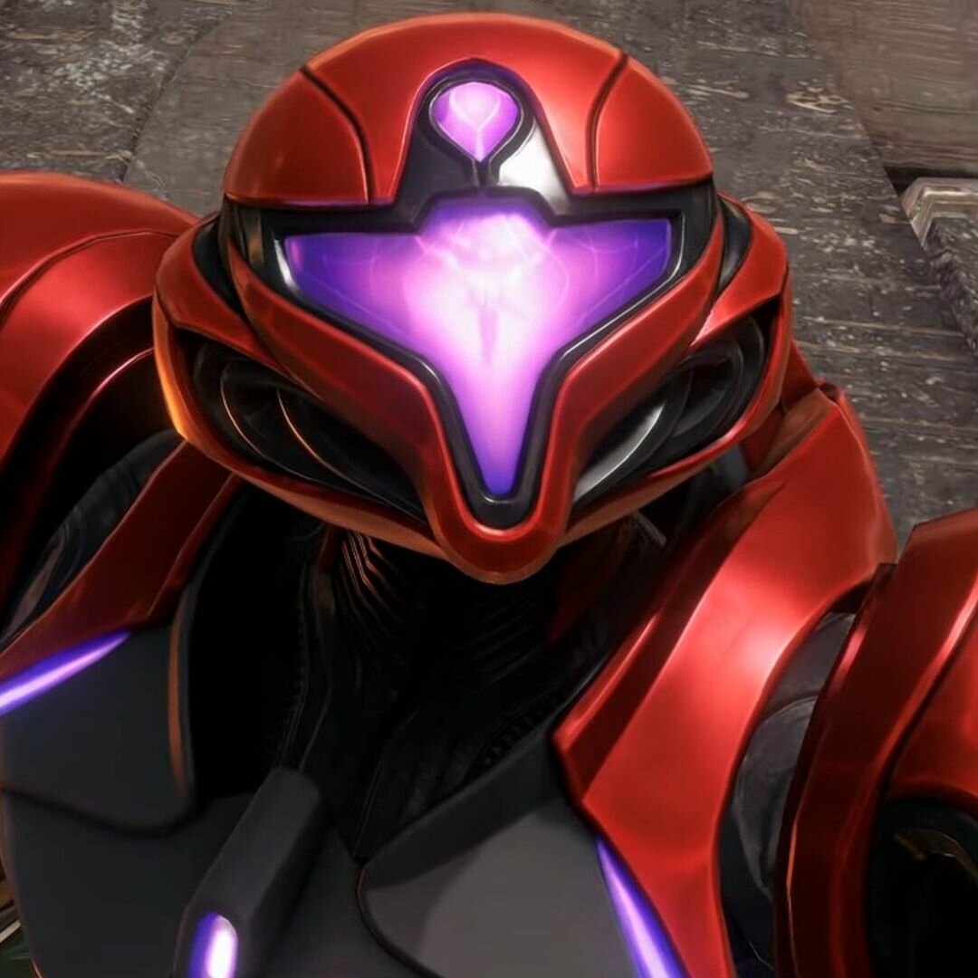
Think it might be that the ears and cap are too detached from each other, both by shape and paint job. It makes the top actually look like a seperate helmet from some angles. The camera looks a like a swollen eye and is kind of uncanny imo. Thats just my taste I guess. Since it's vaguely conceptually similar to what you have, here's the new samus helmet that just dropped a few days ago. Maybe it will be some inspiration for angles and layering of components, idk lol
-
I don't think Bandai has any interest in correcting wing molds these days. If they did, they'd have changed the 25 and 29's wings to milk this whole hardpoint with no accecories scheme they have going on with these new designs. Then they'd be able to milk those frontier sound boosters, and the 19kai having hardpoints would almost actually make sense. The only thing this feedback has the slightest chance of saving are the 19S and 19F however unlikely that is. They probably already have those molds made and the release is imminent, if they ever had plans to release them. I wouldn't be surprised if they figured out the issue on their own and fixed the F/S after producing the kai, from watching marketing crews play with the toy lol. Or they went full Bandai and just deleted the idea of hardpoints on the F/S out of kneejerk and giggles because no fun is allowed where it makes sense lol
-
It's not uncommon for Bandai to stick in developmental lore in their instruction booklets. It doesn't really mean they will or will not produce those related units. Y'all are probably reading too much into this one.
-
Welcome back! NGL, I'm not into cyclops buggo looks, so I'm no judge of these, especially the side profiles. The Kairos head would be what I would lean towards for being the farthest from that style lol. But I think the front profiles with trooper helmet vibes is worth exploring. The idea of it reminds me of the YF-30's head
-
I thought amiami was already sold out earlier. Were they really just that late to open for PO?
-
DX Chogokin VF-31A Kairos - Macross Delta 10th Anniversary
PointBlankSniper replied to MKT's topic in Toys
Was just wrestling with my armored AX. Honestly was a lot of suffering that I wouldn't bother going through with on more than just the one unit I own, even if another was given to me for free lol I'd rather they finish up those supers, or released sets of those double missiles that work with or without the super's shields. Or as far as pipe dreams go, replace the wing hinges on this and any future 31 releases with the AX hinges with hard points, so Lil Drakens can be slapped on without funny adapters, even if the position is kind of off. -
Quite sure Bandai is going with a low volume run after some slow sales, especially with the last 31 release. They are probably trying to justify rehashing the rest of the 31 line to themselves by stacking the conditions. High demand, formerly limited, low volume production, fodder army builder, and anniversary marketing, all look like the makings of an instant sell out sales report lol
-
DX Chogokin VF-31A Kairos - Macross Delta 10th Anniversary
PointBlankSniper replied to MKT's topic in Toys
Bandai has no intention of making bank off of these, or it wouldn't be so ultra low stock comepared to the rest of the WWM stuff that we're basically back at PO madness lol -
DX Chogokin VF-31A Kairos - Macross Delta 10th Anniversary
PointBlankSniper replied to MKT's topic in Toys
Crazy that a limited item is going into store retail for reprint. -
Mine came in last week. Colors are nicer than I expected, and matte is also nice than I expected. Kinda weird the gunpod is still in gloss though. Had to do shoulder swap. Ejecting crotch cover is apparently nothing new. The arm plug hole has absurd spring tension, so the gunpod adapter doesn't stay in, and the shield launches across the room if not pushed in at some perfect distance and left to settle so that static friction overcomes the spring tension lol. Intakes barely hold in gerwalk when on the stand. They just want to drop with the legs, and the backpack strut wants to pry that crotch piece out. I know the gerwalk articulation is supposed to be lackluster, but I can't tell if the intakes are just the 2 clicks. And it looks like there is a thigh swivel, but they only turn like 3 degrees with no friction and no ability to resist gravity while on the stand, and then have a soggy backstop that pushes back, so it just feels like plastic that doesn't bend is just flexing back... I can't tell if it's as far as it goes, or I'm doing something wrong. The sloppy abdomen split where the battroid brace goes was somehow sealed together so tight out of box, that I had to pry at with an uncomfortable amount of pressure with a flathead. Never knew there was a fancy swing bar locking switch mechanism in there, but mine came pre locked. That blocked the swing bar from going in all the way, and I couldn't figure out why, because the lock wasn't supposed to be relevant until the next step... Took me a long time to figure out i was wasting my time trying to force it to latch on the fuselage. While on the stand, the battroid legs jiggle and rattle at the swing bar's axel hole inside the crotch, as well as a bit of slop at the latch, despite properly locked in. It's probably the intended fitment by design, but it sure as heck feels like an extremely aged and worn out metal on plastic joint and doesn't inspire confidence... The stand adapter doesn't even seem to sleeve around it's intended crotch space all the way. It's kind of a loose and off angle mess. Superparts are surprisingly easy fit for once, despite the regular sloppy nubs. Gunpod splits slightly crooked and IDK why lol. It's great that I grabs on the crotch in fighter mode without needing that partsforming adapter that self ejects though. Overall, looks wonderful, and panel fitment seems to be great. Waist and thigh structure doesn't inspire confidence when hanging from the stand, because of everything I nitpicked, but it holds after getting them together properly so far, so it's still a satisfying display piece to have. Heres to hoping those sloppy bits are not a longevity issue.
-
Booger's Draken though. Also, now I can sleep knowing I'm not crazy for believing the gunpod mechanisms do their job
-
Seems like couriers all do the same dirty tricks these days. My family was all home looking out for a package during delivery hours recently. Then UPS said we missed a delivery a couple hours later... and scheduled another one for the next day, only to tell us we missed tomorrow's delivery within minutes of scheduling it. All the clown show just to tell us to pick it up ourselves because they are cutting corners on delivery lmao. The part before that was even funnier. The package cleared customs, reached local distro, inexplicably returned to country of origin and retreated halfway across that country for days, and then was suddenly out for that imaginary first delivery rofl. I have infinitely more faith in uninsured and untracked months long surface parcel and the regular postman, than these so called worldwide premium express courier conglomerates. Anyway, I'm guess it's the screw thats digging into the head fin.
-
I'm guessing best position will have to be somewhere in the middle, where the fin is between the backpack bulge and the crotch cover.
-
It's as you say, but then there's a third mechanism where the grip also pivots out of the gun at at the front of the trigger guard, making the former two mechanisms excessive. If I'm not mistaken, the trigger might even be able to slide back after pivoting out, so it can rest against the crooked butt and have the barrel fin stay clear of the back pack humps if those really were an issue. But so far, nobody has confirmed using all 3 and explaining why none of it works.
-
Bandai has slapped hard points on everything since the YF-19 full set pack, presumably for play value, even though they won't release any more missiles. So there are more valks than missiles to go around. Meanwhile, they won't add hardpoints back on the revival frontier valks, excluding the armored 171 that they were originally concieved for, despite the 25s canonically using them and even have contours of them molded into the wings. Basically just another fine example of Bandai logic.
-
Gotta wonder why nobody seems to be using the mega grip swivel on the gunpod. I would think the slider and bendy mechanisms shouldn't even need to exist if the grip swings so far. It really doesnt look like the under barrel fin gets in the way of anything. I wanted to say it might be a matter of the swivel being loose, but he slider already puts the weight on the back which should give the muzzle the tendency to go up. Really a headscratcher ATM...
