-
Posts
1342 -
Joined
-
Last visited
Content Type
Profiles
Forums
Events
Gallery
Everything posted by Skull-1
-
I don't even know HOW to use an airbrush. LOL Hooray more Chunky Monkey customs!!!!!!! Sand that nose down to a taper. It's very easy and it looks like the Valks in my gallery. Nice job. Very clean paintjob. I like it.
-
How can you lock a thread that isn't dead yet guys? Hold your mouse over the little "NEW POST" red thingy and read what it says. It says, "GO TO LAST UNREAD." That is not the proper label. It needs to say "GO TO **FIRST** UNREAD." Can I get SOMEONE to fix that?
-
Can someone PLEASE at least change the label? It needs to say: GO TO FIRST UNREAD *NOT* LAST UNREAD. GO TO FIRST UNREAD GO TO FIRST UNREAD GO TO FIRST UNREAD GO TO FIRST UNREAD GO TO FIRST UNREAD GO TO FIRST UNREAD GO TO FIRST UNREAD GO TO FIRST UNREAD GO TO FIRST UNREAD GO TO FIRST UNREAD GO TO FIRST UNREAD GO TO FIRST UNREAD GO TO FIRST UNREAD GO TO FIRST UNREAD GO TO FIRST UNREAD GO TO FIRST UNREAD GO TO FIRST UNREAD GO TO FIRST UNREAD GO TO FIRST UNREAD GO TO FIRST UNREAD GO TO FIRST UNREAD GO TO FIRST UNREAD GO TO FIRST UNREAD GO TO FIRST UNREAD GO TO FIRST UNREAD GO TO FIRST UNREAD GO TO FIRST UNREAD GO TO FIRST UNREAD GO TO FIRST UNREAD GO TO FIRST UNREAD GO TO FIRST UNREAD GO TO FIRST UNREAD GO TO FIRST UNREAD GO TO FIRST UNREAD *FIRST* NOT LAST. Unless the intent is to take you to the last post which makes no sense...as we already have that feature.
-
All of them, including this one: http://www.macrossworld.com/mwf/index.php?...60entry414018 It is not a problem with my browser. I have tried it in several different hotels over the past month in addition to my home computer. It only takes me to the last post of the thread, not the last UNREAD. I never even opened the above-listed thread and it sent me to the very end (Page 4) when I clicked on the arrow. Even if it worked, the IMG TAG is not LABELED PROPERLY. It says, GO TO *LAST* UNREAD" when it should say "GO TO *FIRST* UNREAD".
-
Doesn't work on my end. It takes me to the last post. If it is SUPPOSED to take you to "FIRST UNREAD" (which it does not) then they need to change the IMG TAG ALT NAME to "FIRST UNREAD" not last.
-
Guys, most forums have a feature that allows you to go to the FIRST unread post, not the last. Why does the little red arrow thingy take me to the LAST unread post all the time? That's a pointless feature. I would prefer to see the first unread with the arrow. We already have a "GO TO LAST POST" feature which is the same thing as "LAST UNREAD" in effect. Thanks.
-
Blech. Sorry guys. Doesn't do it for me. That thing is as hideous as they come. Why are they wasting time on this and not giving us a Sonic Birds Valk or some other cool scheme everyone wants?
-
Don't forget rat poison.
-
COUNT ME IN!
-
Looks like the X-Wing Fighter turned Valkyrie...
-
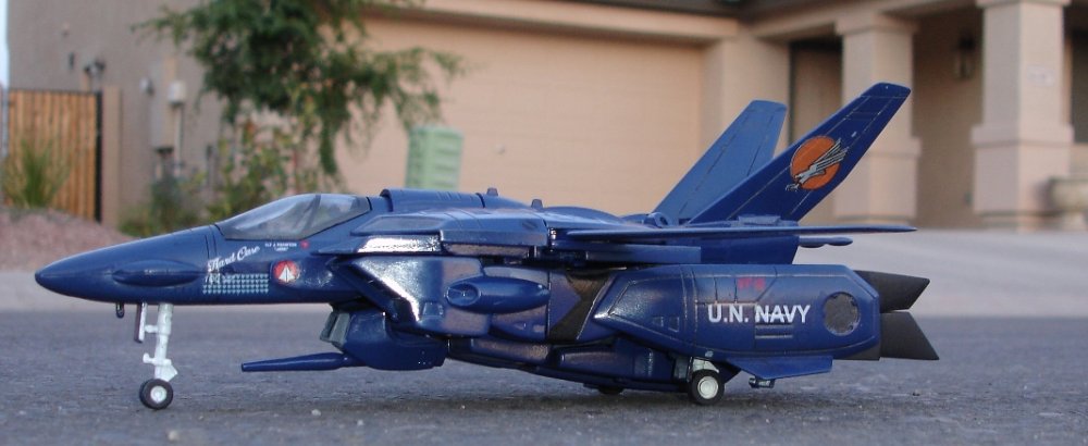
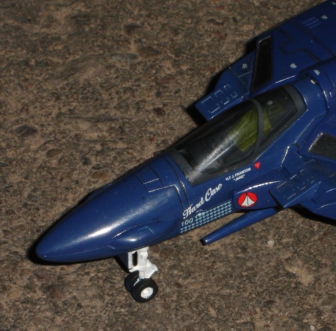
They are working out great. I just need to find a good decal placement guide to finish it with, but I am very pleased with the results so far and couldn't hold off posting pics any longer... For some reason my camera induces "flaws" that aren't really there and that is driving me crazy, but to the naked eye this thing looks exquisite.
-
Maybe these are better. I don't know how to use this camera! Any way, this thing is still under construction but once it is finished it should look fantastic..... I still have a lot of touchup work to do before the final clear coat. The "scratches" and imperfections you see in the photo do not show up to my eyes. The paint is as smooth as glass to the naked eye. I am growing frustrated with this digital camera making the thing look bad. Wish I knew how to adjust it to show what it actually looks like. The blue is still darker than the picture lets on...
-
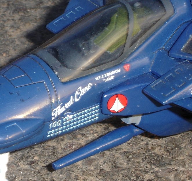
Devin's Decals Hard Case Nose Art http://www.Robotech-AOD.com/images/ValkToy...02005-05-11.jpg
-
I keep getting a 404 when I try to upload this sucker... Very annoying. http://www.Robotech-AOD.com/images/ValkToy...02005-05-11.jpg
-
I can't seem to capture the accurate color without it blurring. Still need the 209 decals to go on it but I didn't order them properly from Dev. Damn. Also need to find a decal placement guide for all the markings that aren't on it yet.
-
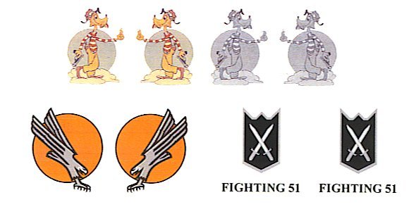
I drew the FIGHTING 51 in MS Paint and made it HUGE. I pulled the STREAK EAGLE off of the book, "The Gray Eagles" by Duane Unkefer (AWESOME READ). The PISTOL PACKIN' AIREDALE is an actual U.S. Navy WWII squadron (Alex Vraciu, top ace). I found a few sites that had patches and stickers of that insignia and asked him if he thought he could make a Valkyrie tail-sized copy of each one. He did. You should see the scripting he did for the nose art.... HARD CASE, kill markings, and LT. J. FRAMTON "JAKE" for the canopy rail. F'ing unbelievable. The guy is amazing. The scan does *NOT* do the decals justice. In person they are PERFECT.
-
Well, I sent him screen grabs of stuff and asked him if he could make decals with them. I never expected they would turn out this good!!!!!! The guy is genius.
-
Please ignore the bad quality of the scan, but you get an idea of the detail with this shot. These are intended to go on the tail of my 1/55s. They look amazing.... The rest of the decals are white so you can't see them via scanner.
-
I just got a set of custom decals from Devin White (ANASAZI) and almost had a heart attack. Ooooooooooohhhhhhhh my gawd.............. These sets are f'ing GORGEOUS! I cannot believe how well the custom tail emblems I sent him came out. *GASP* I am totally........*STUNNED*. *********STUNNED********** I gotta' catch my breath. They came out flawlessly. Very good job!! I can't wait to get them on the Valk!! Nice work, Dev. You are the master.
-
I Like The Kites
Skull-1 replied to Less than Super Ostrich's topic in MW Site News & Member Feedback
THEME #4 is the BEST!!! -

I Like The Kites
Skull-1 replied to Less than Super Ostrich's topic in MW Site News & Member Feedback
Minmei was annoying. Banish her forever. She should only be used for CLOSED and LOCKED topics because she is an angel of death.... BLECK. I think the current color code is a little overkill. Too many colors...but oh well. I liked the SKULL for LOCKED topics better than the lock. -
The MPC is okay in Gerwalk mode. Since that's my favorite mode I like it just fine. I think the 1/48 is superior in fighter and battroid but never have found the Gerwalk mode to look good for some reason... The 1/55 with a swivel thigh mod is the coolest Gerwalk mode out there, IMHO. The puny legs on the 1/60 and 1/48 throw it off for me. MPCs are waaaaaaaayyyyyyyyyyyy too expensive for what they are, but....
-

I Like The Kites
Skull-1 replied to Less than Super Ostrich's topic in MW Site News & Member Feedback
NICE! Looks good on the TOYS forum. The arrows are much nicer than "The Chinese Wraith Girl".

