

guyxxed
-
Posts
331 -
Joined
-
Last visited
Content Type
Profiles
Forums
Events
Gallery
Everything posted by guyxxed
-
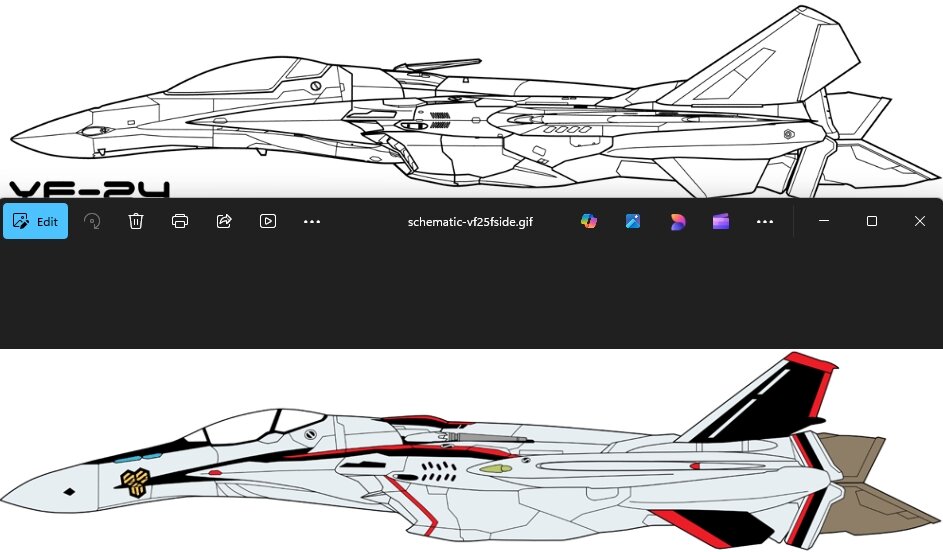
I fully agree that the planes are intended to have key visual differences between them, but the items you point out along with the fact that the legs/engines are truly identical, are what make me think the line art was a purely cosmetic quick rinse on a 25 design that didn't get a lot of thought put into it. For instance, VertexNebula's model on Cults3D does a good job of making that canopy look decent in 3D, but also makes it clear that the flat lower edge really works against the flow of the fuselage and was only ever considered in 2D. I have no doubt that if it were ever rendered on screen as an actual object, the differences would be revised to be much more distinct. I can buy that the nose is intended to have a different shape and thickness to it, and may straighten it up to be a bit more 31-ish. That bulb feature on the side of the nosecone is certainly meant to be something more than markings. What I'm really wondering is what the head should look like. The line art is basically a 25A, but there's no way that's what's intended to be under the hood. Again, I don't think anyone has actually thought that deep into this design to have something in mind, but that would definitely be an area the two planes would be distinct from each other. Oh well, plenty to do before I hit that point, but will have an eye out for suitable candidates in the meanwhile.
-
Line art comparison for the nose. Cockpit is bigger on the 24 as well, though how much of that was 'intended' vs just 'how they drew it for the 5 seconds it was on a monitor in the background', I'm not sure.
-
Not a lot to show yet, but work has begun! I'm trying to be lazy and see if I can convert one of the Macross 30 VF-25A's into a YF-24. Tail fins and leg fins updated, basic wings blocked out, but still a lot to do. Didn't realize until I started deleting things that the wing roots of the 25 aren't level, so need to move them around a bit, also need to cut the aeilerons into the wings and figure out what I did wrong to screw up the tail fin normals, but all just part of my usual kitbash work. It's a bit difficult to tell from the line art, but the 24 and 25 appear to have the same elongated nose, though the 24 has a very different canopy: flat across the bottom edge and doesn't have the front cowl that the 25 has. I may take some artistic liberties there since I think it's a bit boring, but we'll see. Anyway, posting the minor progress here to keep some pressure on myself to keep working on it. 😉


-
Yeah, they do a lot with textures to hide the seams. Maybe a few smoothing cycles in Blender or another modeling software could clean it up? No shortcuts here, I guess, but let me know if there's something else that could be useful.
-
Here is a link to the 31A head from MDS. As mentioned, it's straight from the game without any alterations. I saved the whole head as an STL, but also made separate files of the head by itself and the eye pieces by themselves in case you would want to print them out of different materials. I also included and FBX version just in case that's easier to work with. At a minimum, I would think you have to model a ball joint into the base to adapt it into the DX, but hopefully this gives you a good starting point. Let me know if you have any questions. https://drive.google.com/drive/folders/1hJxO8ozaP97cWCX36qCHfz3M7c5ZLI3_?usp=sharing
-
Its 2025.... where are you in the macross universe
guyxxed replied to SpacePirateNeko's topic in Movies and TV Series
If I have any choice in the matter, I'll be off world somewhere, either in the solar system or on one of the early colonies. In fact, I'd have probably been off world already even before the war. I've been staring at the sky and longing for the stars my whole life. As soon as it became possible in the setting, I'd like to think I would have jumped at the opportunity. -
I can provide what is available from the Macross Delta Scramble game models, but I'm not sure how printer friendly they'll be. I'll try to extract the head tomorrow and save it to STL format. Scaling it as needed and making it compatible with the DX toy will be some work that one of you would need to do.
-
The panel lines are definitely overemphasized on the 31A, which isn't helping its looks at all. I think all of Delta Scramble has this kind of exaggeration in the textures, maybe to help it look better on mobile screens. That said, the white nose cone also gives it a bit of a cartoonish vibe, so the overall effect is less "real". I get what you're saying on the wings, and it's one of the things that makes the AX unappealing to me in that they made the outer wings even bigger on that, which took it in the wrong direction (IMHO). I kind of want to try building a VF-24 as the profile for that is a bit more realistic, but I'm overall not crazy about delta wing craft in general and prefer the swing wing designs on principle. 😉 We'll see where my whims take me next, but hopefully won't be too long before the next updates. Thanks for the feedback and ideas!
-
Done and done. This is the 31A straight out of Delta Scramble with the official textures, I haven't touched anything up on it. It's a bit lighter than the Navy colors, which makes the panel lines stand out and hides the decals a bit. Also interesting is that the shadow on the backside of the tail fin is textured on, not cast by the lights in the model space.


-
Here we go, a 'best and final' for this particular iteration. Put in the NUNS marks, added a plane number to the cockpit area (per normal Navy markings), and tweaked a few other things here and there. Happy for other suggestions, but otherwise think this one can go on the shelf now and I'll move on to the next distraction...er, PROJECT! Yes, project, that's what I meant! 😉


-
I've seen it on Tubi recently.
-
Hey, all. Finally back from my travels and just posting a quick drive by here of an updated markings version to make it more like a Navy plane. Also changed the sensors/crystals because the bright pink just wasn't working for me. 😉 A work in progress, but didn't want it to sit quiet for too long. I used the number fonts from the VF-0 as they are the most "real world" of the ones I've seen, and went old school on the Spacy logo, though the NUNS in grey could work better.


-
Good thoughts, I think I agree about the outline on the tail fins, though it might work if I add a grey fleet or squad marker there, but you're right about the blank back side, good call there. When I get some time, I'll put some squad and plane markings on it in the appropriate greys. Top of the head does need some lightening, too, agree on that. Hope to get some time next week, but it might be until the week after before I can mess with it again. Thanks for the feedback!
-
One last one before I disappear for a few weeks (traveling for work and access --and time-- will be limited for a bit). This is just a very fast repaint using current US navy aircraft colors to try to come up with something "real". Took away all the highlights and flash, with the exception of the two dark stripes on the back to break up all that plain grey. I need to make new decals in the proper dark grey (the white numbers look wrong on this scheme). I would like to do a very light camo pattern on it (the large grey-on-grey blotches the navy uses on some planes) to give it some character and differentiation. This has a nice clean, realistic look, but it's a bit drab at the moment (kind of the point, but still...) It's really just bringing it around to the 31A colors, but with a bit less flair to it, so not sure I've added anything so far. Any thoughts?


-
Color choice may have something to do with it, the orange and blue are kind of sports like. I probably expended them too far across the chest as well, so they end up more like stripes. It might not look like a shark, but I still kind of like the effect. I'll play with it some more when I get some time. I have a few other ideas to try as well.
-
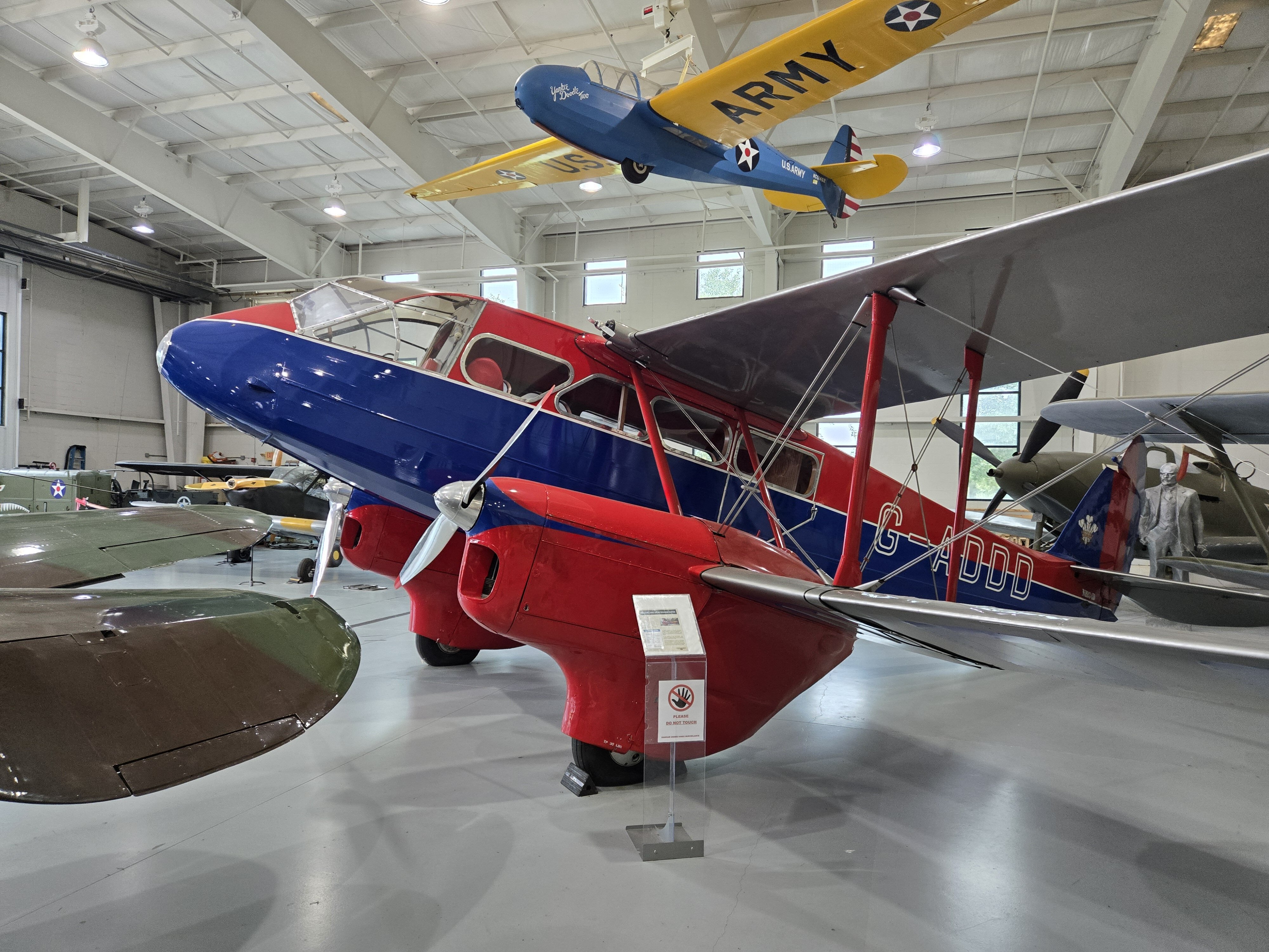
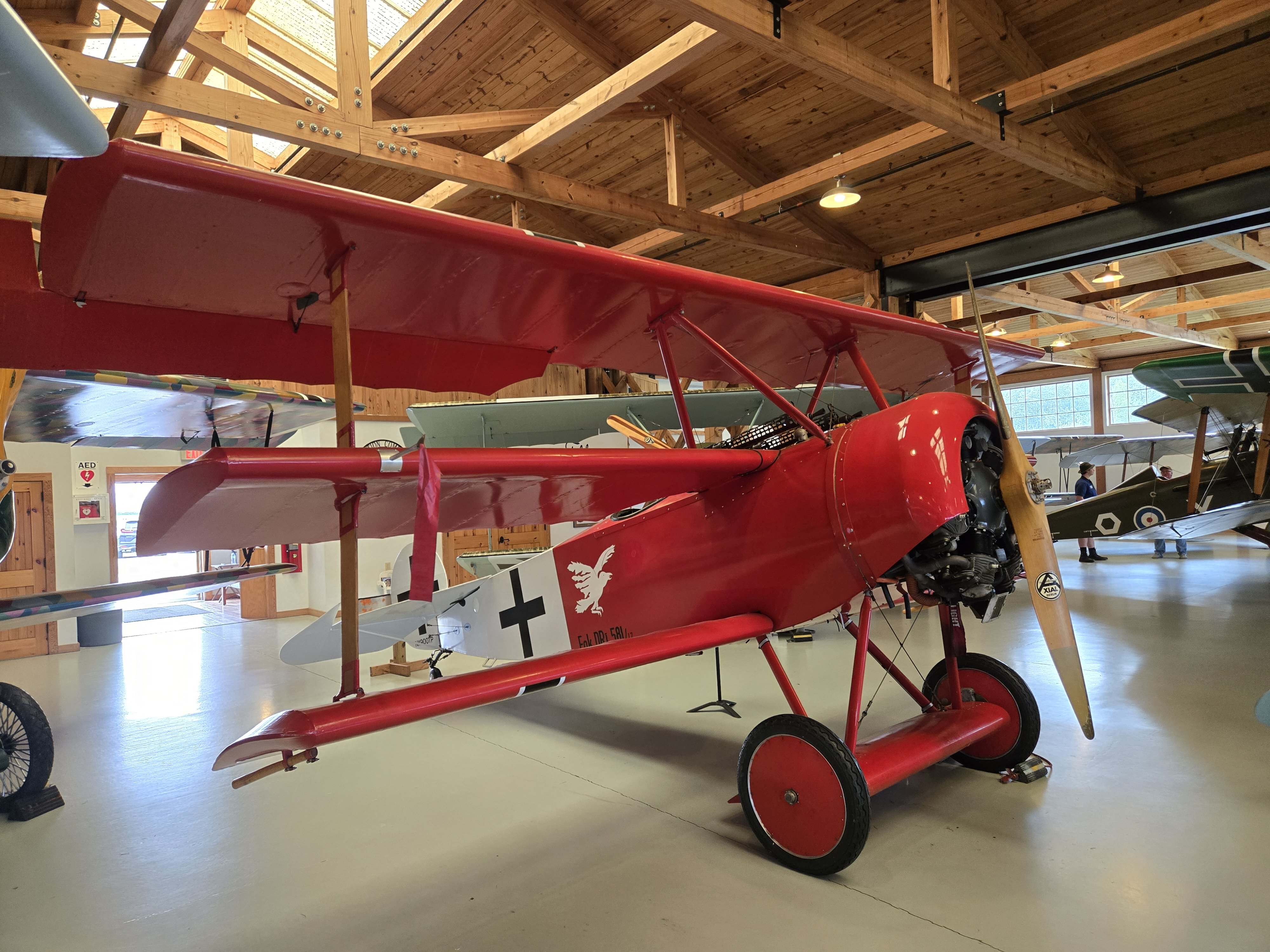
To get things back on topic, here are a couple of very quick attempts to "realify" the scheme. Got rid of the red (though I still kept some orange, just for flair 😉), thinned out the wing stripes, added the back "sword", and colored the ankle guards. Then did a slight tweak with some orange gills and an added stripe on the back. Nothing spectacular, but something to move it in a realistic direction. Have to admit, after going to the museum, I'm tempted to try a silver and red scheme like that T6 Texan in the middle of the group shot, but we'll see how much time I get over the next few days.


-
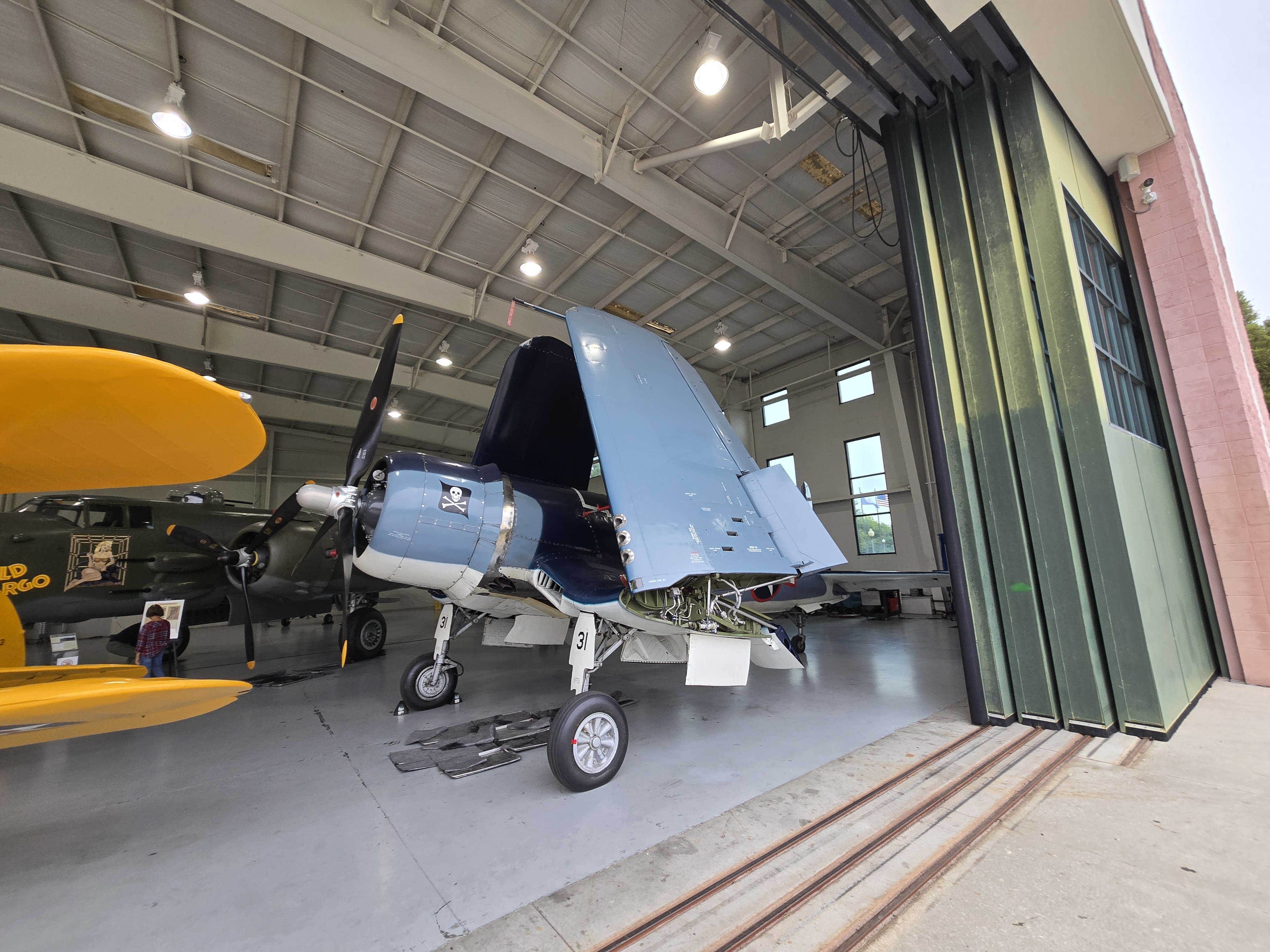
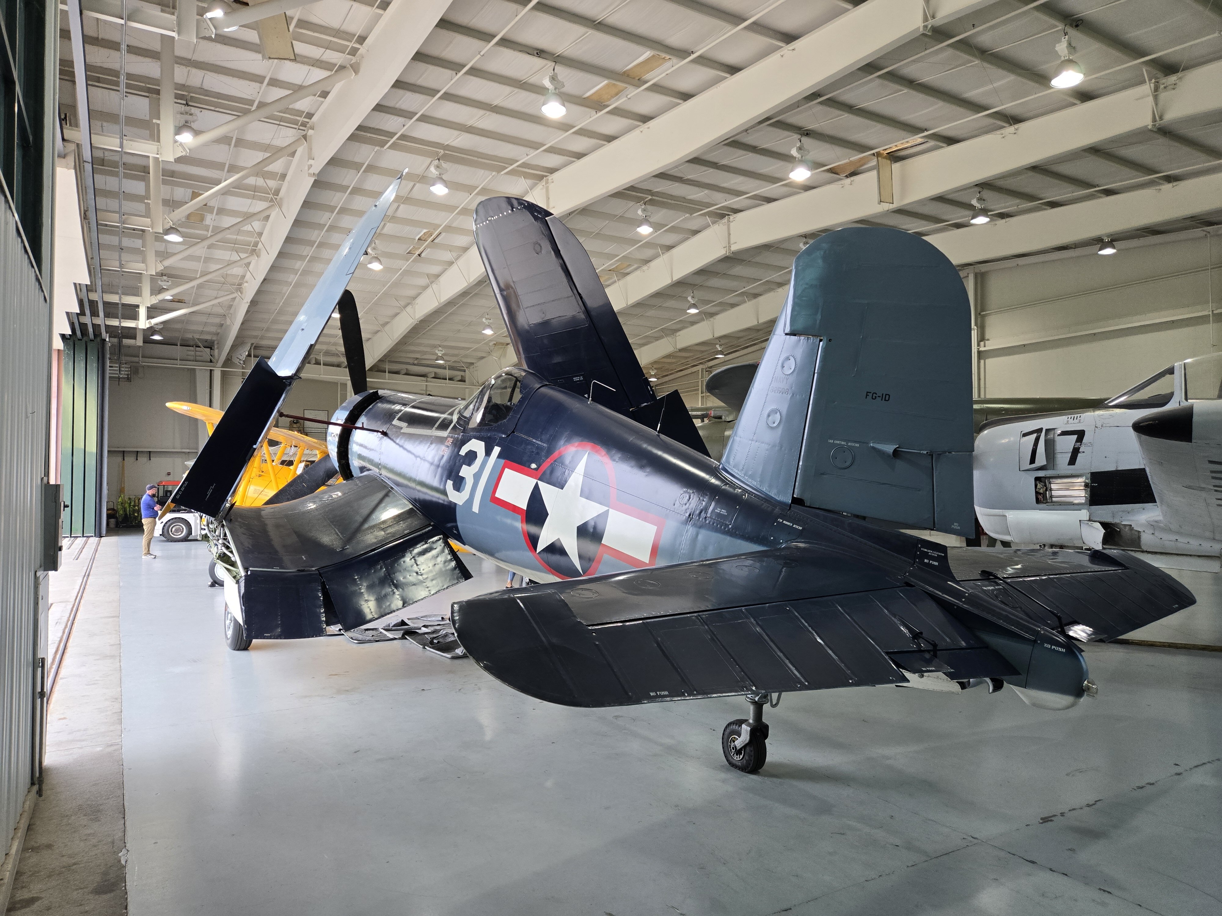
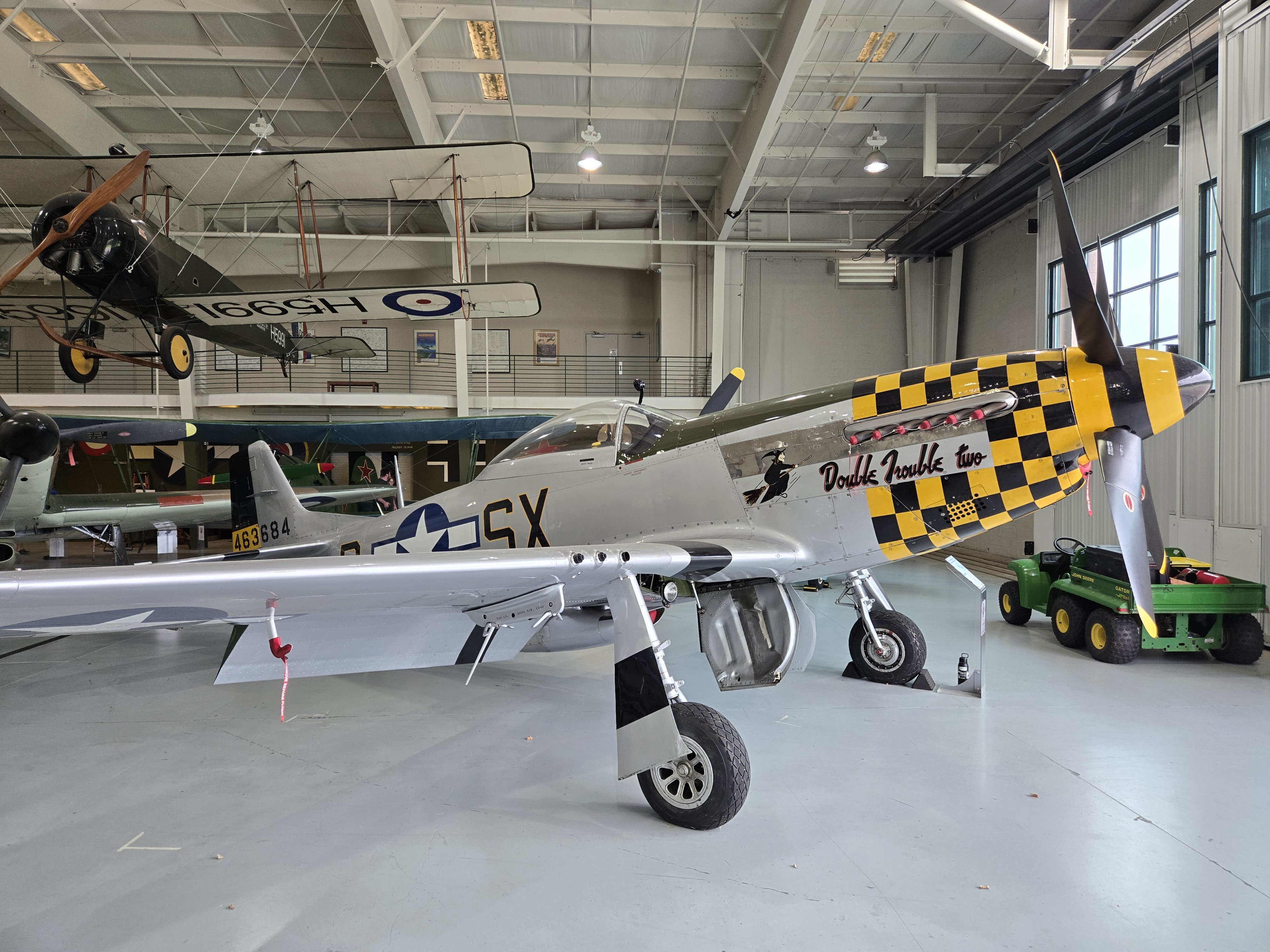
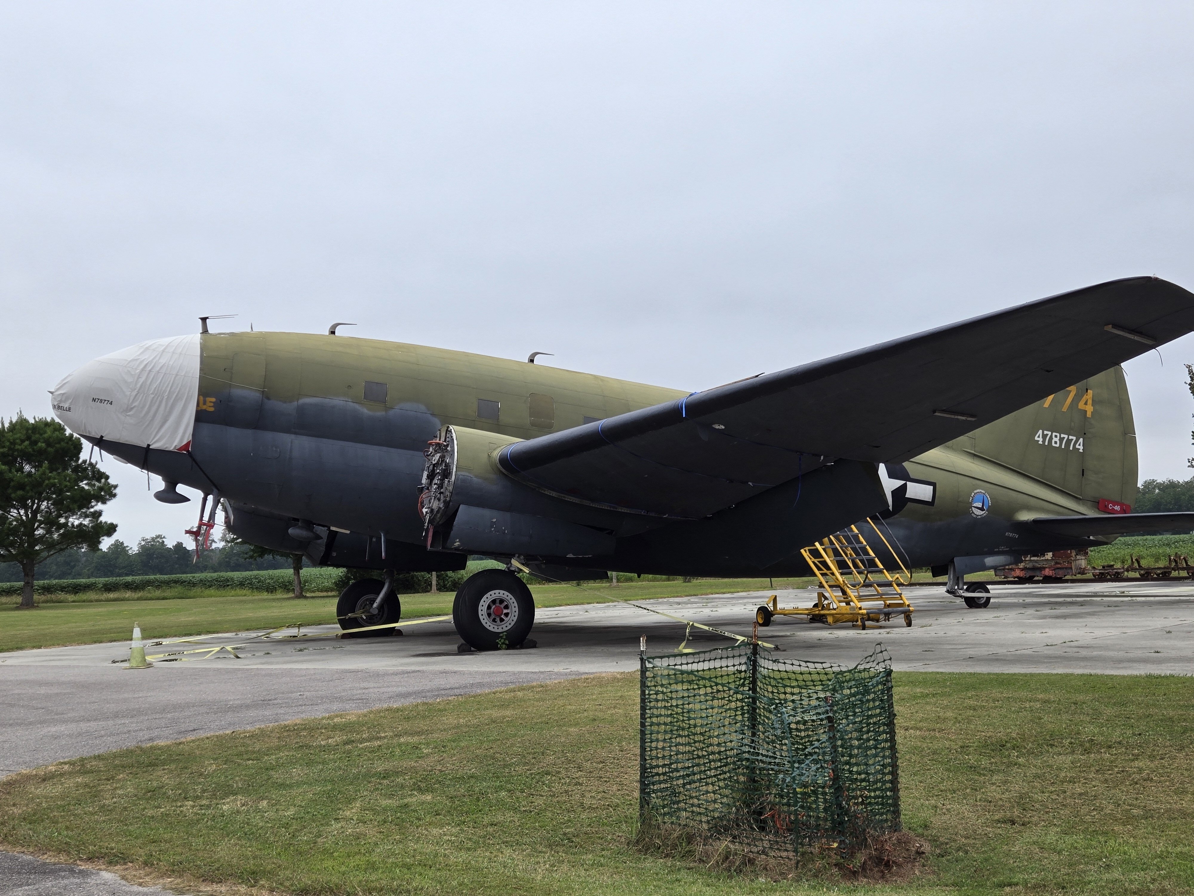
Fully agree, Kawamori's creativity and variety has kept me here for...well, more years than I care to think about. 😉 Your reasoning makes good sense, though I'm not sure the designs actually reflect their intended use so much as whatever cool idea they had at the moment. For all my nit picking, I won't argue that they're all very cool. Tangent: went to the aviation museum today to see an actual Corsair (along with a bunch of other very cool ladies). My color picks weren't too far off, though as PBS might note, no giant red highlights! 😁 (One very cool note, this is a working museum. All of these planes are operational and flown regularly, even the DeHaviland. They just obtained a C-46 and have just started restoring it, very neat to see).

-
I get what you mean, and given my love for the 25, it obviously hasn't been a huge obstacle for me, either, just that I appreciate the design effort that went into the earlier valks and have to grin a bit at the later ones that give a bit of the "well, screw it" vibe with the battroid wing placements. Still look darn cool anyway.😁
-
Nice work! I like the two on the right side of that page, thank you for sharing! And I agree, the flappy stuff all over the backs of the 25 and 31 in battroid have always felt lazy to me. One if the things I always appreciated about the VF-1 was how neatly everything stowed away (even if a bit of anime magic was required) so that each mode looked like what it was instead of the transformer esthetic of a robot stapled to a plane. The Type01-03 thread that ImChris has been sharing his design gets about as close to what we're discussing here as anything, I think.
-
The 171 kinda, sorta comes close to that if you squint real hard. 😉 I get what you mean, though. A fixed wing version of the VF-1, or maybe a slimmed down VF-24 would fit the bill.
-
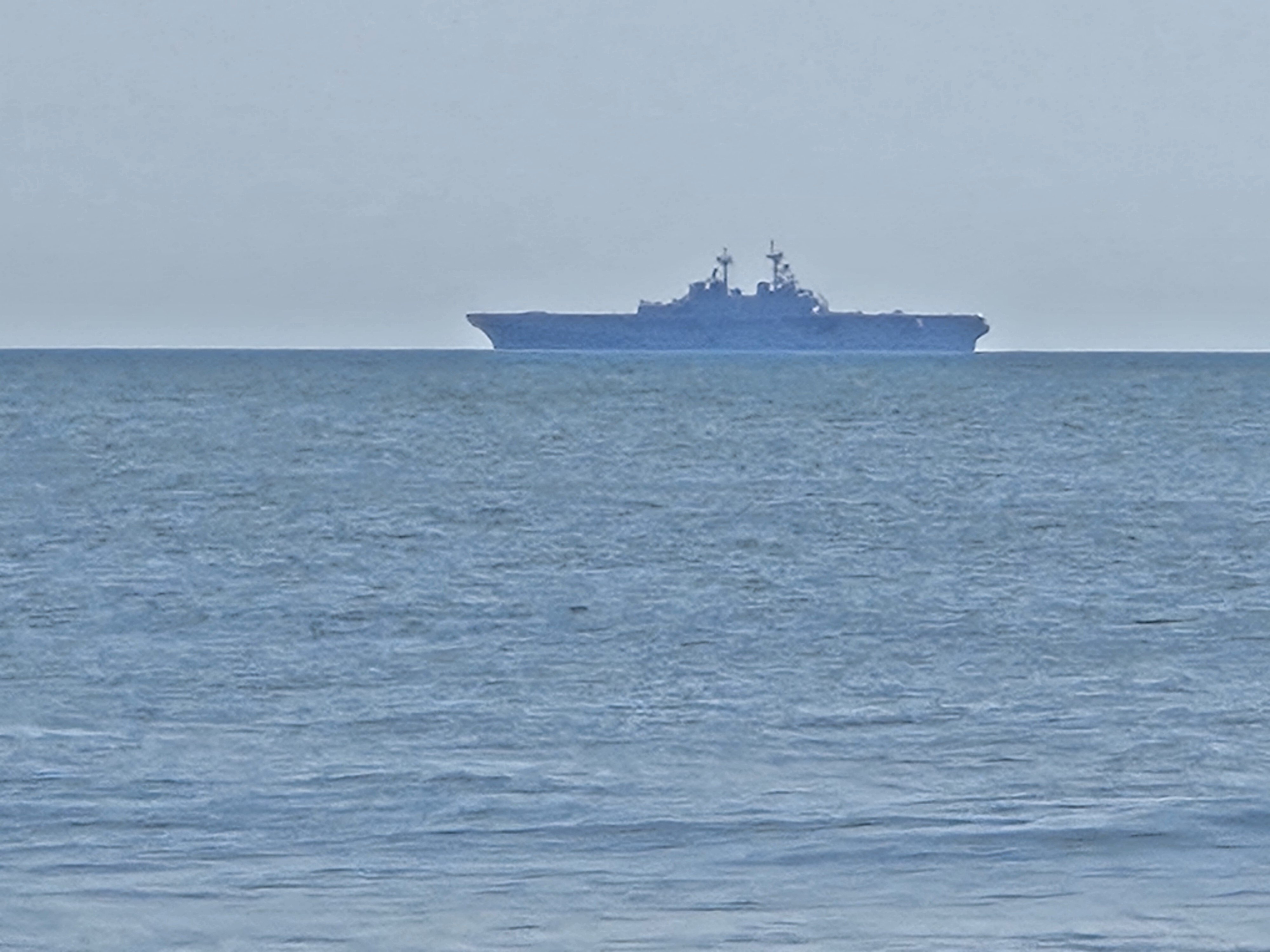
BTW, I currently happen to be in Virginia Beach, sitting on the sand about 10 miles from Norfolk and watching the navy ships and F-18s come and go, so a bit of realism is in my head right now. Speaking of which, one thing Macross dials down considerably is just how LOUD these things are. A gerwalk landing or taking off should send everyone scrambling for shelter! 😁
-
All fair, mixed messages from me, but I was just trying for something that leaned into the 31's flashy side without melting your eyes. 😉 I get what you mean about the sword shape in the back and emphasizing the dangerous parts of the plane (or, maybe a better way to say it, emphasize that the plane can be dangerous. I'll mess with it and see what I can come up with. Expect a few more racer schemes, though, because they might not be realistic, but they are fun to make. 😉
-
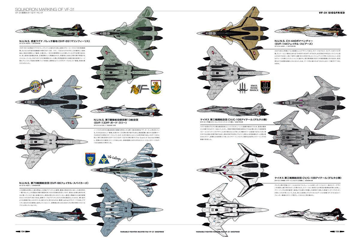
You're not wrong about the gaudy canards, but I was still going for something like a racer scheme, so some bling made sense. For an actual military livery, I'm 100% with you that everything should get toned down considerably. I like your ideas, and agree that a sharper rake to the gills would be more effective. Wrapping them over the chest plate makes me think about maybe even something like a tiger stripe pattern. Something to try when I get some time. Have you seen the 31 Master File? Some of the squad markings they show there sound a bit like what you're talking about with the sword on the back. The one at the bottom right (below) kinda fits that concept. The sea camo one bottom left also gives a nice flow to the shape. I think your suggestions are good and will play with a few things when I get back in front of a computer. I like playing with the flashy race schemes, but maybe I'll try making it look like an actual fighter with the next go. 😁
-
Minor update. Wasn't super happy with the heavy stripes, so moved them out to the wings and used the suggestion of making "gills" to add some color and longitudinal emphasis to the body along with some more balancing to the leg colors. It's definitely a very...patriotic...scheme, and I'm still debating whether it needs more stripes or color on the back, but I kind of like it as it is. Suggestions/comments welcome.


-
These models are the same ones linked to before. See the thread linked here. I just checked and all links are still valid. https://www.macrossworld.com/mwf/topic/51863-macross-models/
