

guyxxed
-
Posts
331 -
Joined
-
Last visited
Content Type
Profiles
Forums
Events
Gallery
Everything posted by guyxxed
-
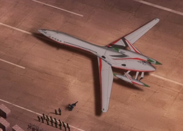
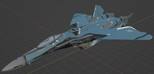
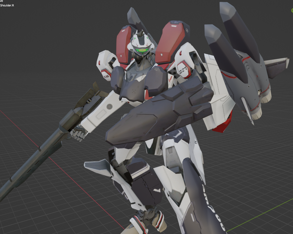
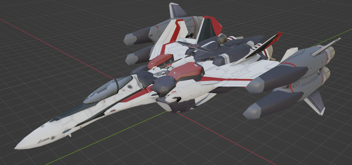
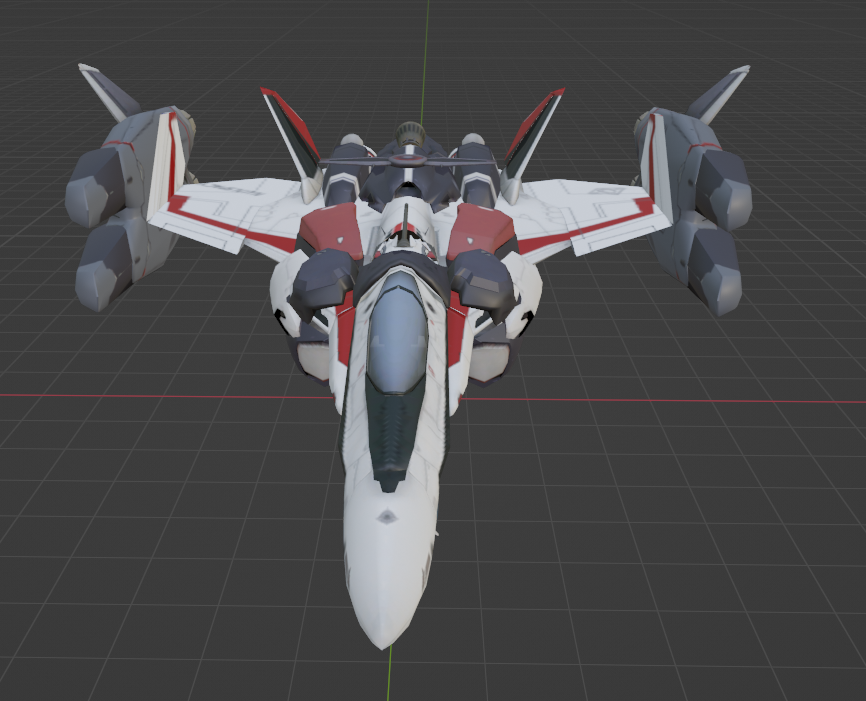
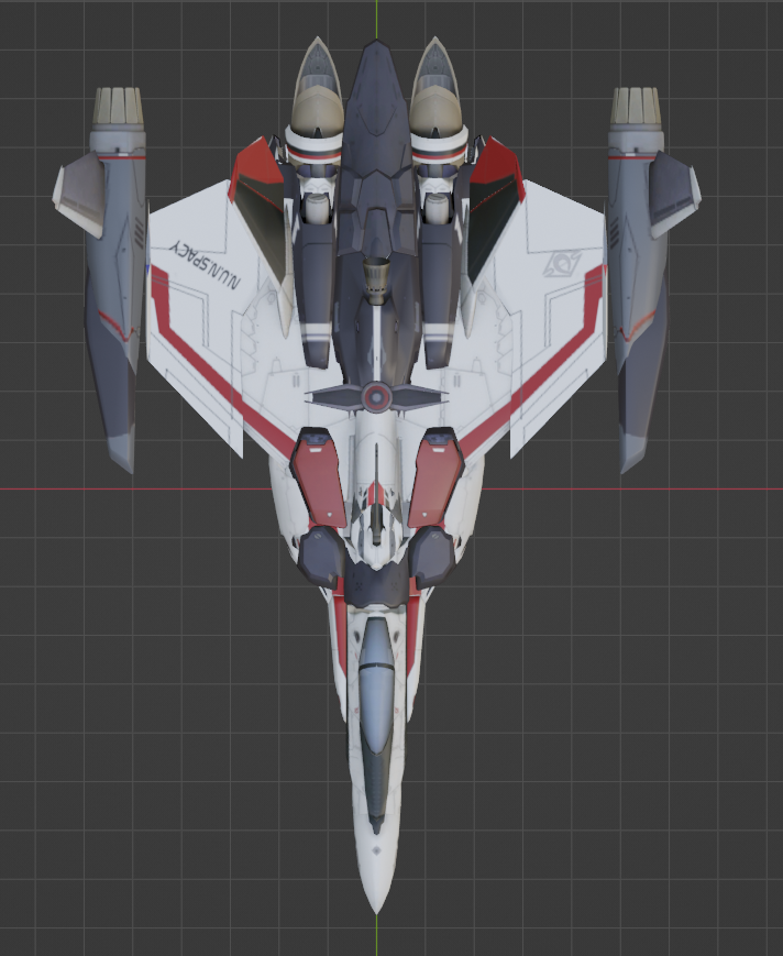
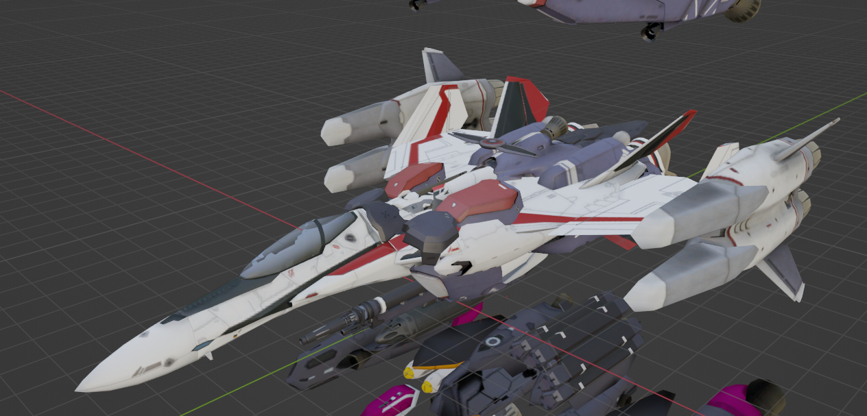
This is crappy and not rendered (just a screenshot from the model space), but a few views of the spaceport scene I've been messing around with. It's a lot different to walk around in it in the actual game environment, but I couldn't get a shot there that didn't end up just a close up of a shipping container. I'll keep woking at that, but figured I would share the concept at least. The red Thuveral is meant to be a commercially owned freighter (that just happens to also be a terrifying warship). FYI, the spaceport is an attempt to build the 'real' port that Mirage and Mikimo first appear in during the first episode of Delta. And, yes, I'm putting way too much efffort into something that was seen on screen for all of ten seconds, but what can I say, it's the way I roll. 😉


-
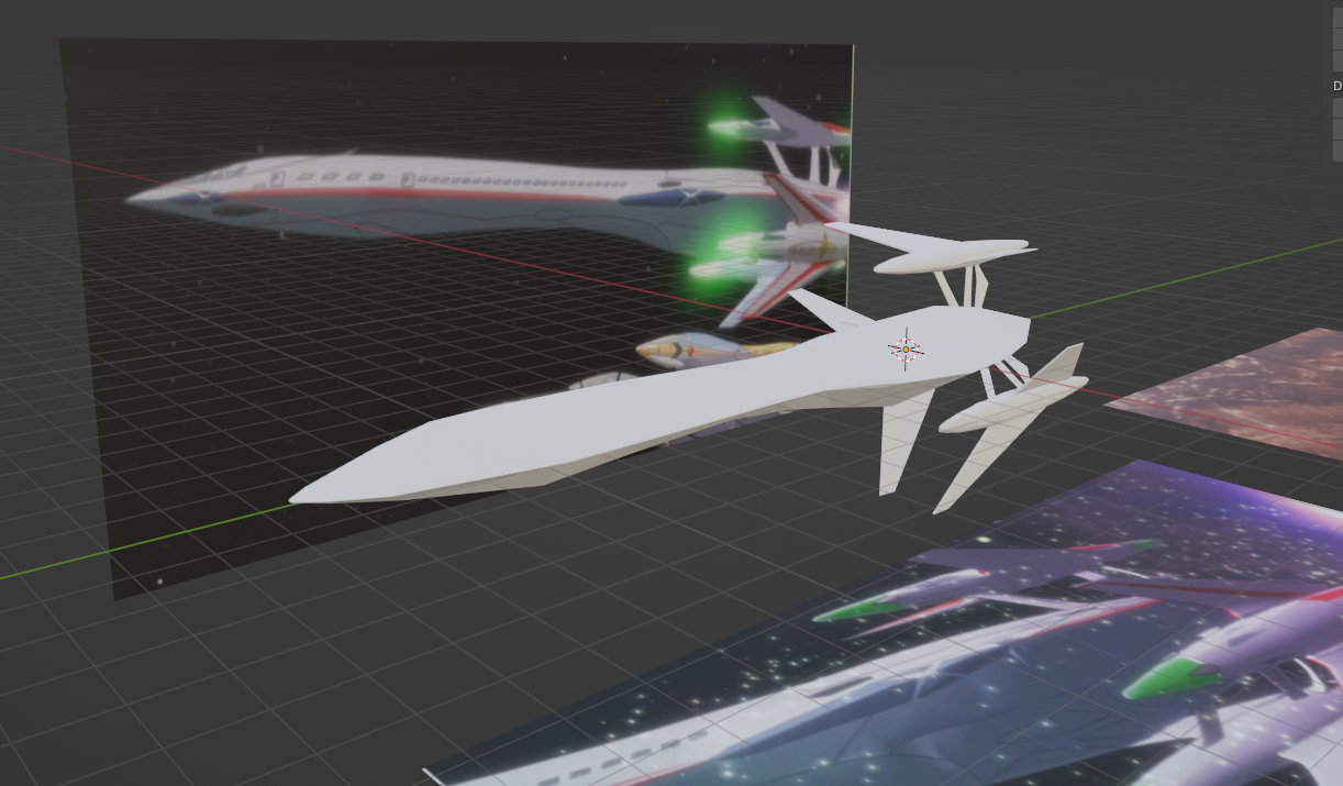
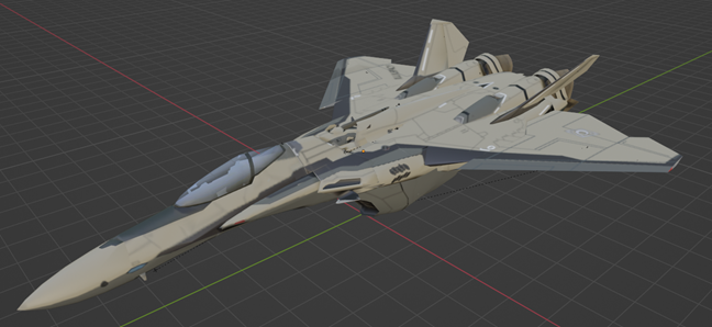
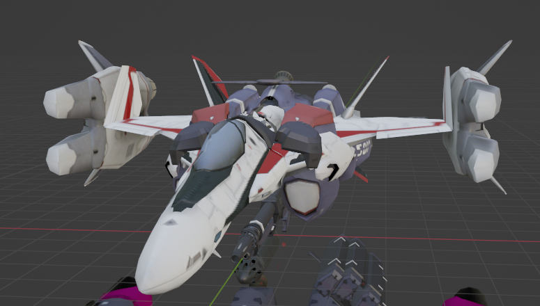
And, done (at least for now). Greebles and gear are added, made a few more tweaks to the nose to round it out a bit, and I think I'm good. Didn't add the Walkure logos because I'm not planning to use it as their personal shuttle, just generic background, but easy enough to add if it ever comes to that. I think I will circle back at some point to cut in the rear hatch and interior details, but it's not necessary for what I'm working on at the moment, and I this is pretty close for the moment. I know, it's not an exciting model, but I'm happy with how it came out and how quickly I could get it put together. I want to try it in a rendered environment hopefully this weekend, but we'll see how things go. Upwards and onwards!

-
Getting close to done now. Still have the greebles and landing gear to make, but think it's coming along pretty well. Debating whether to make the rear hatch functional or not. Almost no references for the back of the thing, so I'd have to make it up for the most part, the one scene in the series that shows it doesn't actually match up to the model (Freyja leaps from a very bare bones interior set, her body blocks any view of the shuttle for several seconds, then an out of focus, far off version with no details drifts by in the distance). Also noted that the upper and lower hatches both open out, oddly enough, instead of the more sensible lower becoming a ramp and upper folding inwards like a C-130 hatch. Oh well, worrry about that when I get to it.

-
General Sci-fi designs across various media
guyxxed replied to M'Kyuun's topic in Anime or Science Fiction
I had a very similar experience flippnig through that book while sitting next to my wife on the couch! 😉 Needless to say, my fandom of Shirow's works come with a very big asterix and a pretty firm date range where said fandom ends. Speaking of architectural greatness, I also need to give a shout out to another obvious one: Moebius. I remember reading 'Airtight Garage' and being blown away by how laser straight and yet totally fluid his lines were and how amazing the landscapes were. Imperial Boy is another (though in a totally different way) that has always grabbed my imagination.

.jpg.10e4cb3795b41f38bec6b903d26af9ca.jpg)


-
General Sci-fi designs across various media
guyxxed replied to M'Kyuun's topic in Anime or Science Fiction
Love this topic, and a lot of great entries so far. This one is a bit of a no-brainer, but I think it deserves mention: Masamune Shirow (Manasori Ota) creator of Appleseed and Ghost in the Shell. His manga work (before he devolved into a hentai artist) was a foundational building block of my sci-fi childhood. A lot like Ron Cobb on the previous pages, Shirow didn't just come up with a cool design, he engineered it! His books were full of technical tangents on all sorts of minutiae and footnotes that I typically found as engrossing as the story itself (and he was usually open about his influences, too, as the "S. Mead" label on the car below helps show). A motorcycle or car that occupied two panels in a comic was fully designed from the ground up and (mostly) work, and I have always admired his architectural ideas as well. Olympus city in Appleseed was an endlessly fascinating place to me as a kid, and I was very influenced by his design aesthetic. Anyway, a few random panels of his to add to the thread:


-
Moving on to working on the Walkure shuttle now in order to further add to my stable of civilian craft. For such a simple shape, that nose section is proving surprisingly difficult to get right, but I think I'm starting to get close.

-
No idea but given the number of shortcuts they took in other areas, it wouldn't surprise me. The wings are on screen for all of about 30 seconds, and feel very much like a last minute add to create some interest during the atmosphere entry scene, so I can't see the animators spending any more time than they absolutely needed to on it. (As a kit basher myself, it's an approach I can fully sympathize with! 😉)
-
Well, thank you! It helps that it's a pretty simple shape, overall, but I was happy with how it came out. And, yeah, the wings were obviously thrown in after the fact as a cool gimmick for the landing sequence. Even with the most amazing memory metals, what's shown in the screenshots is gigantic and probably as much mass as the whole passenger section. The landing gear also has to be pretty weird, since the one shot we get of the plane on the ground shows the nacelles clearly off the surface, but not really folded up at all, so the gear must be like stilts. 😉 I have so far decided to do exactly what the animators did and ignore it and not put it anywhere that I need to figure that out.

-
It's been awhile since I watched Zero, but I had the impression that Shin's family lived on an island somewhere. What I remember is him and his folks standing on the front porch looking at the light of the impact on the horizon, and directly in front of their house was a beach. Unlikely to be San Fran in that case, and the anti UN attack the killed his parents would be more likely somewhere other than a major US city (in my opinions, for what it's worth).
-
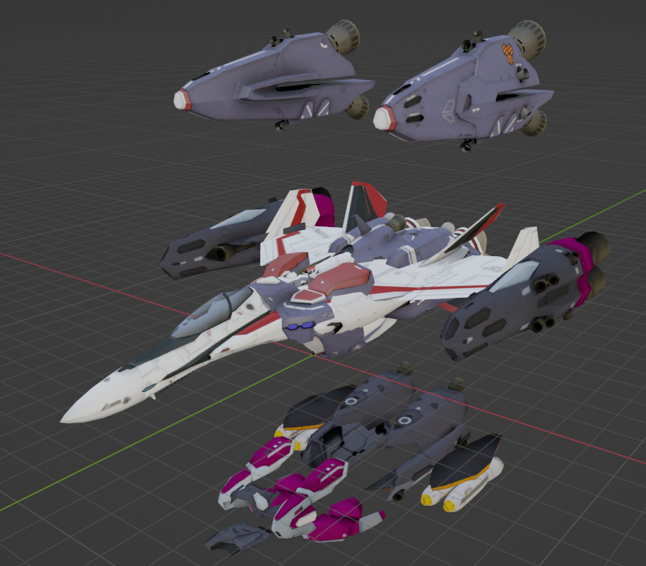
Largely done except for the cleanup. I also need to figure out landing gear and the folding wings, but this gives me what I was after to help fill in the spaceport background. Made a livery based on Juneyao Airlines as well because it's interesting and also why not? 😉 Happy holidays, everyone. See you in the next year.


-
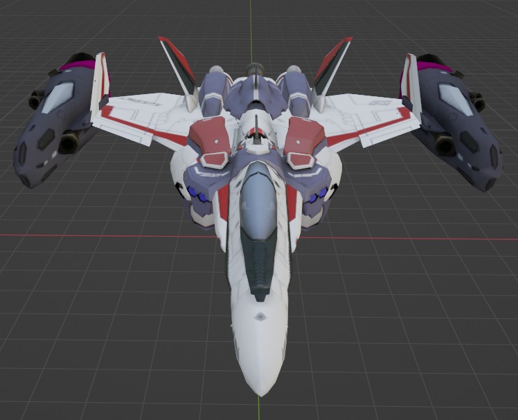
Aaand, on to the next project! 😉 Still early but here's what I'm working on next. In playing with the Al Shahal map, it was quickly becoming apparent that while I have a hard drive full of fighters now, there are pretty much no civilian craft available anywhere. I had made a couple of commercial versions of Zentradi craft to use as background freight haulers but wanted to fill out the spaceport with something more human oriented and decided to start here. I plan to make the Walkure shuttle as well (both are very simple shapes, which is nice), but may need to get inventive since I'm not aware of any other small to mid-size civilian ships in the "official" setting materials besides the container ships seen in Delta. Anyway, hope to have some preliminary textured version of the starliner soon.
-
Thanks, that one jumped out at me as well. I have half an idea for a B/D/G style head and/or a two seater trainer version, but those will have to wait until I get through a few other things. In the meanwhile, updated the google link to add the 24F model for anyone who wants to play with it. Enjoy! https://drive.google.com/drive/folders/1MEqAULkJDzBoGyFBrgRHBX7C7_ZVdfcg?usp=sharing
-
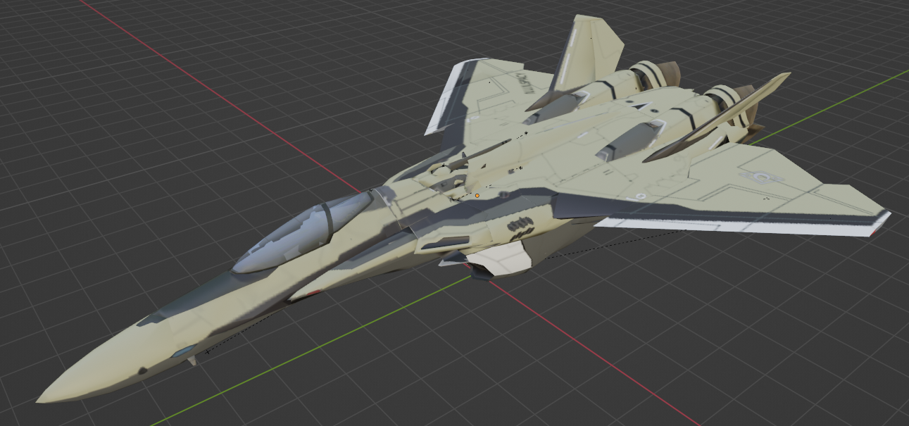
Okay, I lied. 😉 I had some time at lunch and was motivated, so banged this out. A VF-24F version based on one of the discarded Kawamori head designs that I liked. This is a bit more Macross than the Zentradi Helmet head, so maybe more to folks' liking. Enjoy!


-
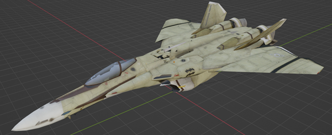
Here we go. Not exciting, but I think it's a decent CF version for the VF-24. Color from the SMS 25A slapped over the pattern from the 171/NUNS scheme. I might have one more thing to try here, but otherwise I think the 24 project has run its course with me. At least, until inspiration (or boredom) strike again! 😉
-
Yeah, I kind of feel the same. The Al Shahal scheme looks pretty good, overall, was just hoping to find something more unique. I tried a green scheme thinking it could look more "military", but it was pretty awful. 😆 Ain't broke, don't fix, guess.
-
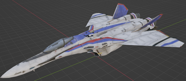
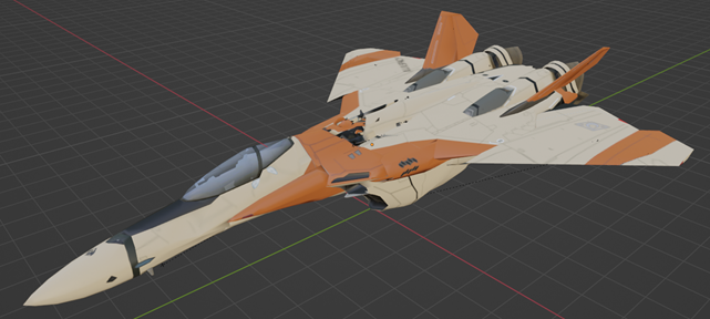
Took a detour to play with different color schemes looking to come up with a good "cannon fodder" version. Mostly just slapping things together to see what might look good. Don't know that anything really jumps out at me so far, but figured I would share a few and see if there were any suggestions. I know, I know, "what about military grey?" That was kind of where I started on this project, but I wasn't thrilled with how it looked, and let's face it, Macross doesn't play by those rules anyway, they like their flash. 😉 If nothing else, here's some stuff to look at. A few are just straight from M30, a few I made, and a few from previous projects just slapped on to see what it looked like. Enjoy!
-
I figured that was a good trade off with getting rid of all the directional nozzels on the 25 Super Pack boosters. The tornado booters can just rotate for directional thrust. Still need to "disguise" the tornado boosters to make them unique to the 24, but baby steps. Here's the pack on a battroid.
-
Somewhat more color coordinated scheme and most of the geometry fixed to match (ish).
-
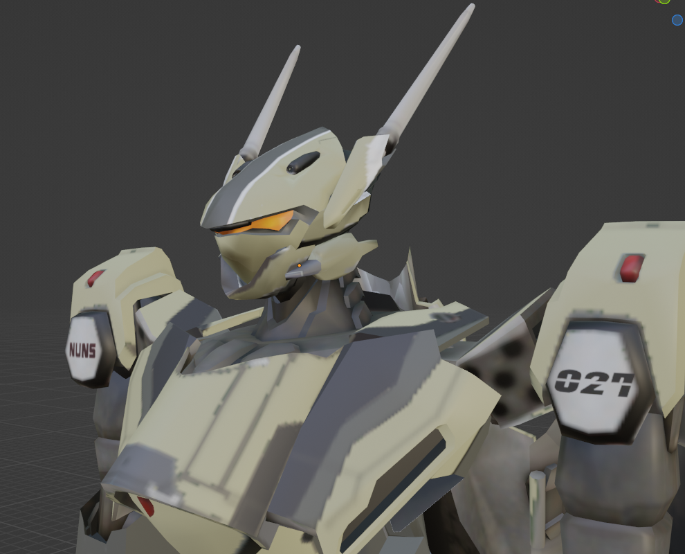
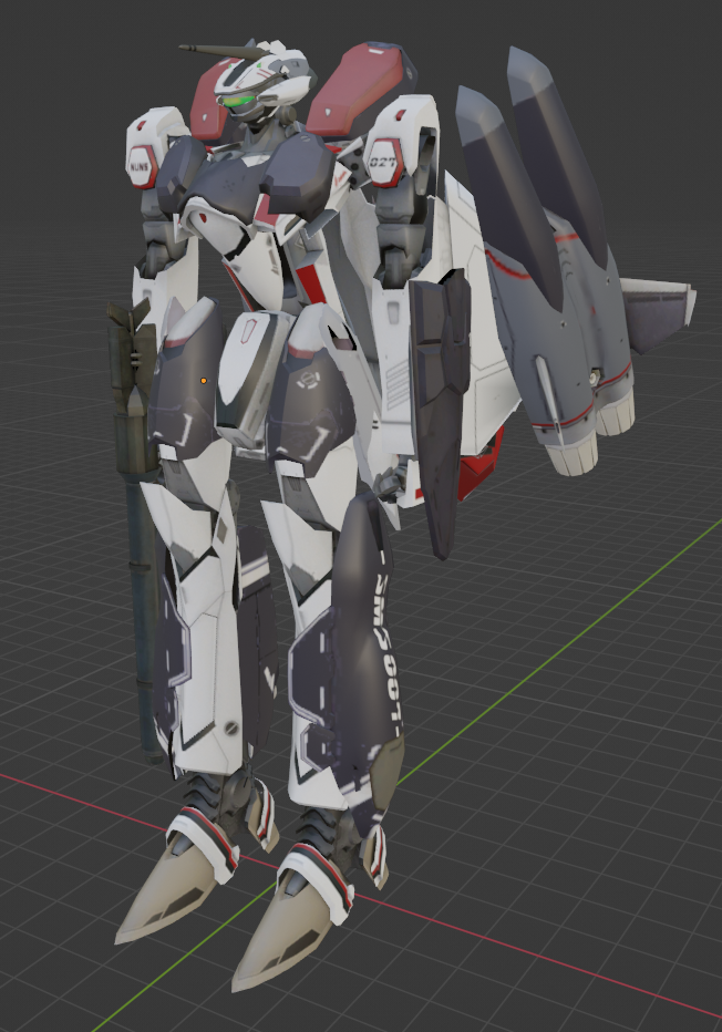
Well, after messing around with pretty much every add on part that I have access to through the games, I think I've settled on what I want to use as the base starting point. Chest plate from the 171, leg and back armors from the 25 supers, shield (stretched and edited) from the 25 armored, and the boosters from the 25 tornado. I like the 171 parts because they're less "fancy" than the 25s and look more suited to a NUNS design, and the tornado boosters look a lot better on the 24 than the 31 boosters did (although since they were developed by the Frontier fleet, it may not make sense to use them on an Earth design, so I may need to "disguise" them some). The inner wings look a bit empty to me, and I may end up making some sort of cladding for them, although I want to keep this as a "super" set and not go too far over into "armor" yet, so it may be overkill, but at the least I'm thinking of giving it missile sets to fill in the space some. A 262 style micro missle blister may work as well. As always, thoughts and suggestions welcome. Once I've got the base components in place, I'll start editing geometry to make them fit and then go into making a unified color scheme for everything.
-
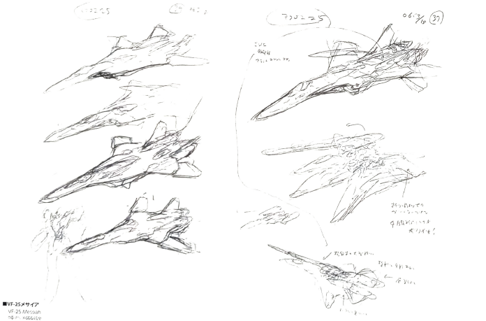
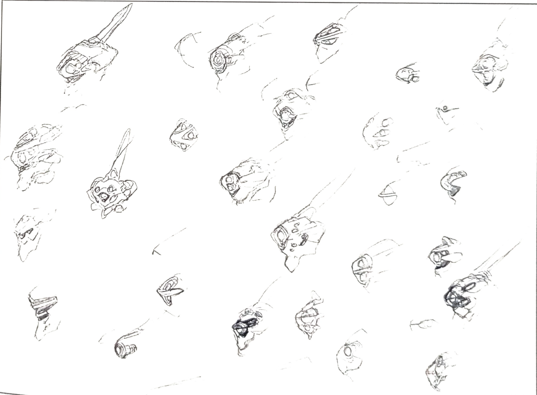
Not sure if this is what you mean, but let me know if this gives you what you're looking for. I hear you on the learning curve, it took me a good while to get over the initial hurdle of figuring out where things were and how they worked. Blender is an amazing piece of software, especially because it's free, but it is NOT intuitive at all, and the insistance on keeping most functions in shortcut keys rather than context menus doesn't help. That said, once you get the basics, it really does blossom out pretty quickly. And believe me, for all my fiddling around, I only know the basics! 😉 Two things really helped me get some momentum with it: first was that I stopped chasing the latest version and just stuck with one of the stable ones (in my case, I use 2.83, which is ridiculously out of date now, but it's stable and was around forever so there are tons of version specific guides and tutorials out there), and second was that I finally got smart and picked a very simple project to do my learning on so that when I finally figured out what I was doing and realized that everything I'd done was crap, starting over again was actually fun and quick and not a giant frustration. On the subject of tutorials, you're absolutely right: there are a million hour long videos out there by well meaning people who have no idea how to convey simple instructions. By far, the best one I've found is Royal Skies on YouTube: https://www.youtube.com/@TheRoyalSkies/videos He specializes in 3-5 minute videos that focus on one task so that you don't have to watch someone build an elephant just to learn how to bevel an edge. Most of his stuff is on animation, but he has modeling videos, too. If you get serious about trying again, let me know and I can put together a set of links to good beginner tutorials that helped me. The Designer Note book is actually pretty amazing and a great insight into the man's process. Here's a page of 31 head designs, and I'm still digesting the pages of concepts he came up with for the 25. A lot of fascinating ideas in there that are a million miles from where he ended up, even though you can clearly see the seeds from an early stage. Fun stuff!


-
I feel like I need to get you a copy of Blender so you can play with these crazy ideas yourself! 😉 I like the idea of a badass heavy gun for the 24 (which is why the 11 gunpod was the one that came to mind first), and also appreciate having a lineage from that to the 25 armaments. I'll look to come back to it in a bit and play with some new ideas. I also just stumbled into a copy of Kawamori's Valkyrie Designer Notes and saw his development sketches for the 25, which include a pile of rejected head ideas that now make me want to go back and try again on those, too. In the meanwhile, I threw pieces of the 25 and 31 super packs onto the plane to see what ideas it might spark, This mix feels like the direction I want to go, though I might add in some of the armored parts as well. Also struck me that rather than edit the 25 parts to fit the extended back and shortened shield, this might be an opportunity to give the 24 a full size shield that extends the buckler and makes the super pack actually useful in a defensive sense. We'll see as I play with it more.
-
It's a fair point, especially since the gunpods are made by different companies than the planes, so it would make sense that fleets would buy "off the shelf" weapons to equip their mechs with. New stuff is more fun, though. 😁
-
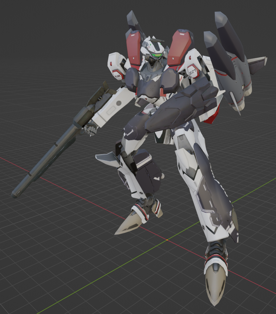
Very minor update, I kitbashed the gunpods of the 11, 11d, and 25 to get something that looks more "Macross appropriate" than the Gundam thing I had it holding before.


-
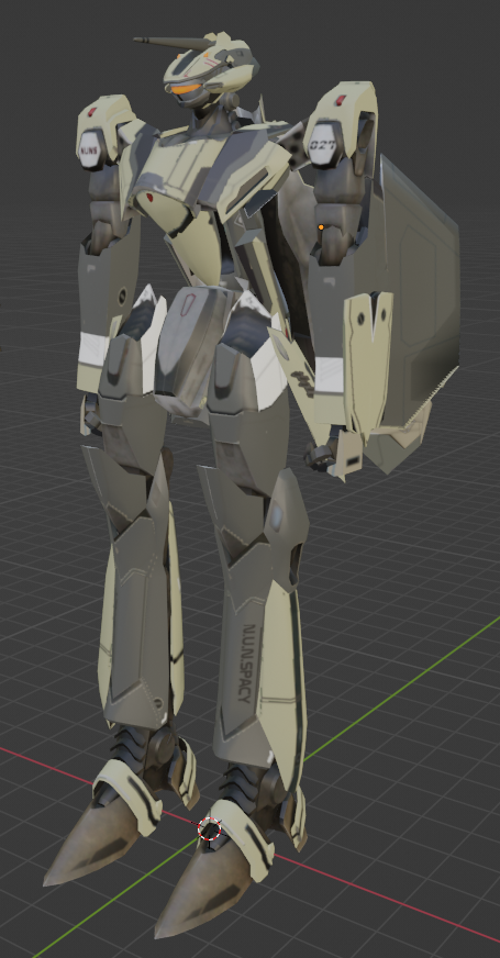
I appreciate it, otherwise I might cry. 😉 It's definitely not a perfect model, I tend to go fast and loose to get results quickly and prevent myself from getting frustrated or bored with a project. "Good enough" but don't look too close at the edges. I'm sure I'll keep working at it to keep cleaning it up and moving it closer to "right", but the calves will have to wait for the moment. I'll also remind folks that the model (the updated one as shown above, both fighter and battroid) is available at the link below for anyone to pick up and put their own spin on. I'd love to see other people's takes on it. https://drive.google.com/drive/folders/1MEqAULkJDzBoGyFBrgRHBX7C7_ZVdfcg?usp=sharing
-
Well, how about that? I honestly never noticed the different calf. Well, add it to the list for future improvements. And ,yeah, the "hump" is just leftover shading, that area by the shield is flat on the model, but the texture still includes some form following features. What can I say, I'm lazy. 😉
