-
Posts
4920 -
Joined
-
Last visited
Content Type
Profiles
Forums
Events
Gallery
Everything posted by M'Kyuun
-
M.A.S.K. - Show and Toy collections
M'Kyuun replied to areaseven's topic in Anime or Science Fiction
Good point about the licensing; I wasn't thinking about that aspect but focusing more on the creativity side of the topic. However, that's definitely an obstacle which the Chinese seem to contend with on a much looser basis without as many legal repercussions. I don't agree with stealing IPs, but at the same time, my hypocritical self has bought numerous third-party Transformers over the last decade or so, and quite honestly, I think they're smartly cornering parts of the market that Hasbro and Takara aren't really operating in, like the legends scale market, and doing it brilliantly. Moreover, I think they approach toy design, much like Takara does or used to, by trying to make the best toy and then assigning a price instead of working within a set budget and making adjustments to the toy until it fits, which often means the toy is far more limited in parts, features, paint etc. It's a shame that everything is so much more expensive here in the States, but that's the reality of our times, and the situation will likely never improve alas. There's obviously passion at both Hasbro and Takara, and I'm exceedingly glad that they've put the designers out in the public space to talk about what goes into the toys. They're obviously working under constraints, and by talking about that, if only tangentially at times, I appreciate the candid perspective and I hope it quells some of the bitching and moaning among the fandom. We're still going to complain, because humanity, but for those of us with a modicum of empathy, seeing the bigger picture regarding the circumstances in which they labor to try and make good toys allows for a bit of forgiveness if a toy comes up a little short in our minds. Even third-party toys come up short from time to time, but man, what a wonderful time to be a fan of 80s stuff with folks like Ramen Toys , 3P Transformers makers, etc, realizing our childhood dreams through passion, skill, talent, and drive to create the toys we wished we'd had when we were kids. We're spoiled, and I'm loving it.- 354 replies
-
- matt trakker
- rhino
- (and 9 more)
-

M.A.S.K. - Show and Toy collections
M'Kyuun replied to areaseven's topic in Anime or Science Fiction
Likewise, both space and money. M.A.S.K. is another notable toy series from the 80s that had some really standout toys, and honestly, if Hasbro wanted to, they could just dust off the old molds, perhaps add a few new ones to complete the roster, put a little publicity behind it, perhaps hire a studio to give the show a modern makeover, and just let the money roll in, as I think the toys and the concept as a whole still have the power to captivate and intrigue. Since it shares the transformation gimmick with their other huge franchise, I'm surprised that Hasbro hasn't at least tested the waters by reviving M.A.S.K. for a new generation, if only in a limited fashion. Perhaps they could produce some video shorts to create publicity and gauge interest before committing to new toys. But I think it still has strong appeal that kids and adults alike would respond to. As to Ramen Toys, the passion and effort they put into these toys is obvious and remarkable. I'm constantly amazed by the abilities and commitment of fans to create today the toys we wished we'd had as kids. Chinese fans, notably, are killing it as they form toy companies dedicated to making modern interpretations of 80s and 90s toys; it's shame we don't see that same level of dedication or craftsmanship on our own shores, since these properties all originated here.- 354 replies
-
- matt trakker
- rhino
- (and 9 more)
-
Obviously, it's going to try to look like a VF-19 Fire Valkyrie, so we can expect the majority of it to be red with yellow accents. As someone above mentioned, the entire forward fuselage is hanging off the back and will just rotate 180 degrees to cover the head. The shoulders are shaped like the VF-19's pauldrons and will likely fill that same role on this in fighter mode with the forearms recessing, much like the VF-14, into the backs of the legs. The wings wrap around the lower legs, which will likely compress over the thighs to foreshorten them and present as the rounded aft fuselage of the VF-19, while the wings unfurl into their proper positions. The compression of the legs , IMHO, will be the most complex part of the transformation, and the resulting fighter will be a mix of blockiness due to the OP chest and smoothness due to the forward fuselage and lower legs sharing the VF-19's design characteristics. It's a bit of a Frankenstein's monster due to sharing opposing characteristics being taken from two very different designs that, IMHO, don't marry well, especially as they relate to an aircraft, and even more especially, an aircraft design as sleek and aerodynamic as the VF-19. Personally, I would have been more excited if they'd taken a similar direction as they did with Maverick, which takes notable cues from the VF-1 without copying it directly (we have Jetfire for that), albeit taking cues from the VF-19 while hewing close to that design and transformation schema without copying it entirely. I think this thing is going to be a travesty writ large, but I'm profoundly biased towards Macross for its realistic and sleek valkyrie designs. Takara, and Hasbro by extension, have abysmal track records for creating jetformers that are anywhere near approaching aerodynamic or realistic. More often than not, they are partial aircraft sitting on the backs of blocky folded robots that often don't even integrate the arms into the jet mode. Fighters are big machines (I know, as I worked around them during my AF career), far bigger than cars, and yet Takara always manages to tuck the arms somewhere even in the smallest of car modes, or motorcycles for cryin' out loud! There's far more real estate in a jet fighter, and yet they often waste large chunks of a fighter that could be used to integrate arms. It boggles the mind the lack of creativity or the reluctance to try to find better solutions. All I can say is that in twenty years of working around military aircraft, I never saw a single one with arms hanging off the sides or big blocky underbellies. Macross is proof that a realistic aircraft mode is possible for a transforming robot; I just wish the folks at Takara and Hasbro would take a few notes.
- 69 replies
-
- macross 7
- collaboration
-
(and 1 more)
Tagged with:
-

The Unlicensed Third Party Transformers Thread
M'Kyuun replied to slaginpit's topic in Anime or Science Fiction
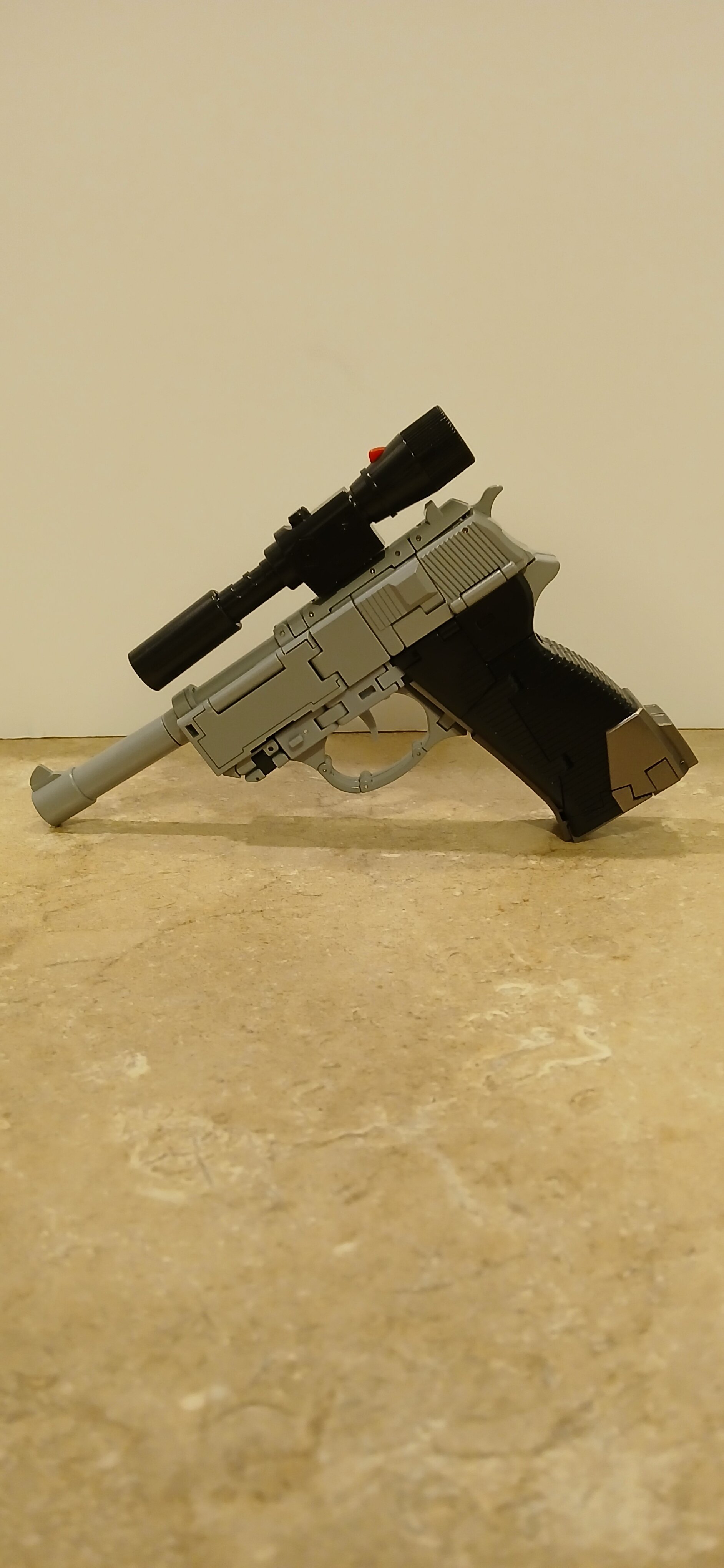
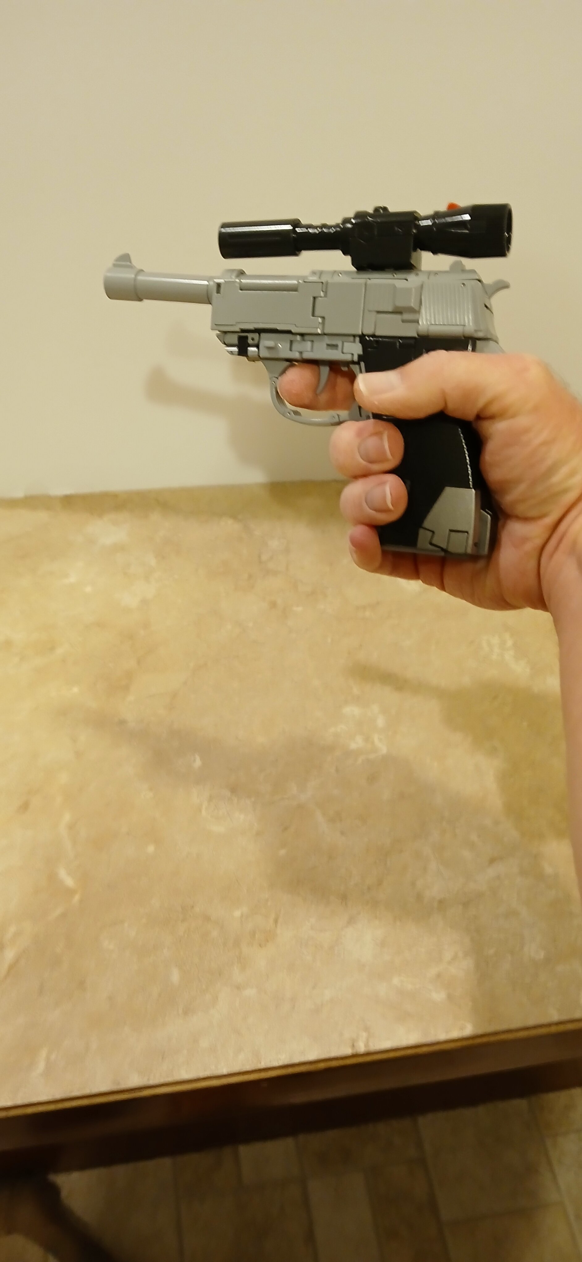
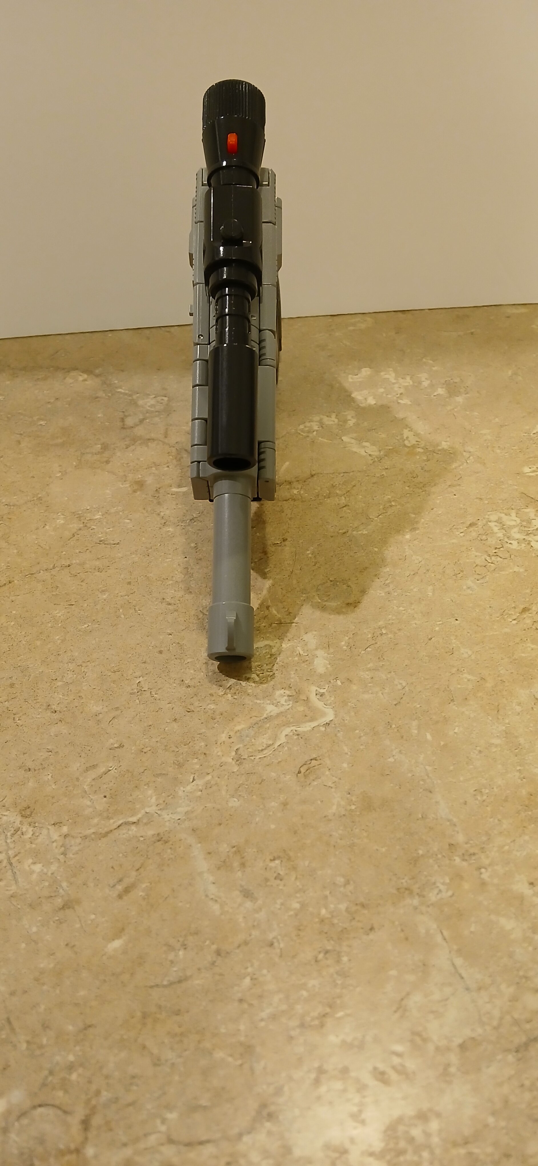
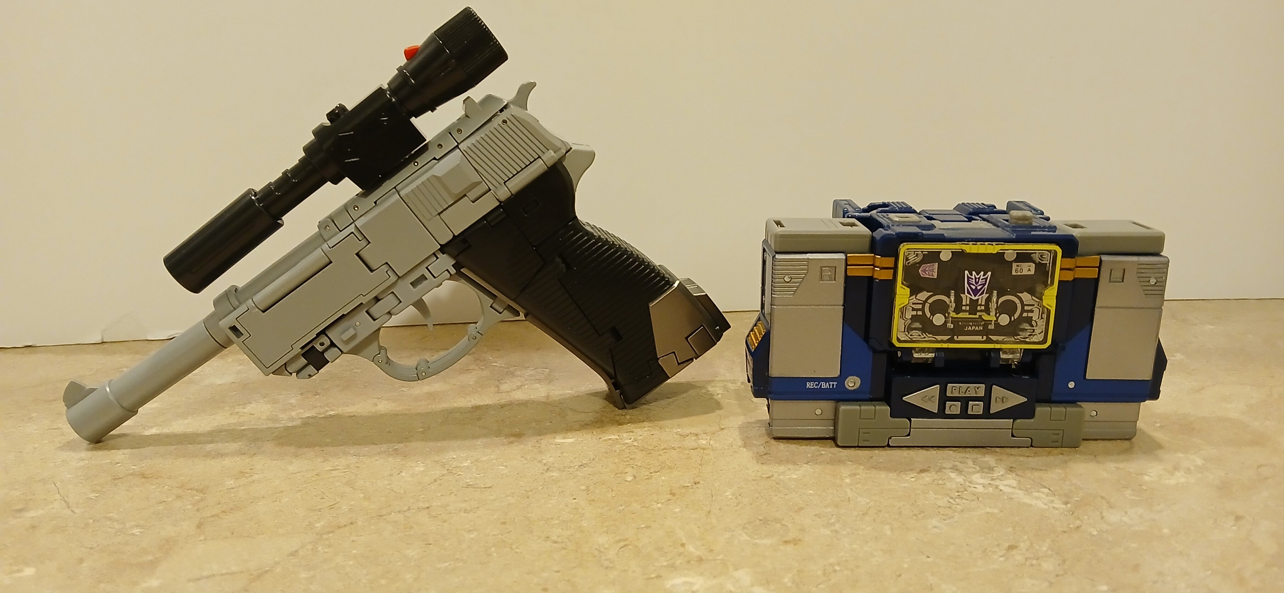
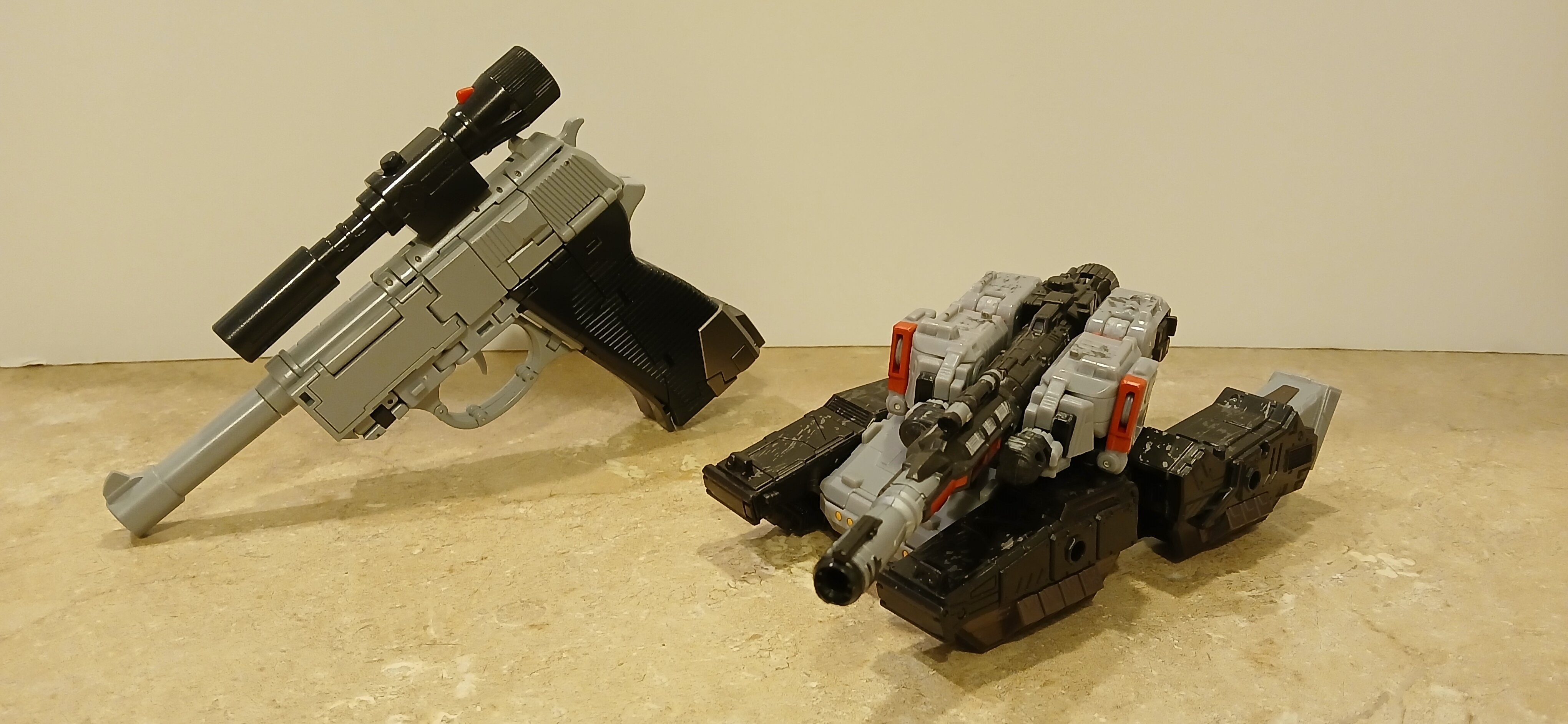
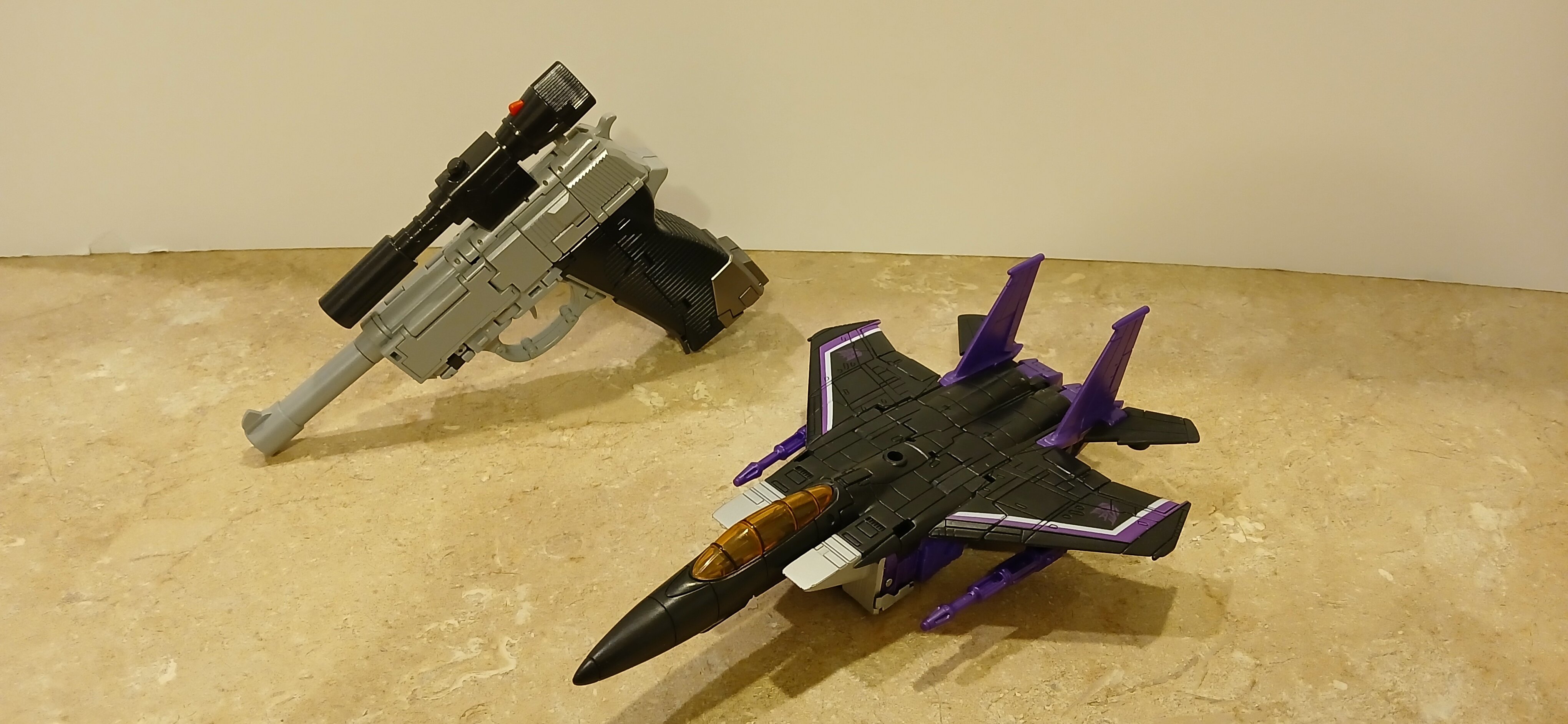
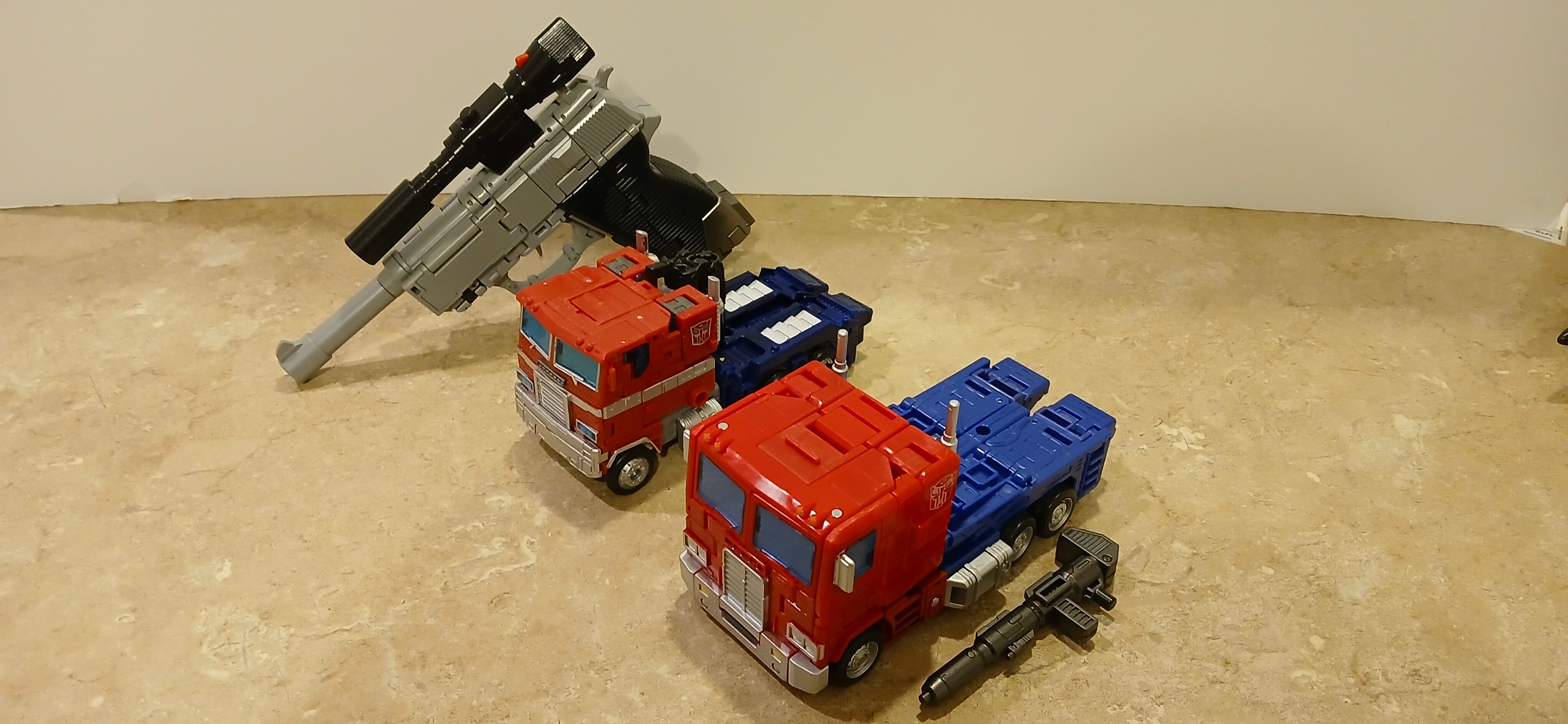
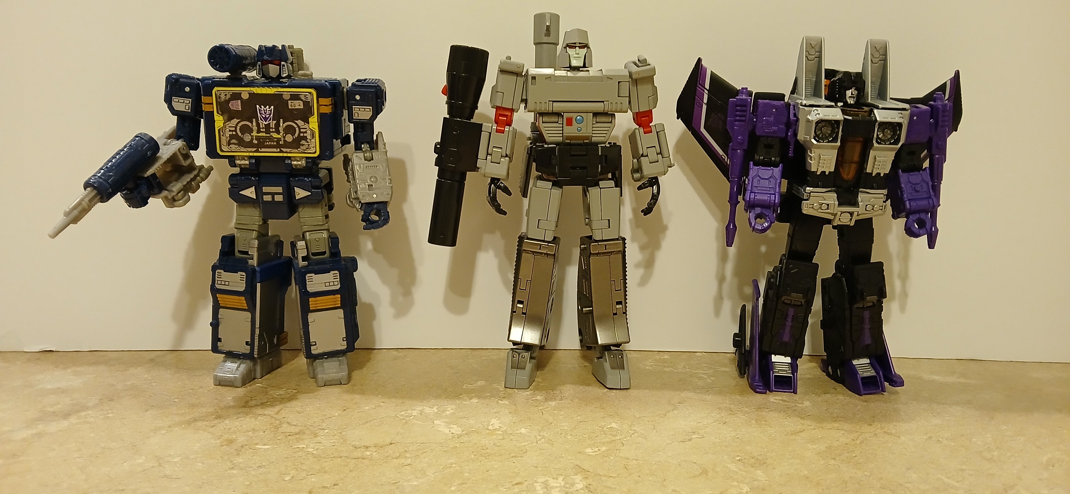
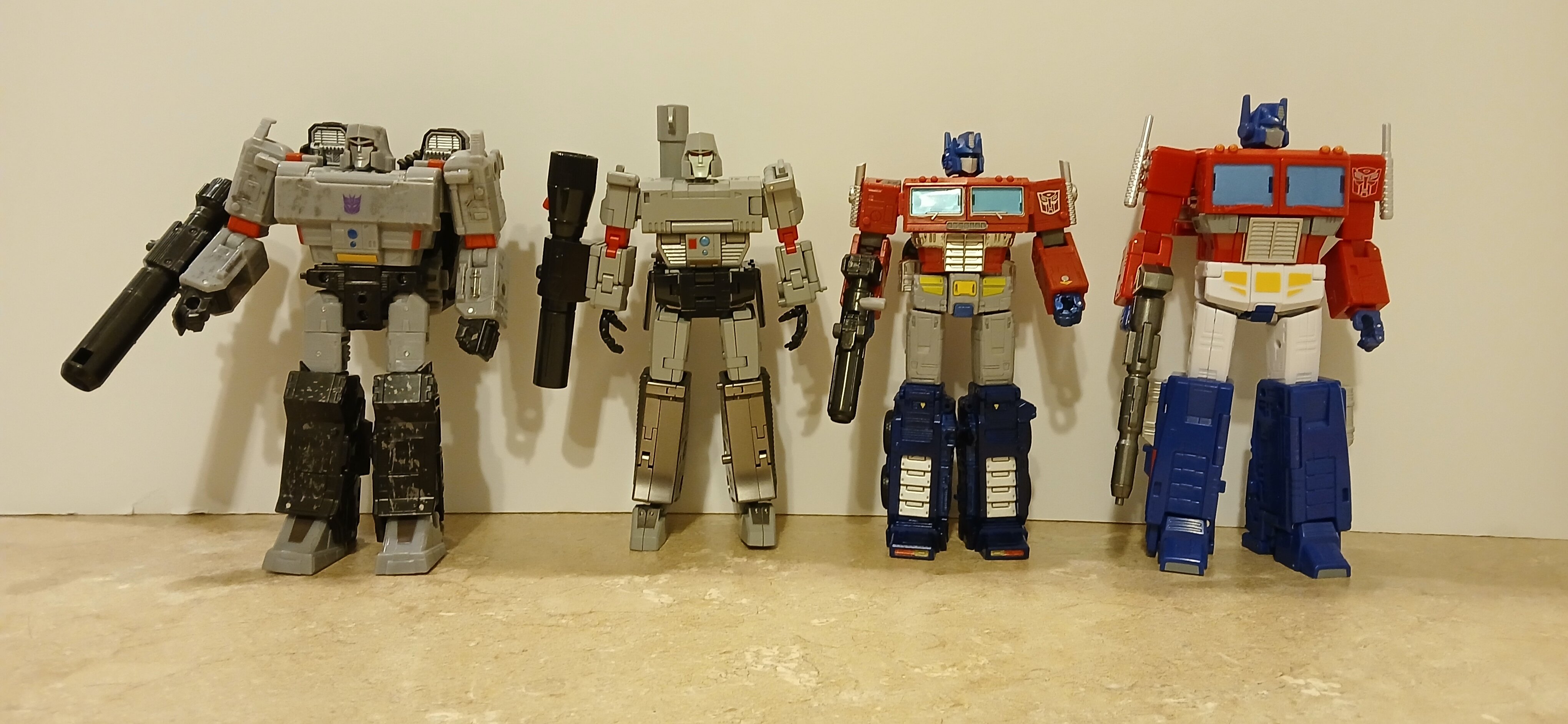
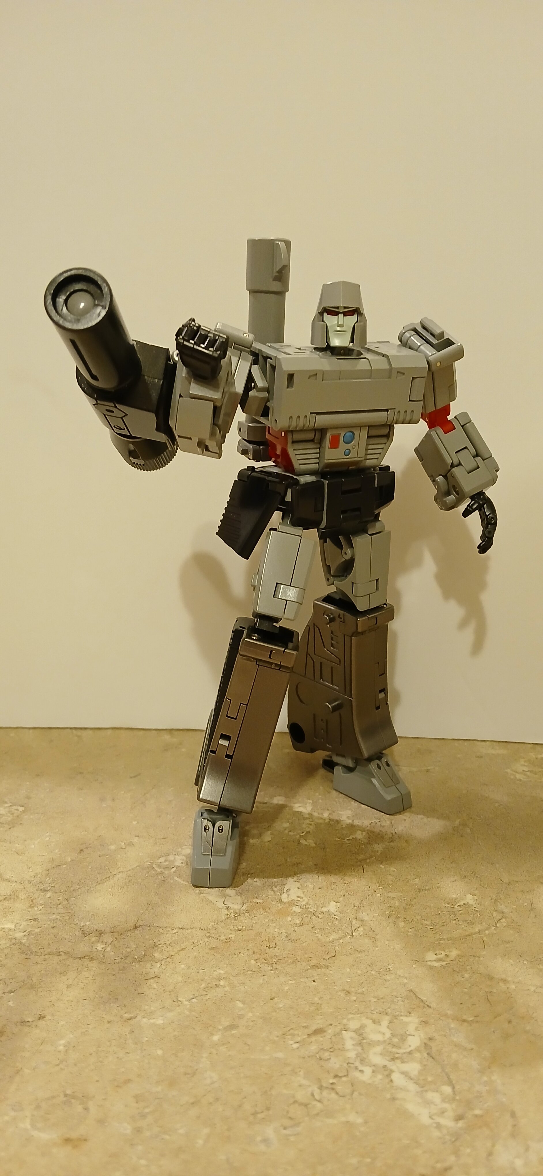
I've expressed many times over the years how much I wish some third party would give us a CHUG scaled G1 Megatron with a proper pistol mode that at least fairly resembles the Walther P38. I was quite surprised, pleasantly so, when Newage stepped up to the plate with just such an offering. I already had their legends scaled Megs, and to be quite honest, it wasn't the best offering at that scale (ahem, Magic Square's Doomsday takes that honor, IMHO). Thus I was a bit concerned until pics of their grayscale model surfaced, and at that point I breathed a sigh of relief. It looked good, and while I didn't care for the trigger guard forming the insides of the thighs, in all other aspects it exceeded expectations. My copy arrived today, and I haven't been this excited for a fig in some time. I'm not the best reviewer, but I did take a few comparison shots for those curious as to how it'll scale with other figs. A note of caution to anyone out there getting this: I nearly broke my copy following the included instructions. I highly suggest watching PrimevsPrime's review, as he offers a clear and concise methodology for transforming this figure that will keep you from breaking stuff. Gun mode: By this point in time, it's a foregone conclusion that most G1 Megatron toys that become guns, regardless of scale, are going to be replete with panels. All things considered, this comes together very well, and while there are a lot of panel lines, I think it still presents well. I believe I saw it mentioned somewhere that he's missing his safety, but beyond that, he's fairly accurate. For those wondering, the trigger is not spring-loaded- you have to adjust its position manually. I have kid hands, so it's a pretty good fit for me. NGL, I had some fun with him in this mode. My wife was all 🙄. 😁 Comparisons: I figured I'd show how his alt mode compares to other bots' alts. First up, Netflix WFC Soundwave. WFC Siege Megatron WFC Earthrise Skywarp WFC Earthrise Optimus Prime and SS86 Optimus Bot mode comparisons: Overall, I'm really impressed with this fig. The articulation far exceeds what we can expect in a mainline toy, the transformation, when done properly, is relatively intuitive although I'd suggest guidance on the first time, paint and sculpt are very well done (most of the figure is painted), and of course, he transforms into his original pistol form which isn't feasible with official toys. Very happy that this exists, I hope more like it are coming, and I'm supremely happy to finally fill a vacancy in my mainline collection that I thought would remain forever empty. edit: The box indicates that this is the first of a series, so hopefully Newage will indeed make more figs at the mainline scale. They've not even done triple-changers at the legends scale yet, that I'm aware of, but I'd love to see what they'd come up with for both Blitzwing and Astrotrain, as well as upscaling their really-well done seeker mold. Hopefully, good things to come. The more I handle Romulus, the more I appreciate it- just a well-done fig.- 9246 replies
-
- 1
-

-
- fans toys
- mastermind creations
- (and 19 more)
-
I have just a single copy of the new Renegade (for now) and I've only built the main model, as I'm not all that plussed about the inspired Alienator model. I watched JANG's review, and I agree with his thoughts on the Alienator build: it looks better as a ship if you remove the leg assembly. After building the 10355 Renegade, I'm rather impressed by the integration of the large trapezoidal flag at the nose as a creative solution in lieu of the non-existence of an analogous wedge brick. That's been a point of contention, and while there are certainly other ways the designer could have realized the nose that would appear more 'brickish', I thought it a simple but elegant solution. YMMV, of course. I also agree with Huw Gilliam's opinion that there is far too much yellow used, especially around the cockpit. The original Blacktron sets used the yellow accents far more sparingly, and I wish the designer had followed suit with this set. As an update, it's just ok to me. Mike Psiaki, the designer of 10497 Galaxy Explorer, essentially upsized and improved on every aspect of the original. Jae Won Lee, the designer of the Renegade, exercised far more liberties in his interpretation which removed a certain salient aspect of the original and just didn't quite deliver on the same level as the new Galaxy Explorer. I still prefer my original Renegade to this, and I feel sad saying that, as I vehemently want these homages to both continue and to improve on their originals. Well, here's hoping that they take the feedback to heart and the next update will be more 10497 and less 10355.
-

The Transformers Thread (licensed) Next
M'Kyuun replied to mikeszekely's topic in Anime or Science Fiction
Likewise, although I'm torn on whether I want it to be crowdfunded or just a nice titan class fig at retail. It'd likely be cheaper as a retail toy, but to really capture the complexity of the design, Haslab might be the better way to go. Either way, I'm in for a copy if they make it.- 17043 replies
-
- transformers
- toys
-
(and 5 more)
Tagged with:
-
Every success in your tinkering.
-
I had a copy of the Alienator as a kid, and I have two of them at present. It's a cool model and, similarly to the new Renegade, this 'B' model misses the mark a bit compared to the original. Like the OG Renegade, the Alienator has a large cargo box that makes up a significant portion of its bulk and it's completely missing on this reimagined version. Too, the shimmying legs and feet of the original, which still look much better to me than the reimagined version, are a bit of an anachronism on a modern take. I understand the intention, but when so many liberties were taken with the rest of the model, it seems moot. Too, I don't particularly care for the look of the legs or feet on the 'B' model. Unlike 10497's 'B' models, which maintained the updated aesthetic of the new Galaxy Explorer applied to its smaller sister ships, this stands starkly independent from its original inspiration for all the wrong reasons, IMHO. Unlike the reimagined Alienator, I like the smaller mech which is its own thing divorced from any previous set. Having built the new Renegade, it just doesn't fill me with the same sense of awe that 10497 did, and still does, I wish they'd had Mike Psiaki design this new Renegade too, keeping the design language he established with 10497, but hewing closer to the original ship's design while making improvements. Alas, it wasn't to be and this is now official, for better or worse. Fortunately, LEGO lends itself to modding for those so inclined. I think the greatest point of discontentment comes from having seen any number of the Renegade and other Blacktron sets reimagined as really well-done MOCs over the decades, which inspired hope for any future official set. For me, the new set doesn't quite reach the bar that's been established by fans, and so its enjoyment factor is eroded by disappointment.
-
I'm looking forward to seeing what you come up with. I only own one copy at present, and while it's not bad, I do wish the designer had skewed more towards maintaining all the salient features of the original ship, especially the cargo box.
-

The Transformers Thread (licensed) Next
M'Kyuun replied to mikeszekely's topic in Anime or Science Fiction
I'm in agreement. Along with the '89 Batmobile and Tumbler, I'd love to see them do the Mach 5, Kaneda's bike, a Lightcycle, the original Spinner from Blade Runner, the dropship and APC from Aliens, the Oblivion Bubbleship (admittedly, not much to work with given its skeletal frame), Airwolf, and Blue Thunder. Trypticon would have been ideal for a Godzilla crossover, as the scaling between him and the majority of normal sized bots works out much better. I'd really be stoked if they brought back M.A.S.K. as part of the Transformers line, but I think the optimal time for them to have approached such complex toys would have been in the early Bayformers era, when deluxe figs cost $10 and some of the Bayformer toys were nigh-MP levels of complexity. Where both prices and complexity levels are now, I don't think they'd be able to do the toys justice, quite frankly. I think 3Ps would do a better job at this point, and I'd welcome it.- 17043 replies
-
- transformers
- toys
-
(and 5 more)
Tagged with:
-

The Transformers Thread (licensed) Next
M'Kyuun replied to mikeszekely's topic in Anime or Science Fiction
Likewise. I quit collecting them after Dinobot; the retail offerings sufficiently meet my need for BW figs, and they're more space-friendly in my ever-shrinking house. as you say, it's great for the BW collectors who want to finish off the core cast. Funny, I love the Dinobots, but I've never been much into the Predacons, which really should have been the proper antagonists for the Dinobots, both with their robo-beast alts. Easy pass on that set, which ostensibly looks good from the pic. If Takara & Hasbro get around to doing a set in Legacy, I'll consider getting them if I like how they turn out. I have yet to own a set of Predacons/Predaking, so that would be my first. Yeah, this thing looks tragic. I've already posted my rant, but looking closer, there couldn't be two more diametrically opposed designs between OP and the VF-19 Fire Valkyrie. So what's this thing going to turn into: a truck with weird plane bits hanging off of it, or another extremely boxy jet that's more robot cargo hanging under jet facade than a proper jet? Like I said above, they should have just asked Kawamori to help them design a bargain version of the VF-19 maintaining its salient features and transformation and maybe given the bot mode Basara's turtle shell shades as a nod. I would hate the head, but if everything else was truly VF-19, I could live with it as a crossover.- 17043 replies
-
- transformers
- toys
-
(and 5 more)
Tagged with:
-

The Transformers Thread (licensed) Next
M'Kyuun replied to mikeszekely's topic in Anime or Science Fiction
The point of "Basara Prime" is lost on me. Elevating the most worthless and ineffectual protagonist within the entire series to Prime status is laughable on the surface. However, my real concern is with the eventual abysmally reimagined VF-19 that they're going to attempt to make him become, and the terrible non-canonical bot mode that they've created for him b/c they are so very bad at designing transforming jets. The real tragedy of this is that the VF-19, one of Kawamori's most beautiful and iconic designs, exists. They could simply ask Kawamori to work with them designing a Transformers toy that captures the VF-19 in both modes, albeit at their budget limitation. I would rather have a slightly lesser quality VF-19 that looks and transforms like the VF-19 than some crappy remake that pretends to be a VF-19. Obviously Big West and likely Kawamori gave the ok to TT for this, but if I was Kawamori, I'd want to supervise the design to keep it close to source. That faded pic says otherwise. This saddens me; how amazing would it be if we could get the Macross pantheon of valks as Transformers characters, maintaining the og designs?!! It would be revolutionary, and we'd finally have some TF jets worth a damn at a more affordable price point than most of Bandai's and Arcadia's offerings. Even if they did them all at commander class price points, if those budgets went into the mecha and not into peripherals, i.e. a lot of useless accessories and effects parts, to keep them as close to source as possible, that would be excellent and would offer a fantastic crossover element to the line. The glimpse of what's coming dashes all hopes of any further Macross crossovers living up to the potential. Well, at least we got Maverick and Jetfire.- 17043 replies
-
- 1
-

-
- transformers
- toys
-
(and 5 more)
Tagged with:
-

The Transformers Thread (licensed) Next
M'Kyuun replied to mikeszekely's topic in Anime or Science Fiction
I feel more badly for the folks who were working on the game than actually not getting the game itself. All that incalculable investment of time and effort by those people was just shelved; I can only imagine the emotional and mental toll something like that must take. It's unfortunate and dismaying.- 17043 replies
-
- transformers
- toys
-
(and 5 more)
Tagged with:
-
I have my own quibbles with it, but overall, I like it too. I'm a battroid guy and one of my greatest beefs with the old Yamato was the disproportionately skinny legs, wobbly hip joints, and tiny feet that made it both awkward looking and unstable. The DX fixes those issues; it stands and poses well and looks pretty darned good doing it. Anyway, I'm glad for the positivity.
-
Every success to you! Share your experience, as it's an ambitious project.
-
Appreciate the brief commentary. Mine's on its way from Denmark along with the new Blacktron Renegade. I visited my local Wally today hoping to find a lot of the 2025 sets and the series 27 CMFs, but they didn't have the CMFs nor the new Space mech polybag (they had one of a toucan, though) nor either of the large spaceships. Glad I ordered them, as I'll likely have them in hand next week. Meanwhile, I've been staying busy building the two 'B' models for the Dreamzzz Mateo and Z-Blob the Knight Battle Mech set. I'll be building the 'A' model soon, but IMHO both 'B' models were 'A' model-worthy designs themselves. I've been wanting this set all year and I resisted the temptation to order it earlier so I'd have something to request of my wife for Christmas. We lucked out and I got the display copy, their last, at one of our Barnes and Noble stores, the only place I've seen this set, including our LEGO Store downtown, all year. Happy to have it at last, and happier still that it was such a well-executed set with really enjoyable alternate models. The other set my wife got me is the Dark Falcon, and I'm looking forward to putting that one together, too. I just couldn't resist having a white Darth Vader fig in my collection, and the rest of the paradoxical characters in this set are also welcome additions. For those who don't know, the Dark Falcon is based on a design from the LEGO Star Wars: Rebuild the Galaxy series on Disney Plus, a typically humorous and 'alternate universe' take on the galaxy far, far away that we all know and love. It's well done and worth a watch IMHO. And as a bonus, Mark Hamill voices Luke Skywalker. I've seen some of Nick's builds in person at BrickCon in Seattle. I believe I even spoke to him once, but this was years ago and I was blissfully unaware of the extraordinary talent in whose presence I was basking at the time. I hope he comes to BrickCon again in the future so I can hopefully convey my awe. Concerning this and his other models, one need only spend a minute or two watching his assembly video to understand that you're seeing talent on a rare level. I wish that LEGO would release builds on this level in their 18+ line, as they'd make for some truly interesting, immersive, and challenging builds for those of us who are already building at a high level. I'm no slouch with the brick, but Nick is truly stratospheric in his ability to use LEGO in novel and creative ways and I'm simply left gobsmacked with every frame, and I'm humbled to the point of feeling like an amateur.
-
The concern is that I'm experiencing the lack of clutch power from new, never-used skeleton arms. I turned to my older stock, in fact, because until just recently, I had a higher degree of efficacy from them than new parts. Even my older parts, which haven't seen much use, are evidencing a reduced clutch power which makes me wonder if it is indeed an environmental issue. My thinking is to move the release mechanism's trigger to the forward bulkhead freeing up the engine section to be modded into doors thus mimicking the original's design. I love cargo as a theme and as a design feature; the omittance of the original's cargo box to house the land vehicle is a strike against this set as an update. That's a fair bit of playability lost: loading and unloading the vehicle into the box, loading and unloading the box itself, which requires the additional feature of opening doors and the possibility of a ramp, and finally, the modularity of the box to be incorporated into another smaller ship utilizing the cockpit and a single engine component. With further modification, both the air drop feature and a land-based cargo door/ramp features would expand the playability of the design by a fair margin and bring it closer to the original set in its characteristics. I wouldn't mind applying these and other modifications in an effort to render it a much more faithful, albeit properly upgraded, version of the original Blacktron Renegade. While modding is not at all my strong suit, as I tend to concentrate on variable mecha, as an owner of the original set there's a part of me that's a bit discontented with this new Renegade, especially when looking at the excellent execution of 10497 Galaxy Explorer compared to the original 497/928. This set misses the mark in a few areas.
-
I stumbled on that independently very early this morning when I couldn't sleep. I was going to post it, but I'm glad I didn't now. Huw Gilliam is a pretty well-known British builder who does a lot of CAD rendered MOCs but also builds the odd model with real brick. Looks like this recoloring is the latter, and IMHO, it's an improvement on the original. I think the cockpit, especially, benefits from the removal of all the yellow, but overall I think the greater use of black throughout improves the model and brings it closer to the original look of Blacktron. I appreciate that he built a central container like the original, but honestly, I'm not really feeling those heavy latticed support elements on top. Huw didn't change the drop mechanism, either, and IMHO, the new Renegade is due for a retrofit of swinging doors and a ramp in the back to bring it closer to the original.
-
The Saturn V is an exemplary set for use of clip and bar joints. Just a brilliant set. I find it alarming that you've had so many clip breakages; I keep a lot of sets out on display and to whit I've never had an issue yet with broken clips. Add to that my numerous transforming MOCs which I manipulate and put on public display every year. However, I've noticed a lessening of clutch power in some parts with clips of late. I built a pumpkin that turns into a spider and it relies heavily on the skeleton arms to effect motion in a goodly portion of the model. I gave my last good model of it away this last BrickCon and ordered enough parts to build two more from LEGO's online PAB. I've built at least six copies of this thing since the original in 2019, which itself went through probably a hundred or more transformations at a convention before I gave it to its intended owner. Even after all that manipulation, all the joints were still tight, and thus it was for pretty much every other model I built of it until just recently. I did a lot of mixing and matching of various parts with bars and skeleton arms before finally finding a group that only somewhat have the collective clutch power of every previous version. I'm not sure what's going on, but it's frustrating. I could blame it on mold fatigue, but I even resorted to digging into my parts stash for older parts that I've had for years and the problem persisted. I keep my parts at room temp (around 77 degrees Fahrenheit) and that temp doesn't swing much in either direction throughout the year. I think the problem lies with the skeleton arms, but I'm not sure why I'm experiencing the same weakness in my older parts when I never did before. It's weird. However, my issue lies more with clutch power than breakages, of which I have had very, very few over the years despite my heavy use of them in my models.
-
These are brilliant. the white one in particular doesn't even look like LEGO on first glance, so well is the build and the applied livery. Hope you'll share more pics of these. I'm not a car guy, per se, but I enjoy the Speed Champions line quite a bit. I appreciate that comparison. Purely from an initial view, the new Renegade is notably much chunkier than the original, which had a more minimalistic skeletal look to its frame that helped it to look sleeker. I, too, wish the designer had opted, like Mike Psiaki's excellent update to the Galaxy Explorer, to maintain a closer appearance to the original ship while enlarging the whole and updating various areas and features accordingly. The new design is a notable departure from the original, made all the more apparent by a side-by-side comparison. I still plan on getting a copy or two, but my enthusiasm is much less for this than what I had and still have for 10497. However, it's Classic Space, and I want them to continue reviving more old Space themes, so I'll be getting at least one. Usually I'm in agreement with your views, Chronocidal; however, I much prefer using the clip and bar connections as opposed to Technic pins, which oft prove to be a royal PITA to engage when two or more are used for a quick disconnect system. So far as the GWP Invader set, oddly renamed Cruiser, goes, I surmise that it was designed independently from the Renegade with little or no bleedover, hence the differences in clipping systems. Fortunately, it shouldn't be too difficult to mod to bring it into compliance with the Renegade's clip system. I oft entertain fantasies of modding sets, but I seldom follow through, even after buying copies of the sets that I intend to mod. I find building my own stuff more fulfilling (and time-consuming) and generally abandon modding efforts. This is a set that could definitely stand some heavy modding to render it closer to the OG set as well as rendering it closer to what 10497 did for the Galaxy Explorer, but I already know that I'll likely never bring myself to do it. However, I'm curious and I look forward to other folks' mods for this thing, as there's a bit of discontentment already swirling and you just know mods are coming.
-

The Unlicensed Third Party Transformers Thread
M'Kyuun replied to slaginpit's topic in Anime or Science Fiction
As a fan of Animated, it would stand to reason that this would appeal greatly to me, but oddly it doesn't, at least not enough to have moved me to order it. That doesn't mean I don't think DNA did a great job; quite the contrary, I think they did an excellent job, and I especially appreciate how all the bits come together to form his firetruck appendage as seen in the show, or close enough, anyway. I was just never partial to his Wingblade look, and with this being a rather pricey set, I opted out. Even now, having read the review, I'm feeling a touch of regret; I dig that firetruck look and the fact that it comes with his iconic battle mask and the Magnus Hammer as well as all the armor accoutrement to capture what would have been in fourth season (we were so robbed!). I just don't think I'd want him on the shelf wearing the armor and to me, that defeats the purpose of buying it.- 9246 replies
-
- fans toys
- mastermind creations
- (and 19 more)
-

The Unlicensed Third Party Transformers Thread
M'Kyuun replied to slaginpit's topic in Anime or Science Fiction
TBF, it's obvious that NA developed Romulus with an expectation that SS86 Prime would be complimentary to ER Prime in scale. I think a lot of folks were surprised, myself included, when SS86 Prime was notably larger, and by that time NA was already well past the stage where they could change it. While it's slightly disappointing, I shan't cast aspersions as I've been waiting and hoping for a CHUG scaled G1 Megatron that turns into a Walther P38ish pistol, and thus far, only NewAge have had the chutzpah to even attempt it, let alone pull it off. Moreover, I felt that their legends scale fig was a bit lackluster and I'm both happy and relieved to see that Romulus is a new figure from top to bottom, a marked improvement. I'm looking forward to getting my copy as he'll be the one fig that's sorely missing from my CHUG collection. All that said, I still opine that Magic Square's Doomsday is the best iteration of G1 Megatron I've ever handled at any scale and I seriously hope they'll take a note from NA's playbook and produce Doomsday at SS86 Prime's scale. It would be both a nice coup for them from a business standpoint, but more meaningfully, it would give us fans a nigh-perfect Megs to both match the new Prime toy and fill that missing void in many a collection. I'd be happy to have CHUG Megatrons from both companies. I have both of their legends toys, but mainline is my primary Transformers collection and at the very least, I want all the first season characters. On a side note, if Magic Square was to upgrade Doomsday, I would hope they'd also give their Optimus the same treatment, as both their 2023 legends Prime (Light of Victory) and their MP scaled variant (Light of Peace) are IMHO absolutely the best versions of that character in existence, and a CHUG scaled version would be superior to SS86. I think having CHUG scaled versions of both would preclude my ever needing to buy another G1 OP or Megatron fig for my mainline collection. I hope it happens.- 9246 replies
-
- fans toys
- mastermind creations
- (and 19 more)
-

The Transformers Thread (licensed) Next
M'Kyuun replied to mikeszekely's topic in Anime or Science Fiction
The head is a tad small, but I can live with it. I do wish the forearms were about an inch longer, though, and it's odd that they kept them short considering they're add-on pieces unaffected by any design considerations for Scavenger or Bonecrusher. They could have been any length. Ah well, third party will likely address it along with other nitpicks. Since this figure isn't going to have a frame system to rely on for stability and all mechanisms to that end are going to have to be designed into the Constructicons themselves, with the exception of the waist and thigh section, of course, stability is a greater concern than proportions. I'm hoping lessons were learned from the Combiner Wars era and this thing benefits by being solid.- 17043 replies
-
- transformers
- toys
-
(and 5 more)
Tagged with:
-

The Transformers Thread (licensed) Next
M'Kyuun replied to mikeszekely's topic in Anime or Science Fiction
I didn't get CW Devy due to the lack of articulation and some wonky proportions among the various Constructicons, as well as the odd decision to change Mixmaster's cement truck design. This team of Constructicons and their Devastator combination is looking much better to my eyes. I see Has/Tak are taking a note from the third-party playbook insofar as combining the extra bits into a trailer, albeit a typically odd looking one. But hey, 'A' for effort. I'm a little disappointed that Long Haul's dumper bed isn't hollow and that it can't properly dump. Even among third party toys, Long Haul always gets shorted his real-world vehicle mode's ability to dump, with XTransbots' recent version being the only exception- kudos to XTransbots. While it appears that some of the Constructicons' proportions are still going to be a bit wonky like the CW toys before them (looking at Legacy Bonecrusher's ridiculously short forearms) and ball joints are in evidence for major points of articulation on deluxe figs, overall I think these are shaping up to be better figs that the CW toys and Devastator looks great. I agree with @mikeszekely that the "gap" in Hook's backside (Devastator's chest) is the top of Hook's head. As to the legs' connecting a bit off-center, again I defer to Mike's answer as it's likely to prevent the legs from colliding if they're placed perfectly straight. The CW toy did the same; it only looks like it's more filled in because of the big tires on Long Haul's thighs which are canonically not present on this version given the intention to make it look like the Movie animation.- 17043 replies
-
- transformers
- toys
-
(and 5 more)
Tagged with:
-
Ah, I see your point now. Sometimes the ole cranium is like that lab door in Tron. I concede your point and, too, would have preferred a removable box and double doors at the rear, like the original, as well a fold out ramp akin to that on 10497 Galaxy Explorer. The air drop mechanism is cool in its own right, but IMHO, neither fitting for this particular model nor as engaging, practical, or fun as the original's box and door setup. I would assume, perhaps erroneously, that Chris, the owner and host of Duckbricks, who himself has been to Billund numerous times for unveilings of new sets and interviews with their designers, keeps abreast of what other reviewers, especially those of Tiago's stature as a former designer himself, are posting. Chris himself is friends with a number of LEGO designers and is generally well-informed on his subjects. Having watched Tiago's interview before Duckbricks', I was a bit surprised that Chris continued his assurances that the GWP Cruiser, an update to the original Blacktron Invader, was compatible with the new Renegade. I'm sure he owns that set (he has over 6000 LEGO sets in his collection and intends to found a LEGO Museum) as he often receives full waves of sets free from LEGO to review as well as specialty items. I guess that only proves he's human like the rest of us.

