-
Posts
17090 -
Joined
-
Last visited
Content Type
Profiles
Forums
Events
Gallery
Everything posted by David Hingtgen
-

Worst Science Fiction Film of All Time
David Hingtgen replied to JELEINEN's topic in Hall Of The Super Topics
Re: A.I.'s ending Why does everyone think they're aliens? They're the robots, just "evolved" over centuries of upgrading themselves etc. They're re-discovering their own past and history of their "race". Not random aliens finding a new planet. -

Sony Playstation Portable Thread
David Hingtgen replied to twich's topic in Anime or Science Fiction
Done. From now on most all VG discussion goes in the all-purpose thread, especially talk about the systems themselves. Very popular games that will be discussed ad-nauseum for weeks on end (mainly RPG and "game of the year FPS") will continue getting their own threads as needed. -

Sony Playstation Portable Thread
David Hingtgen replied to twich's topic in Anime or Science Fiction
I don't even own the original. I'm just bumping as mod because I don't want 2 threads about Sony portables. The video game threads are all fractured and overlapping as it is. ::edit:: Dang it, it actually showed up earlier in the all-purpose VG thread. Sigh. Maybe we should just close every other console-specific thread (including this one). Probably make things easier, and many go weeks without posts anyways due to the all-purpose thread. Popular games still get their own threads, but general console discussion and "game of the week" should all be lumped together I think. -

Sony Playstation Portable Thread
David Hingtgen replied to twich's topic in Anime or Science Fiction
Bumping for the PSP2 NGP. -
Theory and application are quite different. If Russia could actually have used that theory and applied it, they should be a generation (or two) ahead of the US when it comes to stealth design. Not several generations back.
-
Just a little point I like to make: Anyone can draw a plane that "looks" stealthy. And then paint it flat black. It's been done in every artist concept and video game for the past 20 years. But being off by like 0.1 degrees screws up everything in the real world, assuming you actually calculated out all the angles relative to the scan patterns and lobe shapes of the radars you expect to encounter and at what bearings. Making 3D curved stealth is even harder. I wouldn't be that surprised if the B-1B or something actually has a smaller radar signature than the J-20. "Looking stealthy and high-tech" is quite different than actually being stealthy. IIRC, the F-22 had a hard time in the final shape tweaking to get it to supercruise without compromising stealth, and that was with a combined NASA-Lockheed effort, the two groups with more stealth knowledge and history than probably the entire rest of the world combined. I doubt China could come close to matching its basic aerodynamic qualities on their first try.
-
If you accept that: Su=Sukhoi Tu=Tupolev Me=Messerschmitt, Then Do=Dornier.
- 656 replies
-
- Macross R
- Macross the Ride
-
(and 4 more)
Tagged with:
-
Dornier. Not Dolniel etc. (yes, Macross loves their quasi-real companies, but for the Sv-51 (and most of M:0) it seems they went with 100% real exact company names)
- 656 replies
-
- Macross R
- Macross the Ride
-
(and 4 more)
Tagged with:
-
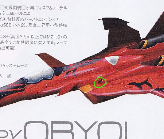
I assume that gun position is inherent to the basic Sv-52 design, not they they were moved because of racing. As for being thrusters----they could be thrusters, even "reverse thrusters", but they are cetainly not "thrust reversers". When it comes to planes and spacecraft, reverse thrusters and thrust reversers are quite different. The VF-19ACTIVE is so far the only valk I've seen with an actual thrust reverser, and like all thrust reversers---it's big! They are too small and far away from the exhaust to be part of a reverser regardless---you can't have the reverser prior to the combustion chamber, or you don't actually have a "jet" to reverse yet. Reverse thruster=retro rockets. Rockets. Verniers. Whole and self-contained. Thrust reverser=a specific type of thrust vectoring utilizing a modified exhaust nozzle. Used with jets. (technically there's a variation used with props, but until we see a prop-valk...) IMHO they're just too small to be most anything involving "air". At best--a small aux intake for cooling critical areas/parts. Certainly can't make a difference with actual air supply to or exhaust from the engines. PS---thrust reversers are important to me. Few people pay them any attention, but I like them a lot, and try to know every type and variation that exists. I really don't see anything in the Sv-52's design to indicate one---I wonder how much of the mods are Kawamori's. The whole "knee" area is different and looks like it could open up, but that's a hell of a long path for flow, and it'd still be asymmetric.
- 656 replies
-
- Macross R
- Macross the Ride
-
(and 4 more)
Tagged with:
-
Yeah, but it's a hole. That weighs less than if there was no hole. A short empty barrel would weigh little. If they were *THAT* concerned about weight, they wouldn't have intricate multi-layer multi-color paint schemes... A truly "stripped for weight" plane is bare metal.
- 656 replies
-
- Macross R
- Macross the Ride
-
(and 4 more)
Tagged with:
-
I'm not just going by "it's a hole". Look at the details, and I swear I can make out a little barrel inside in the shadows--it is incredibly "Macross gun-emplacement-port-looking". And seriously---a thruster or intake that tiny? No way. But it's a perfect gun location. And, even if it is an unarmed civilian version---they could easily just leave the barrels/openings there, rather than plate over them. If someone acquired a VF-19S, there's no need to actually chop off all 5 head-lasers and ruin the look. You can just "gut" them.
- 656 replies
-
- Macross R
- Macross the Ride
-
(and 4 more)
Tagged with:
-
Wow. I think once you hit 5 years, you should start a new thread, no matter how relevant the old one was. Let dead threads lay. Anyways---pleasantly surprised at character designs. Not too big on Panthro's sideburns, but everything else looks good.
-
I think it's blatantly a gunport in both the drawing and the model. On the Sv-51, there's nothing there. Everything just "works" if you assume they just moved the guns inboard a bit.
- 656 replies
-
- Macross R
- Macross the Ride
-
(and 4 more)
Tagged with:
-
I looked but nobody mentioned that the hip-guns weren't merely removed from their normal location----but also replaced directly inboard, to be aligned with the legs/knees. There's gunports a ways ahead of the knees. PS---the A380 has a three-piece aileron, so a five-piece one on a fighter isn't "absurd" or anything IMHO. Check it out: Makes me wonder if Kawamori had an A380 flight and saw this out his window...
- 656 replies
-
- Macross R
- Macross the Ride
-
(and 4 more)
Tagged with:
-

How many people own a green VF-27? (1/60 DX)
David Hingtgen replied to David Hingtgen's topic in Toys
How/what/where? -
Oriole? If the Su-27 is the Crane, the Sv-51/52 can be the Oriole...
- 656 replies
-
- Macross R
- Macross the Ride
-
(and 4 more)
Tagged with:
-
Really, a lot of them, but the closest is King Gojulas.
-
Gojulas Giga is (barely) a Giganotosaurus---more just because of the name and large head than any true detail. Giganotosaurus was big in Japan for a while, every toy dino for a few years there was based on a Giga, from Zoids to Transformers to Gashapon. Ultrasaurus---really, by modern standards, would be a Giraffatitan above all else.
-
Don't want any of it. Where's my VF-4/VF-0D/VF-5000/VF-3000? (I'm only asking for stuff that actually has a chance to be made some day)
-

Star Wars: Clone Wars animated series
David Hingtgen replied to BoBe-Patt's topic in Anime or Science Fiction
I liked robo-Maul, too. Again--if they made Grievous from just a brain, eyeballs, and a heart---surely having the entire upper half would be easier to work with.- 1217 replies
-
- george lucas
- dave filoni
- (and 7 more)
-
But then everyone would say it's too much of a Cortana rip-off. Needs to be a bit different. Of course, ME has already established holo-VI asari tour guides...
-
Not using Paypal eliminates most all intl sellers, and a lot of domestic.
- 8437 replies
-
I thought the F-35's engine was still acting as a turbofan, even with lift-fan engaged. But it's been literally years since I took a close look at the system.
-

Bandai DX Chogokin YF-29 Durandal Valkyrie
David Hingtgen replied to UN Spacy's topic in Hall Of The Super Topics
Well that settles it. -

Bandai DX Chogokin YF-29 Durandal Valkyrie
David Hingtgen replied to UN Spacy's topic in Hall Of The Super Topics
I'd vote for the spelling as "Durandal"---at least that's how I always see it in English. Anyways---FAST packs on the legs---look a LOT like the YF-19's. Look at the missile launchers in the front part. (right side of page, top drawing) But are they FAST packs, or integrated into the legs?

