

David Hingtgen
-
Posts
17212 -
Joined
-
Last visited
Content Type
Profiles
Forums
Events
Gallery
Everything posted by David Hingtgen
-
'Jem and the Holograms' Live action
David Hingtgen replied to Old_Nash's topic in Anime or Science Fiction
It's what people who weren't around in the 80's, think the 80's looked like. (though I will freely admit, I was totally ignorant of the "girl-power-glam-rock" scene at time, only listened to Van Halen and Bon Jovi etc) -
The Transformers Thread (licensed) Next
David Hingtgen replied to mikeszekely's topic in Anime or Science Fiction
Except for, his lower legs being so huge and blocky, they touch each other in a normal standing/walking pose. He only has "clearance" in the "half-squat" pose a lot of people use. These aren't legs, that's not a torso: "Looks sorta decent from front-view only" doesn't fly for an MP. Look at MP-10 from the back. -
I like panel lining as early as possible, as much while still on the sprue as possible.
-
Arcadia 1/60 Perfect Transformation VF-0D for 2015
David Hingtgen replied to Dark_Ghost's topic in Toys
You know very well that "exact" isn't the request here. Just "in the friggin' ballpark". Monitors don't vary THAT much. (certainly not among anyone with an eye for color at all---which the "Arcadia factory colorist" hopefully is) And they obviously know what the proper color is, or they wouldn't have posted 30 different angles of this: Arcadia knows perfectly well that's what color it's supposed to be, and posted that as their "fixed" colors to go with all the pre-orders after the negative reaction to "max blue". They just didn't get anywhere at all even half-assed close to that. They're either incredibly incompetent, or somehow said "make it navy blue" to the factory. -
Arcadia 1/60 Perfect Transformation VF-0D for 2015
David Hingtgen replied to Dark_Ghost's topic in Toys
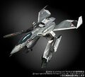
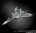
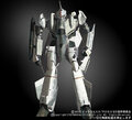
Well, here's what the CF VF-0D should look like (and these are as "right" as can be---"perfectly lit" reference shots from the M0 site back when it was airing, with no color issues from scene lighting etc----was always annoyed they never posted Shin's, or we'd have a specific shade that is "correct" to reference from) (I also have these for Nora's BTW, and they were sent to Yamato via Graham---and the coloring on Nora's turned out great--they had missed a lot of the black accents the first time, but once they got the pics, the revised version was spot-on) Sadly--the CF 0D may be about the second-most boring-looking valk around. (most boring being the CF 11C from M7) PS--if you want proof that the 0D's have light grey bellies, and not white---look at the forearms in battroid and GERWALK mode. White stripe, light grey "outer edge" of forearm. Hmmn, the Yamato 0A also came with stickers for the Wolfpack----some red stripes and logos like that would certainly enhance the 0D as well. But painted-on markings are 10x better than stickers. -
From the album: Reference
-
From the album: Reference
-
From the album: Reference
-
Arcadia 1/60 Perfect Transformation VF-0D for 2015
David Hingtgen replied to Dark_Ghost's topic in Toys
Unless they went with the second-sample colors they showed , those were perfect. -
Arcadia 1/60 Perfect Transformation VF-0D for 2015
David Hingtgen replied to Dark_Ghost's topic in Toys
They don't need to tweet test-shots every week etc. They just need to get the color half-ass correct. Yamato never screwed up a color due to incompetence after multiple attempts, the only example of a wrong color was "intentional trolling by Kawamori" of the -0A. And when they need to do anime-accurate coloring later----bam, they got it spot on. No "it turned out darker than we thought" lame twitter excuse. Heck, Arcadia couldn't even get the YF-19 right, though it's "acceptable". -
Arcadia 1/60 Perfect Transformation VF-0D for 2015
David Hingtgen replied to Dark_Ghost's topic in Toys
No, they won't learn anything. Otherwise they'd have gotten it right after hearing how wrong "Max blue" was, and how positive the response to the grey-blue pics were. Yet they ended up with almost navy, which matches nothing and was the "none of the above" out-of-nowhere color. -
Arcadia 1/60 Perfect Transformation VF-0D for 2015
David Hingtgen replied to Dark_Ghost's topic in Toys
All that is meaningless in the face of a 500-yen gashapon VF-0D that is 10x more accurate, color wise and probably took a week from concept to production. We don't need perfect----but Arcadia isn't even in the ballpark. -
Chronocidal----so you've actually flattened/expanded the rivet, and it worked?
-
Arcadia 1/60 Perfect Transformation VF-0D for 2015
David Hingtgen replied to Dark_Ghost's topic in Toys
Cancelled. There's "off" and then there's WAY off. These colors are the latter. Sigh, hope for re-release someday. (I've wanted a VF-0D more than any other valk the past decade----but it looks like a KO to me being so totally wrong) -
Arcadia 1/60 Perfect Transformation VF-0D for 2015
David Hingtgen replied to Dark_Ghost's topic in Toys
::finger hovering over order-cancel button:: -
Arcadia 1/60 Perfect Transformation VF-0D for 2015
David Hingtgen replied to Dark_Ghost's topic in Toys
Dang it, they still show this pic: Got my hopes up for a second... -
Gundam Build Fighters/Build Fighters Try
David Hingtgen replied to VF-15 Banshee's topic in Anime or Science Fiction
I just hope the Denial Gundam parts are actually PURPLE and like trans-lavender. Not "blue and pink" like how Bandai usually screws up "supposed to be purple" MS parts... -
Certainly crossed my mind, but against giving up the sales of a new Frozen DVD/BR?
-
So, has anyone successfully tightened the "middle" hinge in the wing swing-bar? That's the most important one, and the loosest one. It can make the wings swing out even when the wings are in the full-back high-speed position. (and of course, allows the wings to fall back from full-forward if a moth flies by it...) I just added some more clear nail polish to mine again, but the actual pivot is inaccessible, I can only add layers where the two bars "overlap" which has little effect. I've considered clamping down hard on the rivet with pliers, as that should tighten the joint by expanding the rivet's bottom end--but I don't really want to badly mar the metal. (moderate pressure leaves some small marks, and accomplished nothing---but you can't see it anyways, in either position)
-
I thought they were making like a 30-minute direct-to-video short? Or is this something different? Surely they wouldn't put 30 minutes of new Frozen footage with a full-length movie, for free, when they could charge $24.99 for Blu-Rays and have it sell-out on day one...
-
Gundam Figure Thread - Newtype GN-002
David Hingtgen replied to Black Valkyrie's topic in Anime or Science Fiction
Just got the RD Wing Gundam. (as in, TV, Season 1 Episode 1--you know, the REAL Wing Gundam). Very tempted to ink it up a bit---I generally don't ink in Gundam *figures* (as opposed to models), but this one really seems built for it. Of course, if I ink in this one, I'm going to have to ink in Epyon and W-Zero and Sandrock too... -
The Transformers Thread (licensed) Next
David Hingtgen replied to mikeszekely's topic in Anime or Science Fiction
Hercules totally has black tread forearms. Now, if you use the "Rage" add-on kit he no longer does, because it includes new forearms---but that's not the original design, and actually looks worse IMHO. -
The Transformers Thread (licensed) Next
David Hingtgen replied to mikeszekely's topic in Anime or Science Fiction
Toon Devy has black forearms. And "tread forearms" is a thing now. Plus, "realism". (though treads are often brightly colored on construction/farm equipment--they're not military tanks) -
I expect May 4th for next teaser.
-
Huh, I never noticed before that Ivanov appears to have darker drop tanks than Nora.