tekering
-
Posts
4294 -
Joined
-
Last visited
Content Type
Profiles
Forums
Events
Gallery
Everything posted by tekering
-

The Transformers Thread (licensed) Next
tekering replied to mikeszekely's topic in Anime or Science Fiction
That ugly-ass head is a dead giveaway. 😅 -
Actually, I'm newly OUT. I've had it with Star Wars. This was the proverbial last straw: This Amblin suburb is the most anti-Star Wars setting you could possibly imagine. Yeah, but as mediocre as Droids, as pedestrian as Ewoks, or as childish as Young Jedi Adventures was, none of them anal-raped the setting like this. It's an abomination, a blight on the brand far more insulting than anything Ahsoka or The Acolyte foisted on us. Of course it does; I'd have nothing to whine about otherwise. Are you new to the Internet? 😝
- 465 replies
-
- 2
-

-
- star wars
- skeleton crew
- (and 2 more)
-
Seriously, this is exactly what we feared we'd get when Disney bought Lucasfilm 12 years ago. I'm surprised it took this long, to be honest.
-
Robotech-branded toys are discussed in the Anime or Science Fiction section.
-
Will the stand included with the deluxe version be packaged separately, then? 🤔 It's certainly not gonna fit in that G1 box. 🤨
-
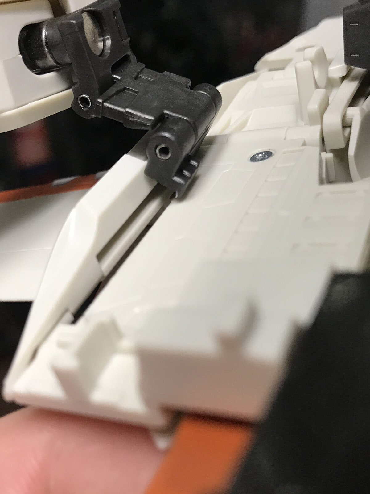
Well, you guys got me worried enough to crack open and check my extras... ...and wouldn't you know it, I got a broken fin right outta the gate. 😒 Furthermore, when moving the right arm, the mechanism completely jammed when the sliding bracket popped out of alignment. It took a frightening degree of force to jam it back into its proper position so transformation could be completed. I suppose the naysayers are right; QC is definitely slipping, and the molds could use refurbishing. 😐
-
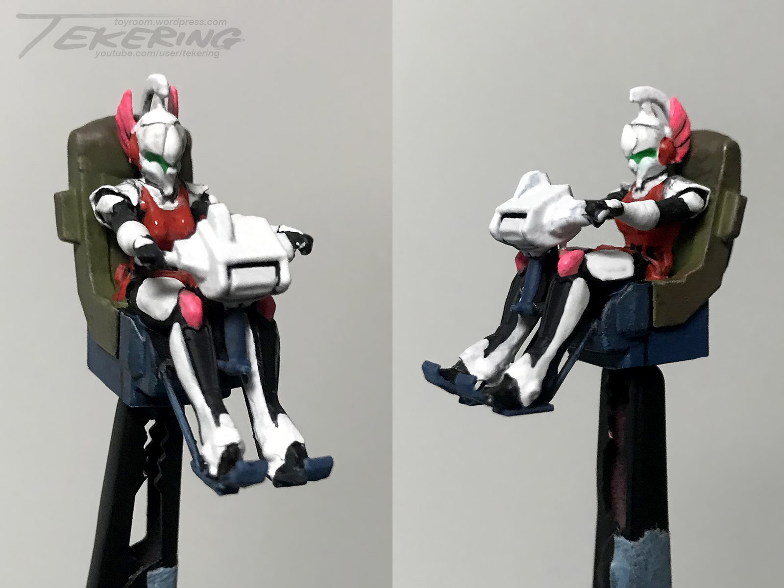
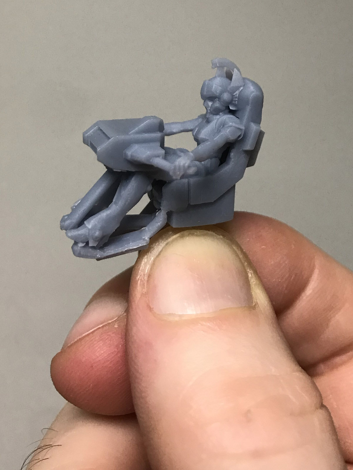
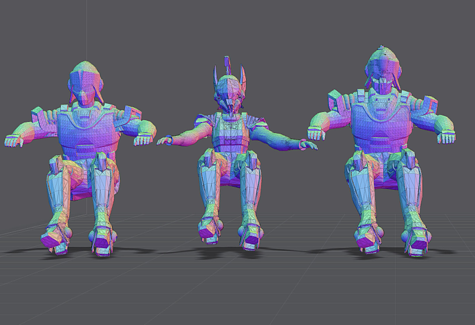
Final models to print: ...and after painting. Can't wait to mount her on her Spartas hovertank! 😊
-
Batman: Caped Crusader (Series) [Prime Video]
tekering replied to pengbuzz's topic in Anime or Science Fiction
I've been binging the first season, and so far, it's got all the same hallmarks as Batman: The Animated Series. Under the direction of Bruce Timm, we have the noir sensibilities, the mature dialogue, and the top-notch voice acting that's been largely absent from Batman cartoons since Batman Beyond ended its run. Rupert Thorne and Renee Montoya return from BTAS, and Harvey Bullock, Lucius Fox, Alfred Pennyworth, Harvey Dent, and Commissioner Jim Gordon are close to their earlier characterizations. Barbara Gordon is now a defence attorney (!), and Clayface is more Darkman than Matt Hagen... and apart from the name and the accoutrements, the new Penguin has little in common with previous iterations of the character. There's more overt violence, and characters are killed off in rapid succession, suggesting this show may be for an older audience than the classic Animated Series; however, there's certainly none of the blood, cursing, or adult content becoming increasing common in the DC animated films of late, so it's still appropriate for family audiences. It's a shame there's only ten episodes so far, though. -
With unpainted figures, yes.
-
General 1/18 Scale Figure and Toy Thread
tekering replied to sh9000's topic in Anime or Science Fiction
...because the 1:15 scale Tumbler is... not... 1:15 scale? 🤨 -
They're not toys. ARTPLA kits typically include figures at 1:24 or 1:35 scale, but you've gotta paint 'em yourself...
-
I'm down.
-
Floppy? Mine's as solid as any other DX Chogokin VF-1 in my collection... which is to say, considerably more stable than most Valkyrie toys, even.
-
The Transformers Thread (licensed) Next
tekering replied to mikeszekely's topic in Anime or Science Fiction
It's a total dealbreaker for me. X-Transbots did it better eight years ago!
-
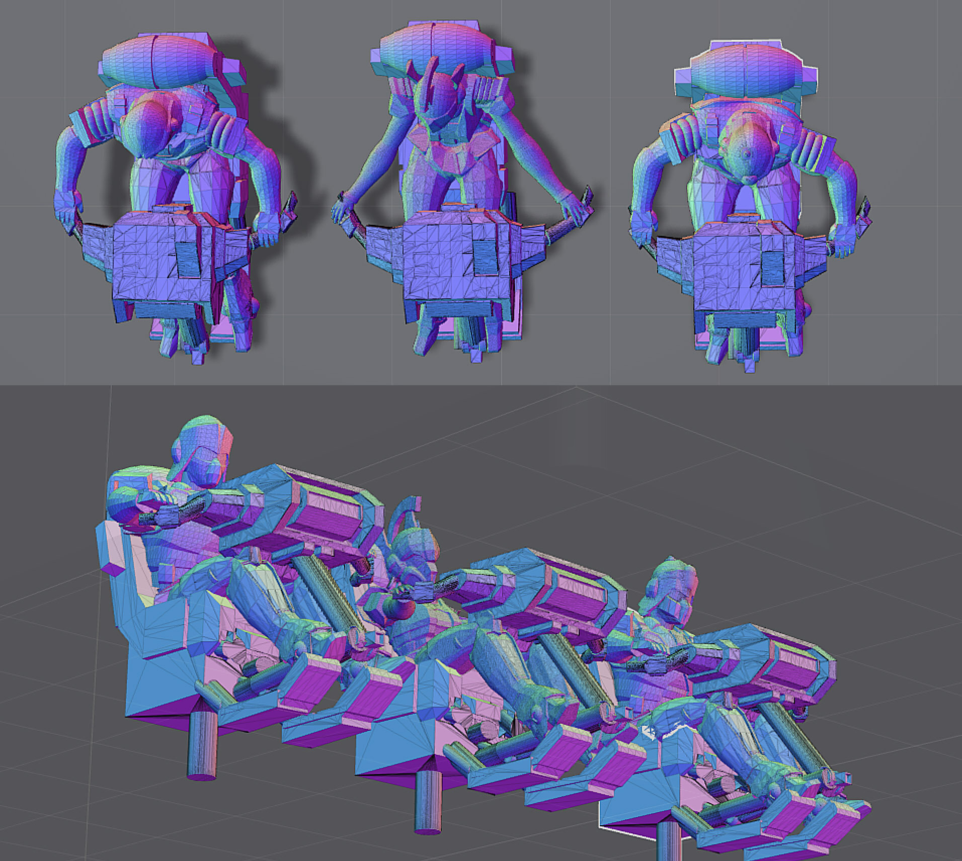
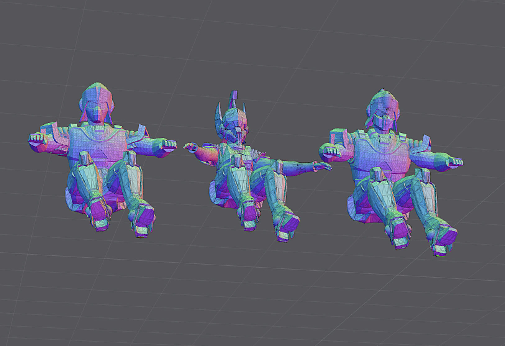
With critical feedback from @captain america, I've substantially redesigned the control surfaces and adjusted the figures accordingly: I'm much happier with ver. 2.0. Much more anime-accurate now, too. 👍 Of course, they'll be quite a challenge to paint... 🤔

-
General (1/12, 1/18, 1/24 Scale) Action Figures Thread
tekering replied to no3Ljm's topic in Anime or Science Fiction
I'd be all over these if they were 1:12 scale... but 1:6 makes them much too big (and prohibitively expensive, no doubt). -
I see the KitzConcept Glaug prototype still can't stand on its own... 😅 Too little, too late, Unix Square. Even the ungodly love-child of Valkyrie and Tomahawk? 😳
-
Hmm... definitely needs a little tweaking... ...but not bad, for a first attempt.
-
The Acolyte - Disney Plus Star Wars Series
tekering replied to jvmacross's topic in Anime or Science Fiction
https://www.forbes.com/sites/carolinereid/2024/04/14/disneys-star-wars-box-office-profits-fail-to-cover-cost-of-lucasfilm/ The presentation gives the impression that Disney's Star Wars trilogy generated a 2.9 times return on the purchase of Lucasfilm as that figure is presented next to a timeline of key events in the production company's history. However, buried in the fine print is the revelation that the purchase price of Lucasfilm isn't even included in the ROI calculation. Instead, it is purely based on the box office performance of Disney's Star Wars trilogy, its two spinoff movies, merchandise, DVD and Blu Ray sales. As revealed, the methodology is questionable as Disney based the ROI on the revenue generated by the movies, merchandise, DVDs and Blu Rays rather than the profit they made as it should have done. Using the revenue rather than the profit artificially inflates the result as it doesn't factor in the costs that Disney had to pay out. -
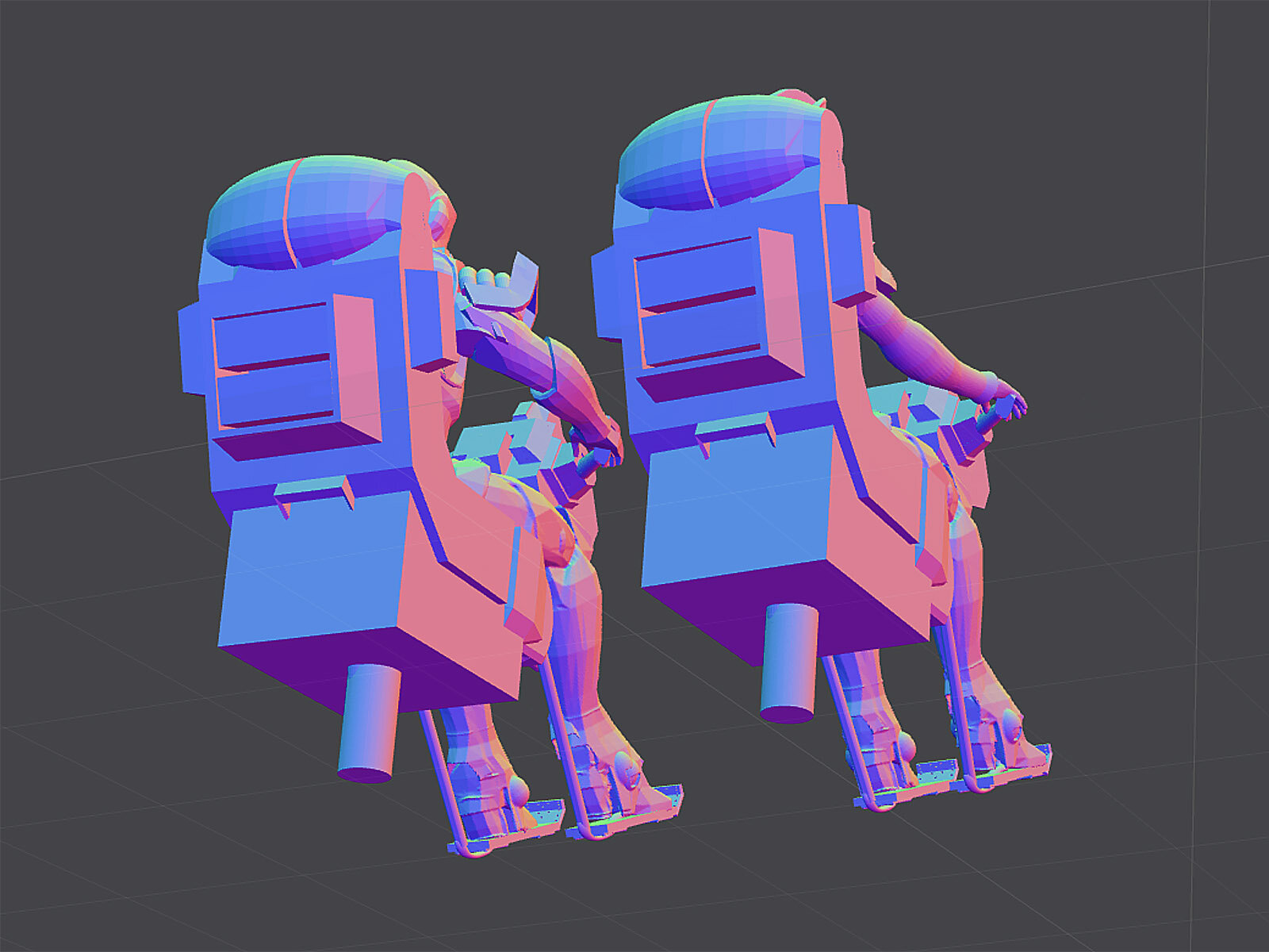
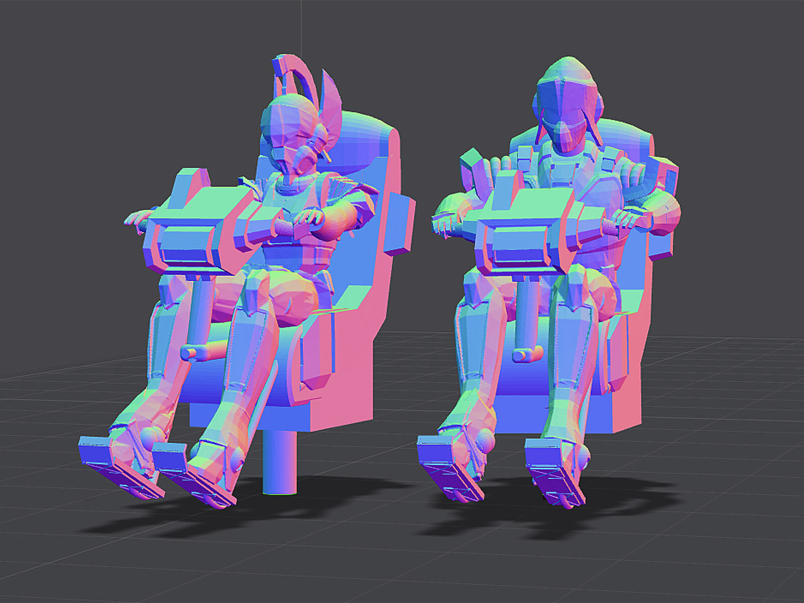
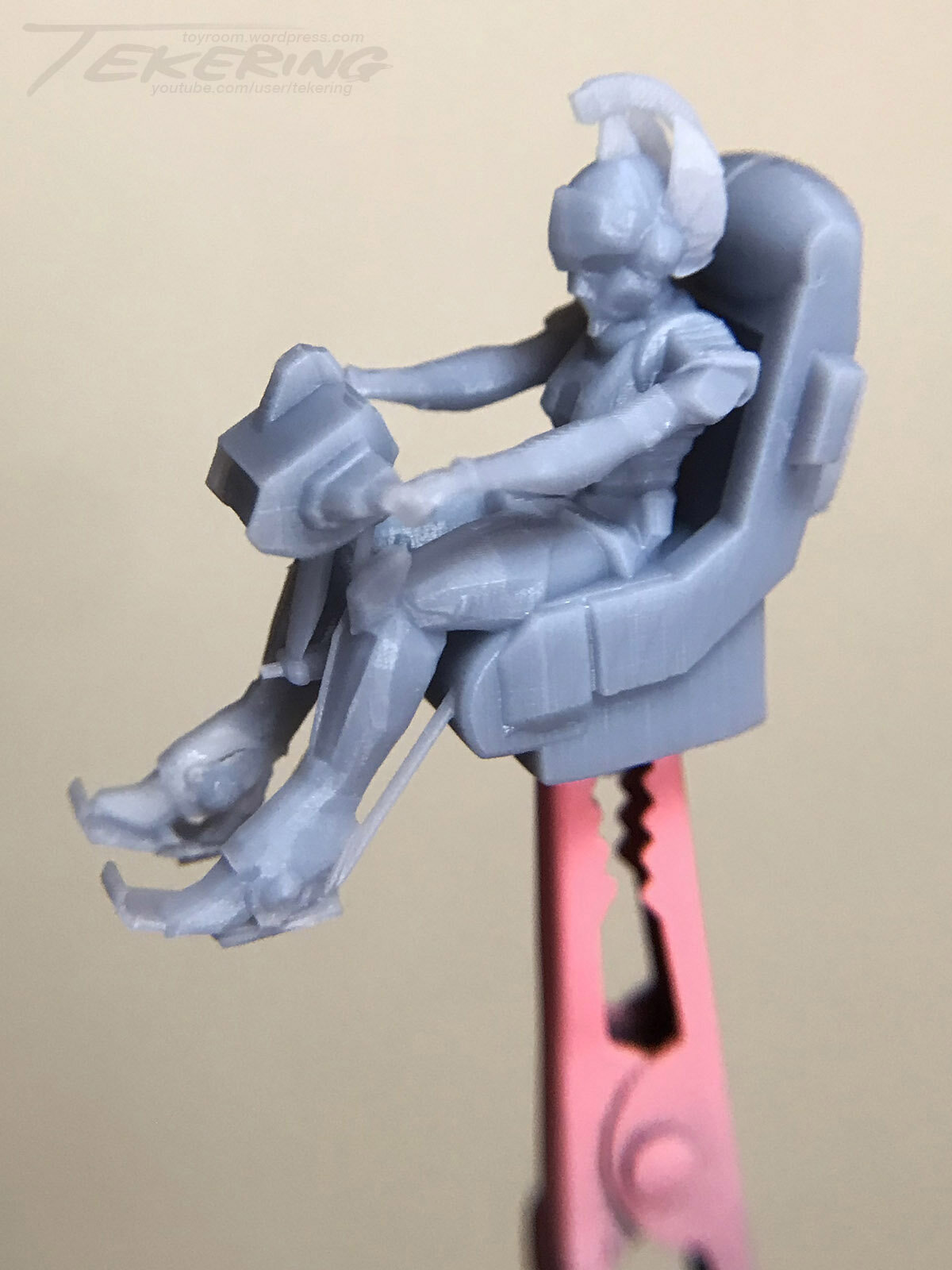
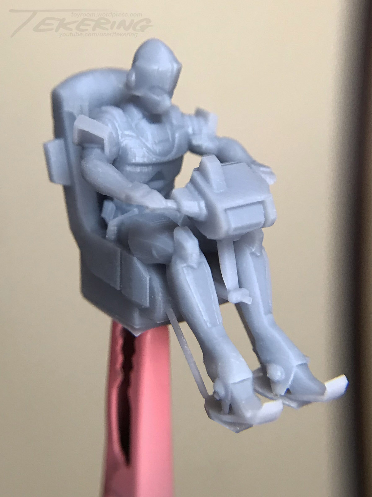
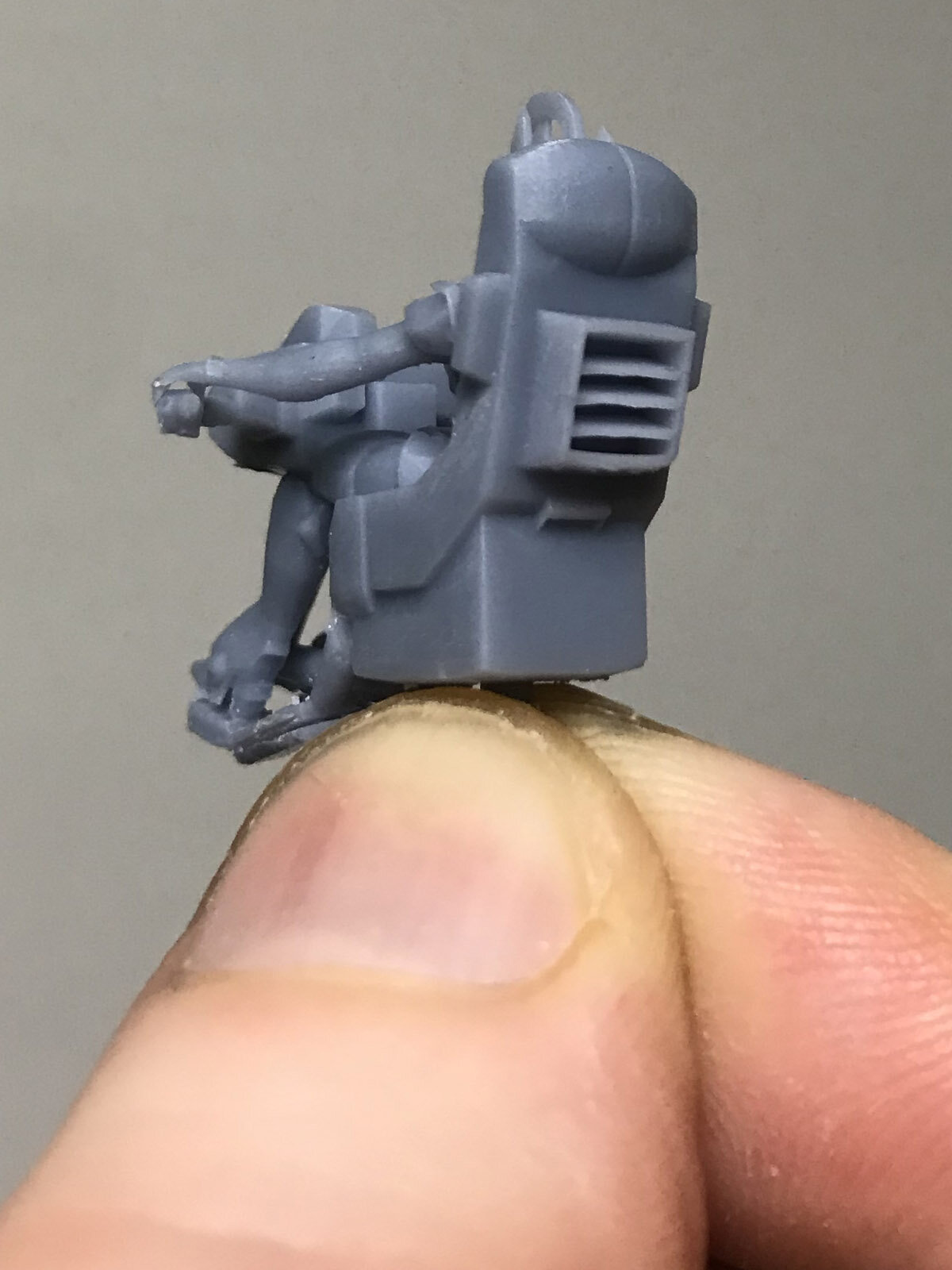
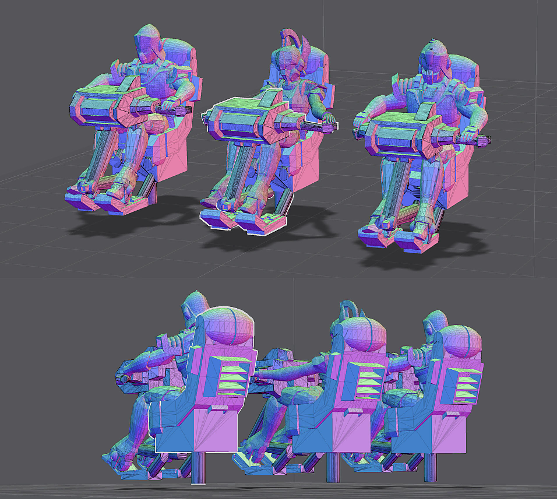
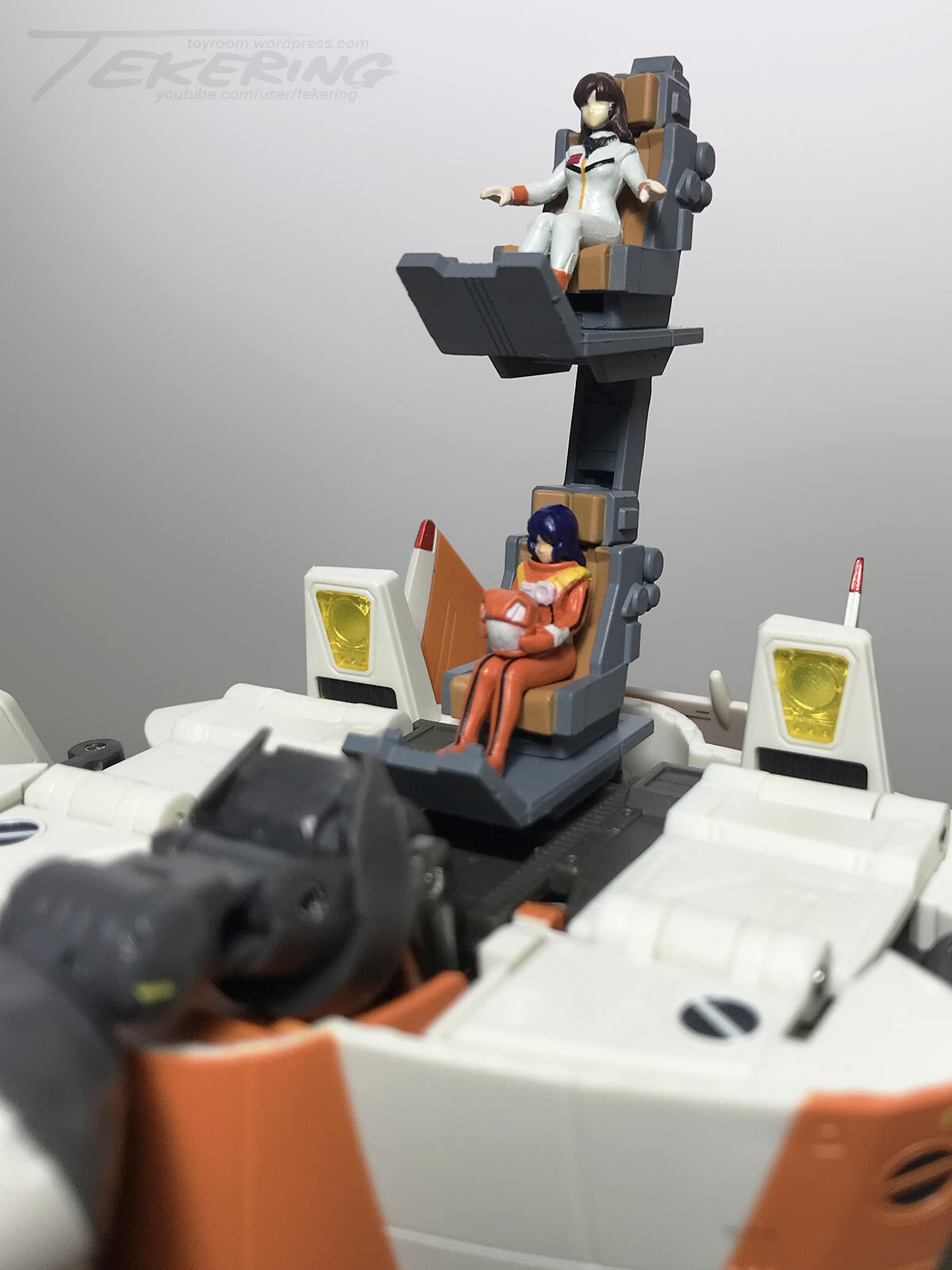
Properly seated at the controls of their respective Spartas. 👍
-
The person previously posted about presumably pushed past his prolonged procrastination: Proudly presenting proof of proper pilots to print! 😁 A positively productive period, perhaps. ☺️

-
The Acolyte - Disney Plus Star Wars Series
tekering replied to jvmacross's topic in Anime or Science Fiction
As we've already established, that's a very difficult assertion to prove these days; in the case of Star Wars, however, there are some unique indicators that suggest otherwise. Like the Toy Story or Cars franchises, merchandise is the primary revenue stream for Star Wars. Streaming viewership, box-office receipts and even theme park attendance may fail to turn a profit, but as long as retail sales remain strong, the brand will remain a success overall. Any Star Wars collector can tell you how badly Disney has damaged the brand simply by acknowledging how little merchandise is being produced and sold these days, compared to the glut of product available in 2015 (and furthermore, how much of that product ends up in the clearance bins and discount stores). Marvel is suffering as well, but not nearly as badly as Star Wars; Hasbro has all-but given up on marketing toys to kids, and is instead focusing on selling directly to Star Wars collectors online instead. Major retailers aren't buying, an obvious indicator that the property is in fact losing stupendous amounts of dosh. -
You mean these?
-
The Acolyte - Disney Plus Star Wars Series
tekering replied to jvmacross's topic in Anime or Science Fiction
ScreenRant reports viewership for The Acolyte is significantly less than half of Andor.