tekering
-
Posts
4294 -
Joined
-
Last visited
Content Type
Profiles
Forums
Events
Gallery
Everything posted by tekering
-

Solo: A Star Wars Story, in theaters May 25, 2018
tekering replied to Dobber's topic in Anime or Science Fiction
A droid rebellion, eh? Droid Rebels? The Droid Wars? Sounds familiar. -
I love how many obscure Muppet characters they managed to work into that... although I could've done with a little less of the inarticulate Animal. Thanks for sharing!
-
If your friend is serious about his art, he should really invest in an SLA printer. FDM resolution is totally inadequate for miniatures.
-
The Official Moscato Hobby Models Thread
tekering replied to captain america's topic in Anime or Science Fiction
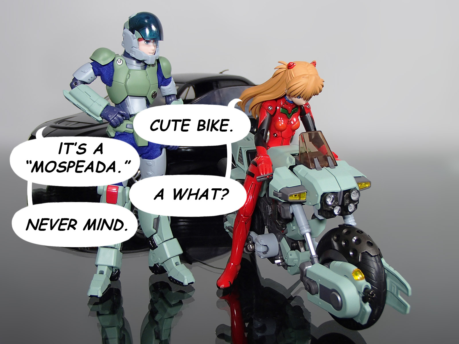
Let's be honest with ourselves, guys. We're not complaining about the barrel of Ray's beam weapon because it doesn't match Aramaki's illustration; in fact, it's damned close. We're complaining because it's so much smaller than the original Artmic designs we know and love. I'm sure what we're all hoping for -- and what we can expect our good Cap'n to deliver -- is a clip-on barrel that matches the size and shape of the classic Mospeada line art (along with a Mars Gallant H-90 sidearm, "saddle bags," and maybe even an HBT canister), matching the original Artmic designs as closely as possible... right?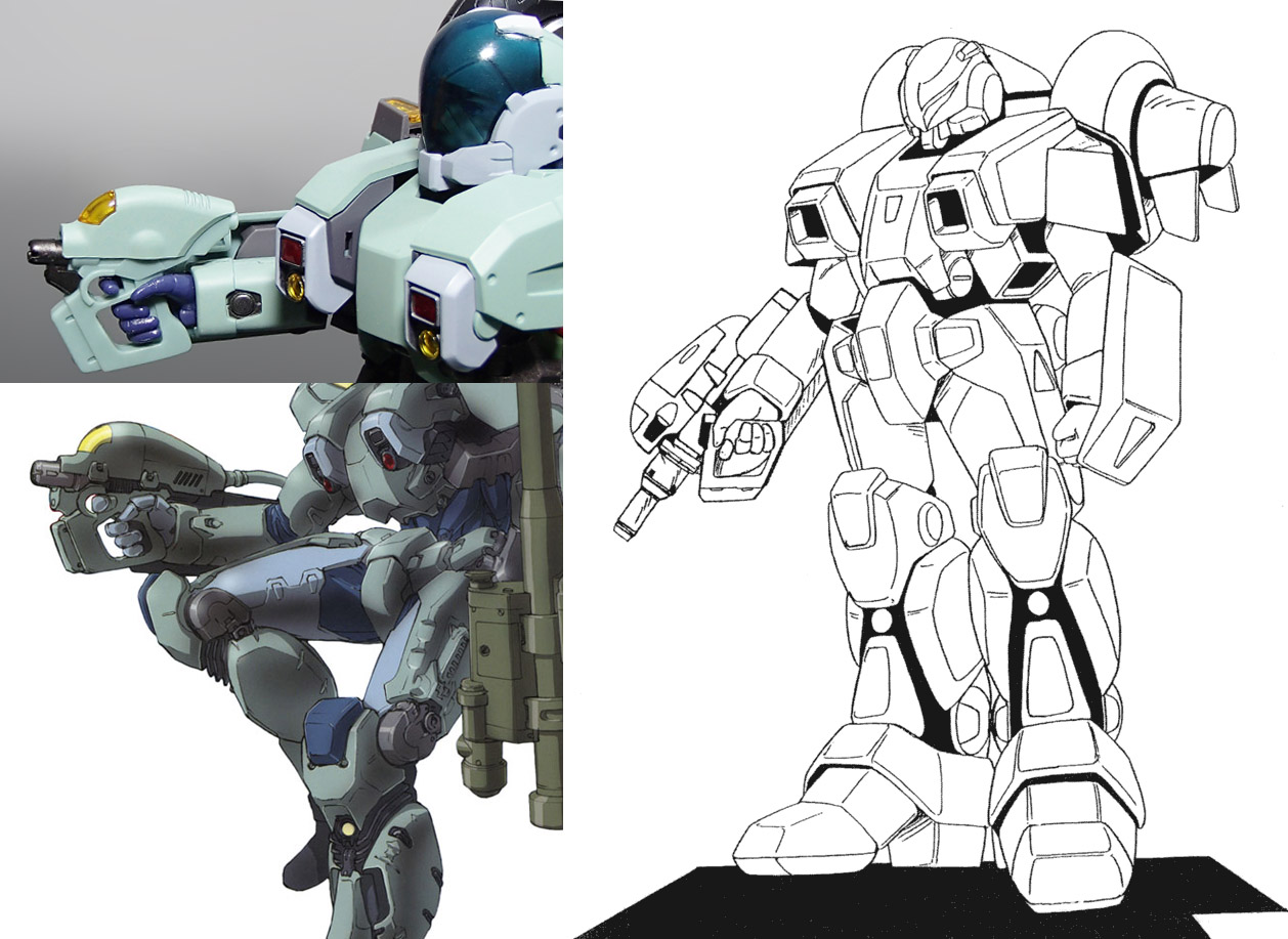
-
You're right, Votoms was just as bad. Both shows treated the female combatant as an abnormality, the otherworldly alien; the exception that proves the rule, as it were. Somehow, the Bridge Bunnies and the Pinpoint Defense Barrier crew always struck me as particularly sexist... perhaps because of their emotional immaturity in combat. (It wasn't until the '90s that anime would codify that trope, however, and a further decade before "immature girls in combat" had become a whole genre of its own.) Mospeada is a lot more mature and progressive by comparison... even accounting for Mint!
-
The bike needs to be cast in a much darker blue, too. And as unlikely as it seems, I'd hope the figure was taller and skinnier than the others; I always got the impression that the "Borough Superior" was meant for taller riders, and the "Bartley" was for smaller riders (e.g. female soldiers). Speaking of which, does it surprise anyone else how overwhelmingly masculine Macross was, compared to other shows at the time? Female pilots and combatants featured regularly in Mospeada, Votoms, Orguss, and especially Southern Cross... Gundam even had high-ranking female commanding officers. We'd have to go back to Space Battleship Yamato in the mid-'70s to find a more male-dominated military. Come to think of it, Noboru Ishiguro might've had something to do with that, since he was a prominent member of the creative staff on both Yamato and Macross...
-
The bridge does not need to be removed to fit it back in its box. The original Yamato release used exactly the same styrofoam insert, and the bridge was attached to the ship to begin with. I'm not even sure why Arcadia chose to remove it, actually...
-
The Unlicensed Third Party Transformers Thread
tekering replied to slaginpit's topic in Anime or Science Fiction
Yeah, Downbeat is definitely the best Masterpiece TakaraTomy never made.- 9558 replies
-
- 1
-

-
- fans toys
- mastermind creations
- (and 19 more)
-
The Transformers Thread (licensed) Next
tekering replied to mikeszekely's topic in Anime or Science Fiction
Chipping, dry brushing, LEDs in the abdomen... I put a lot of love into DMK-01. I'm less inclined to buy 3P figures now, since I bought the iGear Seekers, the iGear Coneheads, the iGear Specialists, Animus, Quakewave, Backdraft, Wrestle, Apollyon, Sunsurge, and Art Feather Bumblebee, representing characters that didn't have official MPs... ...and then bought MP-11 Starscream, MP-11SW Skywarp, MP-11T Thundercracker, MP-11NR Ramjet, MP-11NT Thrust, MP-11ND Dirge, MP-21 Bumblebee, MP-27 Ironhide, MP-29 Laserwave, MP-30 Ratchet, MP-33 Inferno, MP-35 Grapple, MP-36 Megatron, and MP-39 Sunstreaker. Anyone want to buy a ton of 3P figures that now have official MPs? -
Fixed that for you. Most of us living in Japan (or anywhere else in Asia) have to buy online, just like the rest of the world. Love the wall mounts! Unfortunately, I'm gonna have to start hanging my Valks from the ceiling...
-
Your most recent Macross or toy purchase! General thread.
tekering replied to Gakken85's topic in Hall Of The Super Topics
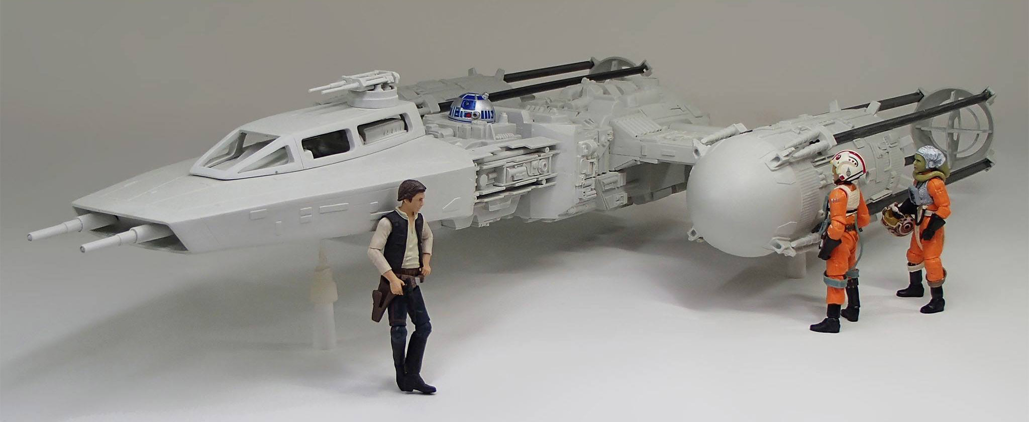
Damn, your LEGO Y-Wing is almost as big as the studio-scale bird I'm building!
-
Solo: A Star Wars Story, in theaters May 25, 2018
tekering replied to Dobber's topic in Anime or Science Fiction
Ah, good point. Let's keep Billie D out of the sequel trilogy, and let him stay where he's of most use: Star Wars: Rebels. -
Solo: A Star Wars Story, in theaters May 25, 2018
tekering replied to Dobber's topic in Anime or Science Fiction
What? A life-sized Millennium Falcon? Oh, you mean THAT Falcon. Never mind. -
The Transformers Thread (licensed) Next
tekering replied to mikeszekely's topic in Anime or Science Fiction
Very clean work, Mike! Thanks for sharing. The last movie Optimus I painted was the "Dual Model" kit, and that was years ago...- 18306 replies
-
- 1
-
-
- transformers
- toys
- (and 5 more)
-
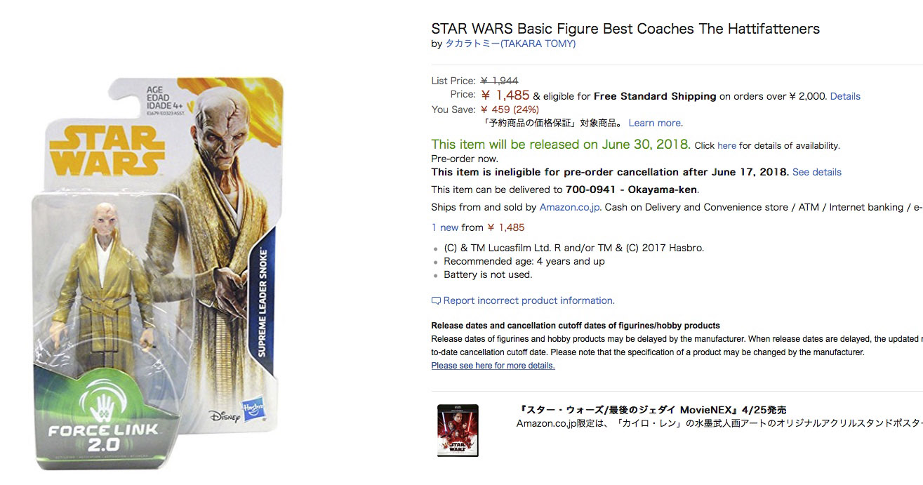
STAR WARS Merchandise Episode - 2
tekering replied to Black Valkyrie's topic in Anime or Science Fiction
Dear Amazon.jp, Please stop using translation algorithms. Seriously, just cut it out. You're ruining Skating Storm True!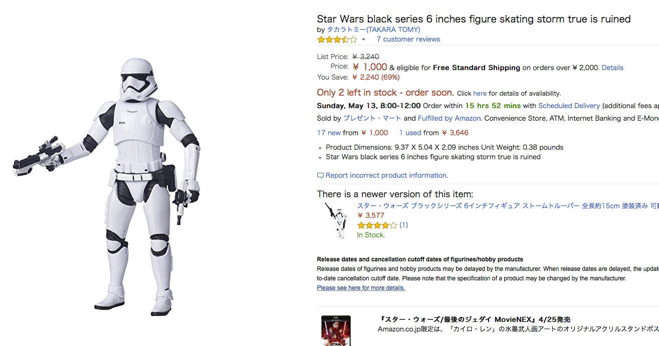
-
Way to put 'em in their place, guy! I felt precisely the same -- the production design, the technology, and the Klingon redesign closely mimic the reboot trilogy -- until this beautiful lady showed up: Okay, Discovery is clearly a reboot of its own, so we can set aside all those nagging continuity issues. This is neither the "Prime" universe, nor the Kelvin timeline; this is a new and different Trek universe again, where Sarek has an adopted daughter, Spock has a human sister, and Klingons are hairless. So be it. Oh, and way to put JJ in his place, guys.

-
Hell, it doesn't even have the elbow articulation to pull off this pose:
-
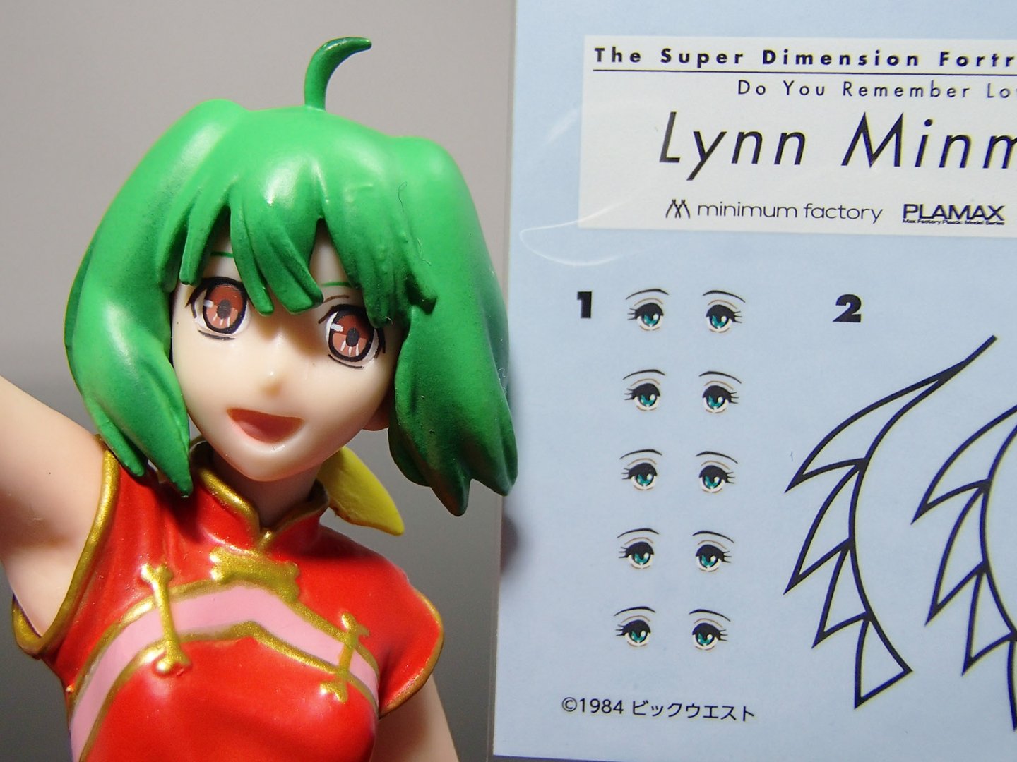
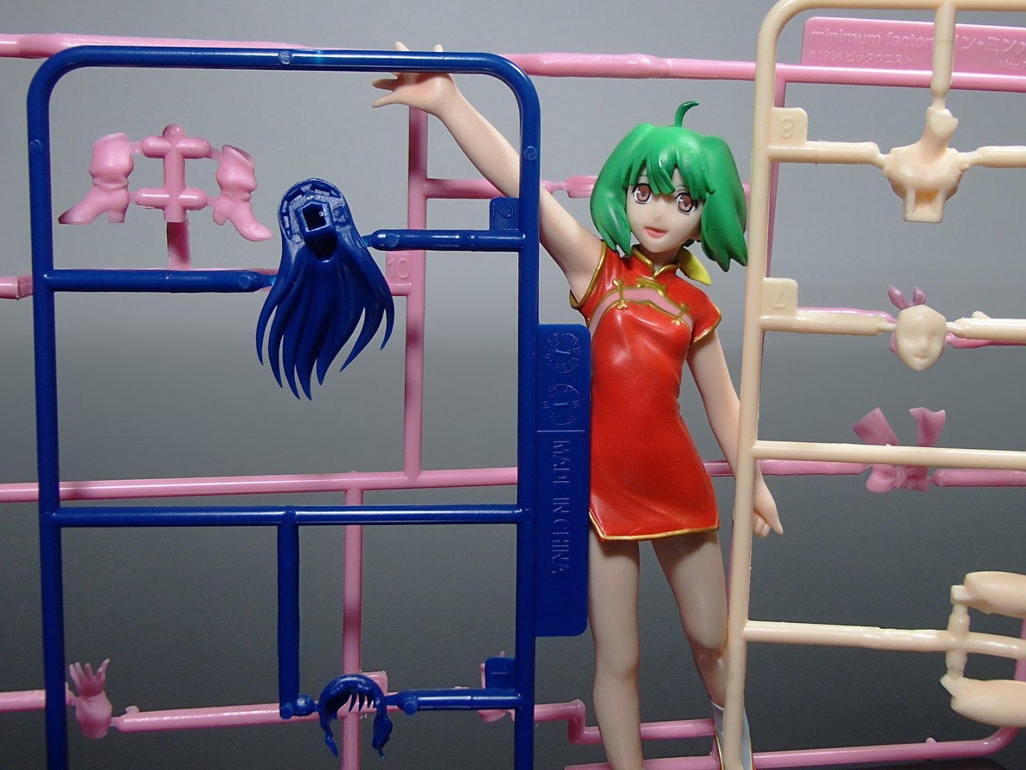
Those are Testors bottles in the background... I don't have a Minmay handy, but perhaps CMs Ranka can demonstrate the size difference for us: CMs Macross figures are 1:15th scale. Minimum Factory models are 1:20th scale. The question of quality is a far more difficult one, since we've comparing completed figures to injection-mold model kits.
-
Solo: A Star Wars Story, in theaters May 25, 2018
tekering replied to Dobber's topic in Anime or Science Fiction
Yeah, but first impressions were even more positive for The Last Jedi... -
Presumably, reissuing the vintage 1:12 Mospeada kits (the decent ones) proved successful enough for Aoshima to now reissue the 1:15 kits (the crappy ones). Ironically -- with the possible exception of the Bartley -- the vintage kits are still readily available on the secondary market anyway, so I doubt these reissues will sell well... if at all.
-
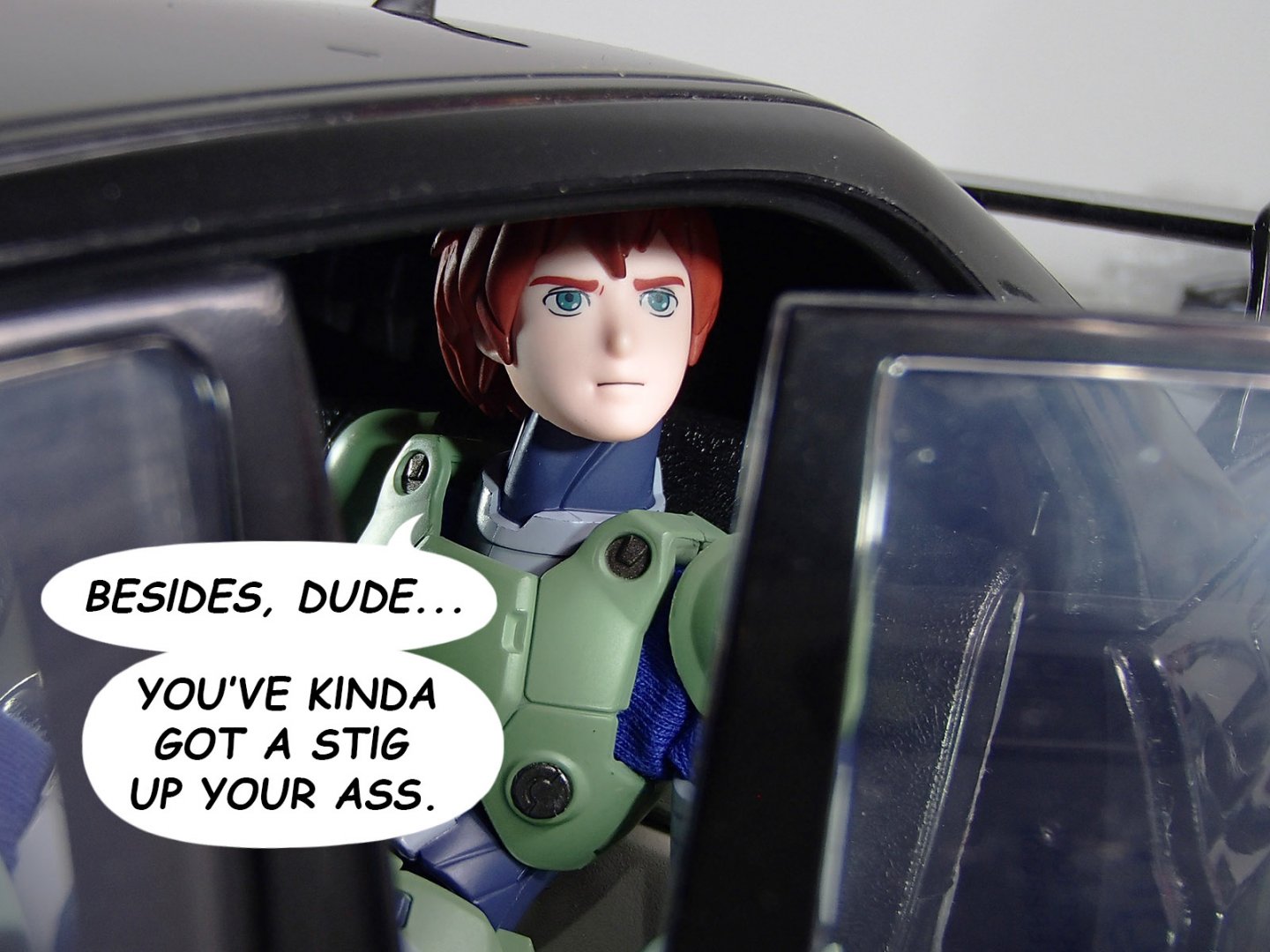
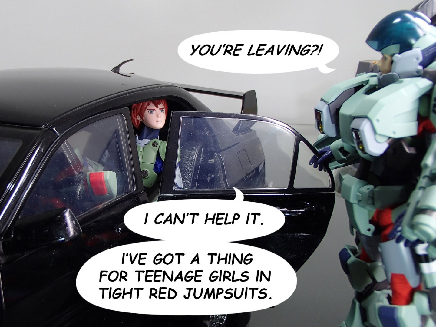
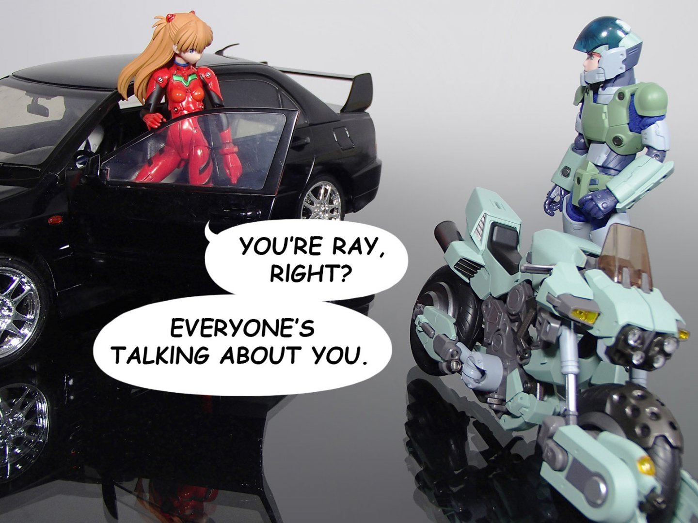
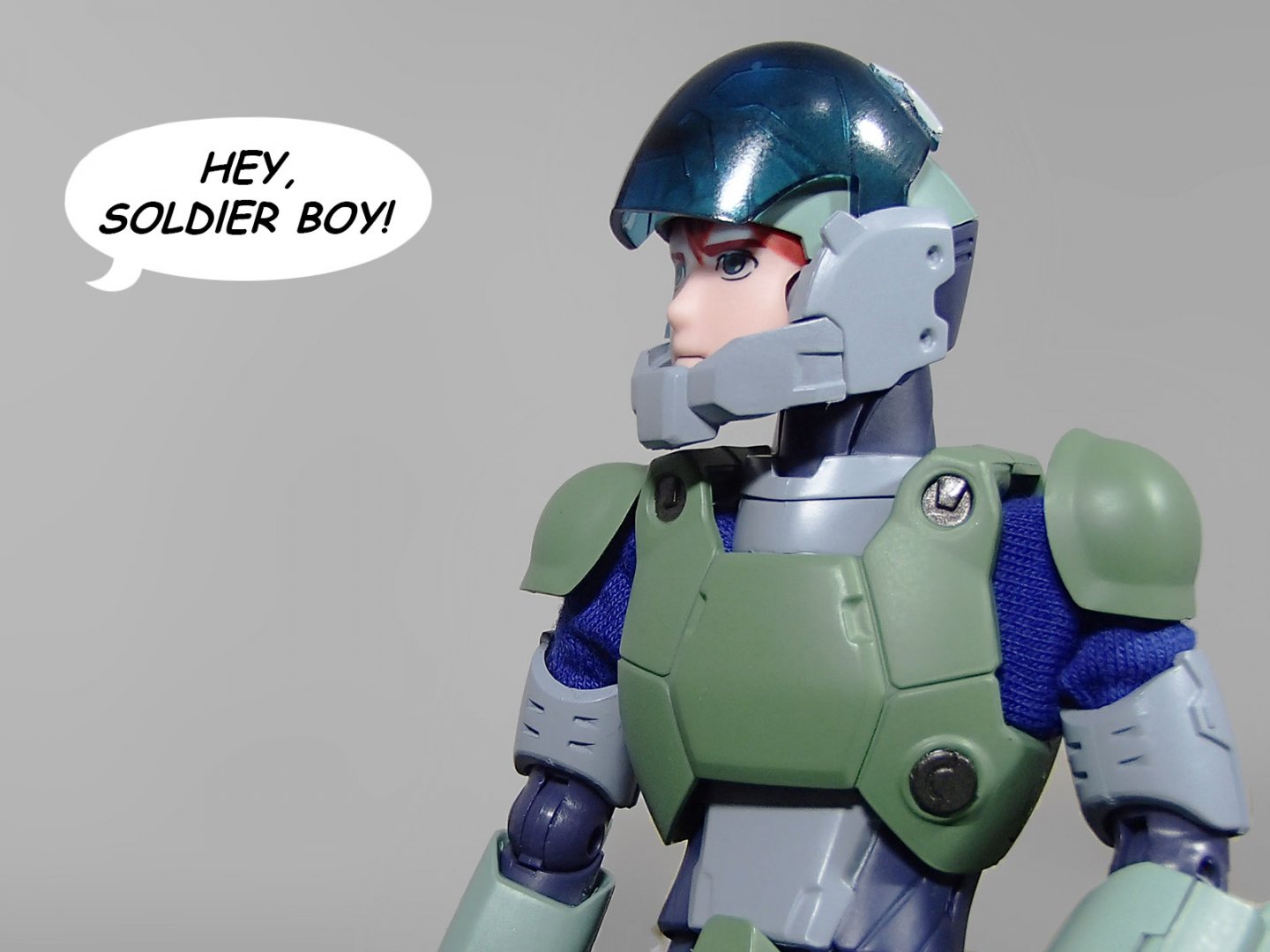
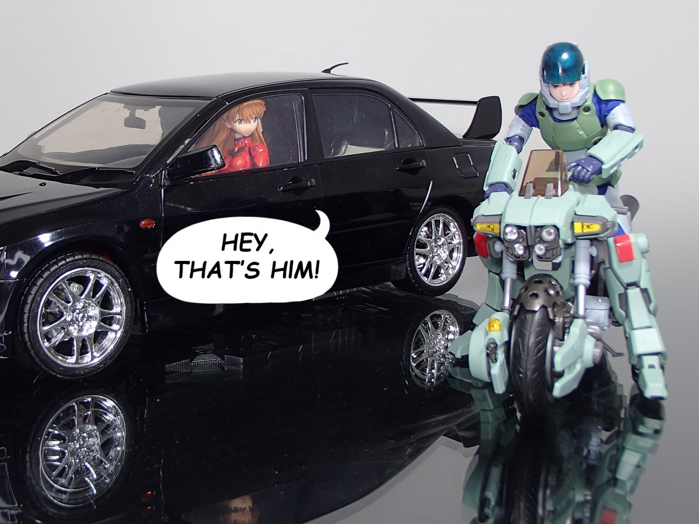
Ray is sure popular right now.


-
The Transformers Thread (licensed) Next
tekering replied to mikeszekely's topic in Anime or Science Fiction
It's a bizarre new direction for the line, to be sure... but the small but vocal toy-accurate crowd will be pleased. Thanks for sharing. Love the G1/Diaclone head on Cordon! -
The Transformers Thread (licensed) Next
tekering replied to mikeszekely's topic in Anime or Science Fiction
Yeah, but TakaraTomy has done a lot to damage the Masterpiece brand of late. The whole "+" series is flooding the market with older releases, molds that have been repainted, retooled, and knocked-off multiple times already, with only minor cosmetic changes to differentiate them from previous versions. Who wants to buy yet-another Sideswipe variant, since their original release has now been rendered (slightly) inferior? Who wants to buy yet another Datsun mold, now that Prowl's got cartoon-accurate blue windows? Who wants to buy that shitty Hot Rod mold again, seeing as it comes with a Targetmaster now? Not many, it seems, judging by retailer discounts and aftermarket prices... 40% off MP-26 43% off MP-10B 44% off MP-40 46% off MP-12+ 49% off MP-31 -
For what they're charging, I'd expect much greater accuracy than that...
-
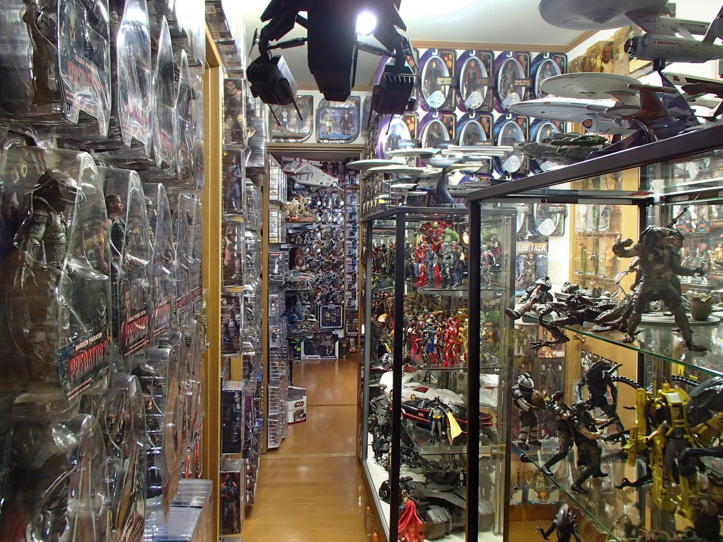
My wife doesn't object to me spending time with my toys, nor does she have a problem with the money I spend on them... She has a big problem with the amount of space they take up, however.