-
Posts
242 -
Joined
-
Last visited
Content Type
Profiles
Forums
Events
Gallery
Everything posted by danbickell
-
I actually used to work with an artist named Jason Lewis, 10+ years ago. I think I do recall that he was a Macross fan as well (and was always admiring my Club-M 1/48 Strike model that I had in the office). I wonder if it is the same guy? I haven't been in touch with him for years now, but somebody just mentioned him at a dinner I was at on Friday, and apparently he is living in the Seattle area these days. I'll see if I can get in touch with him...
-
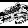
Finally had some free time today, so I got the rest of the panels cut in to the nose. I've got to get to bed, so I'll let the pics do the talking: Really needs ambient occlusion at this point, to do it justice:
-
Yet Another VF-1 Model (with GBP and SA vairants)
danbickell replied to tipatat's topic in Fan Works
LOVE the visor detail! You certainly beat me to the punch on that. Excellent work! -
Thanks! I'm really happy to hear from a guy with your background. I put a lot of thought into the nose gear, and used plenty of reference from Navy birds. A lot is borrowed from the F-14 (which is quite apparently what the original design is based on, and what they referenced for added details in the VF-1 Master Files), but I wanted to modernize it more, and used F-18 gear as reference for that. I made the decision to modernize it further with a few Macross conventions I decided to adopt, since "overtechnology" should come into play. I left out any sort of fuse box/ electrical maintenance parts you would find in the gear bays, since their electrical systems should be advanced beyond that. Likewise, there are no actuators for things like the catapult bar, since small and powerful self-contained servos are clearly used all over for transformation related mechanics. Some of that should spill over into the design of the landing gear, along with smaller components due to stronger materials. I think it is a common (but understandable) mistake to want to fill in all the details EXACTLY like modern AC. Some things should carry over, though, hence the hydraulic system and details like tie-down rings. As far as the rivets in the gear bay (that seem to be popular!), I actually went through a few revisions on those. I figured that the outer skin would mostly likely be composite rather than sheet metal, and smooth, with the exception of a few flush-fit fasteners for access under panels. The gear bays might be metal though, and part of the frame work, with conventional rivets. My first pass had more than twice as many rivets, and they were bigger (was looking too much at Tomcats for reference), but I decided that material advances would allow for smaller, stronger rivets, and went for a tighter, cleaner look (more like the Hornet). I really appreciate all the kind words! I'm motivated to get some more work done on this project, as soon as I can get some free time.
-
This is all done in Maya. It is all old-fashioned poly modelling, and a mix of subdividing primitives, extrusions and booleans, and going poly by poly. I particularly enjoy going about a project like this slowly and methodically, because we never have the opportunity to work this way in the game industry. The only high-poly modelling I ever get to do are "detail" models (to bake down normals and ambient occlusion to the game models), but the schedules are always way too tight to be able to go about it the way I would without the time constraints, and the detail levels are also still limited by the resolution of the game assets (can't waste time on details that will end up being smaller than pixels). I find it liberating to just go nuts on it, without a care about how long it takes. I will probably make a "game resolution" version of this when I'm done, with the details baked down from this. It would make a nice portfolio piece, and demonstrate "what could be" if we were ever given the time to do things "right". I know there are a few projects going on here on the forums that might be able to put it to good use, and I would happily contribute. The younger guys I work with these days are all into Zbrush, which I would love to play with if I ever get the opportunity. I do enjoy showing them how I do it the old-school way, though. I've always found that there's a very fine line between genius and mad man.
-
Thanks! Feel free to borrow whatever you want. I try to not "make stuff up" as much as possible, so most details are straight from the lineart or Kawamori detail sketches. Some of the landing gear stuff is from the VF-1 Master File solution for the mechanical issues with the original lineart designs, but I tried to throw out as much of the "apocryphal" added details as possible, and substitute the original design elements wherever possible. The hydraulic system is made up, but based on systems from modern aircraft. Something I've often said to the artists I've worked with: "Remember, good artists borrow, and great artists STEAL!"
-
Thanks, guys! I know the feeling. I've done a number of VF-1 3D models over the decades, and have often been inspired to start a newer and more detailed model after seeing others surpass my previous efforts. Seeing the growing talent here on this forum over the years is exactly what motivated me to start this one up. I feel like I need to take it to the next level and get it out of my system. (But I secretly hope somebody will come along and push it even further!) Of course, at the rate this is going for this level of detail, it will be a long time before I've got a completed model. I started in on cutting panels into the nose skin, starting with the trickiest one (and it was a pain), but the rest should be a piece of cake and go pretty quick.
-

Yet Another VF-1 Model (with GBP and SA vairants)
danbickell replied to tipatat's topic in Fan Works
That looks awesome! I'd love to see more of that J head. I wouldn't want to post pics of my landing gear in your thread, so I finally got around to starting my own WIP thread. You can see my gear there. I've done a few animation tests with it, but haven't put anything presentable together yet. My DYRL VF-1 WIP thread -
The canopy was a fun to work out as well, figuring out a hinge system that would actually work, with hydraulic actuators. Most recently, in order to seal up the nose geometry at the rear, I've had to go ahead and model the head and work out the transformation mechanism there so that everything works. I'm resisting the urge to detail the head at this point. Next up is cutting the panel lines into the nose, and getting the nose geometry "final" before moving on. I will problem texture the nose first as well, before moving on to the next part.
-
Here is a cut-away view I put together for Talos, for reference for his valkyrie profiles: The third revision of the vernier thrusters: The 2nd revision of the nose blisters (sensor version): The nose landing gear proved to be quite a challenge, requiring some compromises to get everything to mechanically work and fit properly. I borrowed the side-mounted triple-segmented main hyraulic actuator from the VF-1 Master File, re-proportioned to fit in a properly sized bay. All the moving parts are functional and rigged, including the actuators for the gear bay doors.
-
Due to popular demand, I finally decided to post a WIP thread for my current spare-time project: my DYRL VF-1 3D model. Thanks to everybody for their kind words and support, from the few renders I've posted in other threads throughout the development of the model so far. There is some great talent on this forum, and I'm happy to join in with my efforts. For those that don't know me, I'm a veteran video game developer (my most recent works were featured in Call of Duty Black Ops, Call of Duty World at War, and Call of Duty 3), and I recently came out of semi-retirement to work with some former colleagues as an art consultant at Isopod Labs. As a life-long Macross fan, this is a labor of love, that I'm working on whenever I have the time to spare. It is great to have a project like this, with none of the limitations I've always had to live with working in game development! My goal is to create the definitive, super-detailed 3D model of the VF-1, starting with the DYRL version. I want to make it as close to lineart-accurate as possible, while maintaining mechanical functionality as much as possible (which is a real trick, due to all the anime magic required to make this stuff "work"). Compromises certainly have to be made, but I'm doing my best to avoid them wherever possible. So far, only the nose section and A head have been modelled, and neither are "finished", or even textured yet. I plan to update this thread as I progress, and I welcome any and all comments and discussion. I hope you guys enjoy a little Valkyrie porn! The proportions for this model are starting with the Hasegawa 1/48 model, which is, in my opinion, the best mix of proportions I've seen yet. It has many of the proportions from the Yamato 1/60 V2 line, but refined and with much more detail. Still, it isn't entirely accurate (especially when it comes to DYRL details), so I'm doing my best to refine it. I'm a cockpit junkie, so I dove in with the most detail in the cockpit right off the bat, to get it out of my system. These are older versions (previously posted in other threads):
-

Yet Another VF-1 Model (with GBP and SA vairants)
danbickell replied to tipatat's topic in Fan Works
Thanks! My model is still limited to just the nose and head, though. You've done a nice job of putting together a complete valkyrie, with GBP, FAST packs, and weapons. It might take me forever to get to that point, at the rate I'm going. I'm too much of an accuracy-nut for my own good! You've made some interesting choices, mixing and matching mostly TV variant features with a few DYRL versions (the seat and hands). Mine is strictly DYRL, but I do plan to make a TV version as well, and your cockpit model makes me eager to get side-tracked on that! I really like the proportions of your landing gear. It looks like a nice match for the original lineart. I spent a lot of time in the last month adding functional landing gear to my model (just the nose gear), and found it quite necessary to change the proportions and re-work the main hydraulic piston to actually work mechanically and fit in the properly shaped and sized gear bay (limited by the proper dimensions for the cockpit tub, and the recessed area for the head). I'm guessing your landing gear is just a posed display model? That is probably both the easiest and the best choice, if you want it to look accurate to the lineart. Nice work! -

Yamato 1/3000 SDF-1 modification and paint up...
danbickell replied to wm cheng's topic in The Workshop!
Beautiful! That kind of panelling is exactly what I was hoping you would do, and it already looks awesome. Can't wait to see how this turns out! -
Here is a new diagram, comparing the TV, DYRL, and The First canopies: The original TV canopy had square corners in the front, and the glass was flush with the front of the frame. For DYRL, the front of the frame was has a diagonal angle cutting the corner, on both the inside and outside of the frame (though the outside is not obvious in much of the lineart, with all of the area in front of the frame painted black). The glass was revised to no longer be flush with the front of the frame, leaving a significant lip (outside the glass). There is detail within ths lip on the frame, which could either be a vent, or the attachment point for the heat shield (to allow it to sit flush in battroid mode). In addition to this, the whole shape of the top of the nose gradually becomes flat and squared off towards the front of the canopy frame (rather than being round, like on the TV version). DYRL also added the small rearward extention at the bottom of the frame, where it angles up towards the rear. The hinge was also revised, with an additional low rearward extention (not the hinge point, perhaps a locking tab). The panel lines, and the round vents rearward of the canopy were revised as well, to fit with the changes (and accomodate a slight re-work of the area behind the canopy, where it meets the chest piece). DYRL also added more of a bubble shape to the glass (bulging out more at the sides), like an F-16 canopy, allowing for more headroom and better downward visibility, and adding a more modern touch to it. In Macross The First, the front appears to combine the square outer corners of the TV version with the angled inner corner of DYRL and the DYRL non-flush step from the frame to the glass. Early issues show an exaggerated DYRL rearward extention where the frame angles towards the rear, and later the stepped rear frame rather than the straight angled rear. The hinges appear to be similar to the TV version. The DYRL style bubbled glass is apparent in some drawings as well. Here are a few quick renders of my DYRL VF-1 3D model (untextured, work in progress) to help show the DYRL canopy details: Toys and models: Yamato 1/60 V2 is a hybrid canopy. The front frame has the DYRL inner and outer angles cut in, but the glass is pretty flush with the frame, like the TV version, although squared off a bit like DYRL. The rear is pure TV version. There is also a fair amount of the bubble present in the glass shape. Yamato 1/48 is much like the 1/60 V2, but the angled front corners are undersized in proportion. The bubble shape is practically nil. Hasegawa 1/48 is a hybrid as well, despite the 2 options provided. The frames are similar, with the front outer corner angled (but undersized), but the inner front frame has no cut angles. Instead, it is a continuous straight line on the inside, but angled forward a bit (not matching anything from the shows). The rear is TV version. Club-M 1/48 is pretty close to the DYRL canopy, including a very slight rearward extension at the bottom of the frame, and the lower hinge tabs (inappropriately used as the hinge itself, which doesn't work quite right). It lacks the front step down to the glass (the glass is pretty flush), doesn't square off at the front of the canopy frame, and doesn't have enough of a bubble shape either. The old Imai 1/72 transforming models, and old Bandai models have correct TV canopies (despite the proportional/shape inaccuracies that are all over those models).
-
It isn't super apparent from the first issues. It started as a slightly exaggerated version of one of the minor canopy changes from DYRL (which none of the Yamato toys, or any other model has, with the exception of the Club-M 1/48), and then it became more pronounced in the recent issues. The new VF-1D also has a similar canopy variation, close to the VT-1 canopy frame, but proportioned more flat like the original VF-1D rather than the taller bubble VT-1 canopy. The existing Yamato 1/60 V2s all have a hybrid TV/DYRL canopy (rear frame is TV, front frame is DYRL), and nobody seems to notice or care. Even the Hasegawa model kits miss these minor differences, and I think Yamato could get away with leaving the canopy as-is.
-
I would be in for one, if they get it right. I'm not a fan of that Wave conversion at all. The head sculpt is poorly proportioned, and doesn't reflect the way the re-design appears in the manga very well. The re-design isn't proportionally very different than the original J head, it mostly just has added details (that I happen to like). I'm also a fan of the new paint scheme. I've always liked the J model, but Hikaru's old paint scheme was simplistic and kinda boring. It hasn't aged well, and that's why they changed it. I'm in, if the new sculpt looks more like this: As far as the pilot, they did change up the flightsuit design a bit as well: I'd also be in for the Macross The First VF-1D as well. I think it is a great update, and as much as I love the VT-1, I'm glad they stuck with the D and freshened it up. Definately bring on a Macross The First SDF-1 too. This one is a no-brainer, using the existing 1/3000 molds with Daedalus and Prometheus.
-

Yamato 1/3000 SDF-1 modification and paint up...
danbickell replied to wm cheng's topic in The Workshop!
Looking awesome so far, and can't wait to see what you do with this amazing toy! I'm not sure I'm sold on the idea of pencil lines, though. It worked well for the studio scale Star Destroyers and the Galactica because they were huge models. A 1/3000 star destroyer would only be about 21" long. On something this size, I feel it will hurt the sense of scale more than it will help. Those pencil lines would be at least a few feet in width, scaled up 3000x. I'd like to see something more like the "aztec" panels on the Enterprise refit from Star Trek the Motion Picture. It would be more labor intensive, but masking off thousands of tiny panels, sprayed in grays with very subtle differences (in both color/value and sheen) would look the best, in my opinion. Despite it's shortcomings, I think Wave was actually on the right track with what they did on the "movie color edition" 1/5000 toys. The panels are just much too big, and the color differences aren't nearly subtle enough. -

Macross & Robotech game in unity3D, call for artists
danbickell replied to SeminNV's topic in Fan Works
This looks promising! I might be interested in contributing. I've had a new VF-1 on the backburner, but I've mostly just been going crazy with the cockpit: I'm a semi-retired game developer (most recent work on Call of Duty - World at War), and this might be just the thing to get me motivated to work on this stuff some more. I was planning to do game-rez versions of this model anyway (with textures baked down from the high rez models). And yeah, if you know what you're doing, you can actually paint normal maps (instead of baking them) to great effect. Here's some game models I did with normals hand painted: Baked is always better, though, if you've got good high-rez detail models. Likewise, baked ambient occlusion from a high detail model helps immensely for the rest of the texture work, not just the normals. -Dan Bickell -
I saw the Bandai 1/72 VF-27 model kit at a store today, and thought of this thread. I bet the kit instructions have nice ortho line art that would be a great starting point for a 3d model. I have often purchased model kits for artists to use as reference, and found that to be very useful. Anybody have the kit, and care to comment, or better yet, scan the pertinent instruction pages for Starscream?
-
Thanks! The last time I started a VF-1 model was 10 years ago (had a month off between jobs), and I never got past the cockpit. People gawked at that one at the time, but it was surpassed many times over in the years that passed. Now that I've been between jobs again, I've finally had the time to go back to the drawing board myself. As I've often told the artists working under me (whenever they would lose data, or have to re-do a model for some reason), "it always gets better the second time." Nothing improves an artist's work like competition from other artists, and I've always tried to maintain a competitive spirit within the teams I've managed. I would always try to set the bar for the level of quality we would shoot for, and wait for someone to eventually surpass that bar. Then it was time to go back to the drawing board and figure out how to raise the bar higher again. As far as the battroid cockpit transformation, I have studied all the available reference to death. My only conclusion is that it is anime magic. With the TV cockpit, the seat moves up higher in the chest than it does in DYRL. With that, and the ambiguous details throughout the cockpit (the lineart and frames from the show seriously lack consistency), there is plenty of wiggle room to make up something workable. The "box" behind the seat must come apart and form the screens. Otherwise, there is no place for it to get out of the way for the seat to be able to move upwards to the battroid position (much less move all the way up to where the head normally sits). The DYRL cockpit is a different story, though. The lineart is remarkably consistent, down to the details. The seat rotates, but doesn't move up much (if at all). This can be clearly seen in Roy's death scene, and the front instrument console can also be seen down near the pilot's feet in some of the lineart establishing the lower battroid seat position. The rear "box" unfolding to become the battroid cockpit screens is problematic, though. I can't match any of the details (again, very consistent) on the backs of the panels with anything on the "box", or anywhere else in the cockpit. At least the seat being able to move up through the neck area isn't present in DYRL, as this presents another problem with the details on the back wall of the fighter cockpit. Those big vents (and the ducting that has to behind them) would have to get out of the way somehow too. Likewise, the vents present on the exterior behind the cockpit (including the large vent added behind the canopy) would require ducting inside, and this would all be in the way of the TV-style neck exit. Ok, so are there other places the screens could come from? The arm-rest consoles are out for DYRL, because the lineart clearly shows that the arm-rests extend out from them and angle along with the seat. Thusly, my plans to make a functional transforming cockpit model will have to wait for the TV version. I've tried to maintain the consistent details from the DYRL lineart in their entirety. I'm adding details where I think they are needed, but I don't want to retcon or delete anything to facilitate the battroid cockpit transformation. I will probably make a separate DYRL battroid cockpit model for this reason. Then there's the 2 seaters... which need 2 sets of screens, that come from where?!? There's no "box" in the VT-1 or VE-1, and only 1 box in the VF-1D. Pure anime magic there, unfortunately. I chose to start with the DYRL cockpit because there is so much good and consistent lineart for reference. The design is so much refined over the TV version, that it just seems to be the best possible starting point. In this case, reference is everything. VF-27, on the other hand, should be MUCH easier. The virtual cockpit solves a lot of problems. This helps illustrate something that might be a lesson to learn in this thread: sometimes, lack of reference can be a huge godsend to the artist. You have to be more creative, but there isn't much to get "wrong" if it hasn't been previously defined.
-
Yeah, sorry for the confusion! That's the cockpit from my new VF-1 model, early work in progress, per Doktor Gonzo's request. Didn't mean to thread-jack, but hopefully it will draw some attention to the thread. I'm a big cockpit junkie, myself. I'll probably end up side-tracked on a TV cockpit (loads more detail than the cleaner DYRL design) and nose variant for that before I ever get around to the rest of the valk. The VF-27 cockpit will be an interesting subject to pull off, especially to do the virtual cockpit. From time to time, I've thought about ways to do the VF-19 cockpit using virtual cameras to generate live maps for it. I'd love to see it done for the VF-27. So come on guys... Let's get some reference together for Starscream!!
-
I've been enjoying semi-retirement, finally finding time for all the projects left on the backburner over the years. I've been talking to a few studios, but I'm in no rush to go back to the grind. Been working on a new VF-1 model, but I haven't got far beyond the cockpit yet, and no texture work yet. Here's a few progress renders of the geo:
-
@Ganbare: I left Treyarch last year, during pre-production for Call of Duty Black Ops, for personal reasons. It would be unprofessional of me to comment on the details, but there were similarities to what was going on at Infinity Ward. The difference is that I (a mere art lead) chose to walk away, rather than fight the power like Vince and Jason (co-founders of Infinity Ward) did, which eventually got them fired and prompted lawsuits. There is a ton of public information about what went down at Infinity Ward. A good place to read up about it is here: http://kotaku.com/tag/callofdutylegalwarfare/ @Starscream: Sorry about the thread drift! That certainly was not my intention. I don't have much as far as Macross Frontier books, and the VF-27 seems to be completely absent in what I do have. I'd be happy to give you feedback when you get your model going, though.
-
Not familiar with him. I looked him up, and he was one of the testers from the basement at Activision. As a developer, we rarely had any interaction with those guys. I take it he's trying to move up to a developer job as an artist? That's cool. I've often said that getting a job as a tester is one of the best ways to get your foot in the door in the industry. Good luck to him, and you, in your endeavors!
-
What's your cousin's name? I was one of the art leads on CoD:WaW at Treyarch, so I should know him.

