-
Posts
3531 -
Joined
-
Last visited
Content Type
Profiles
Forums
Events
Gallery
Everything posted by Reïvaj
-
It hasn't been mentioned, so I guess not. It could have been a nice touch.
-
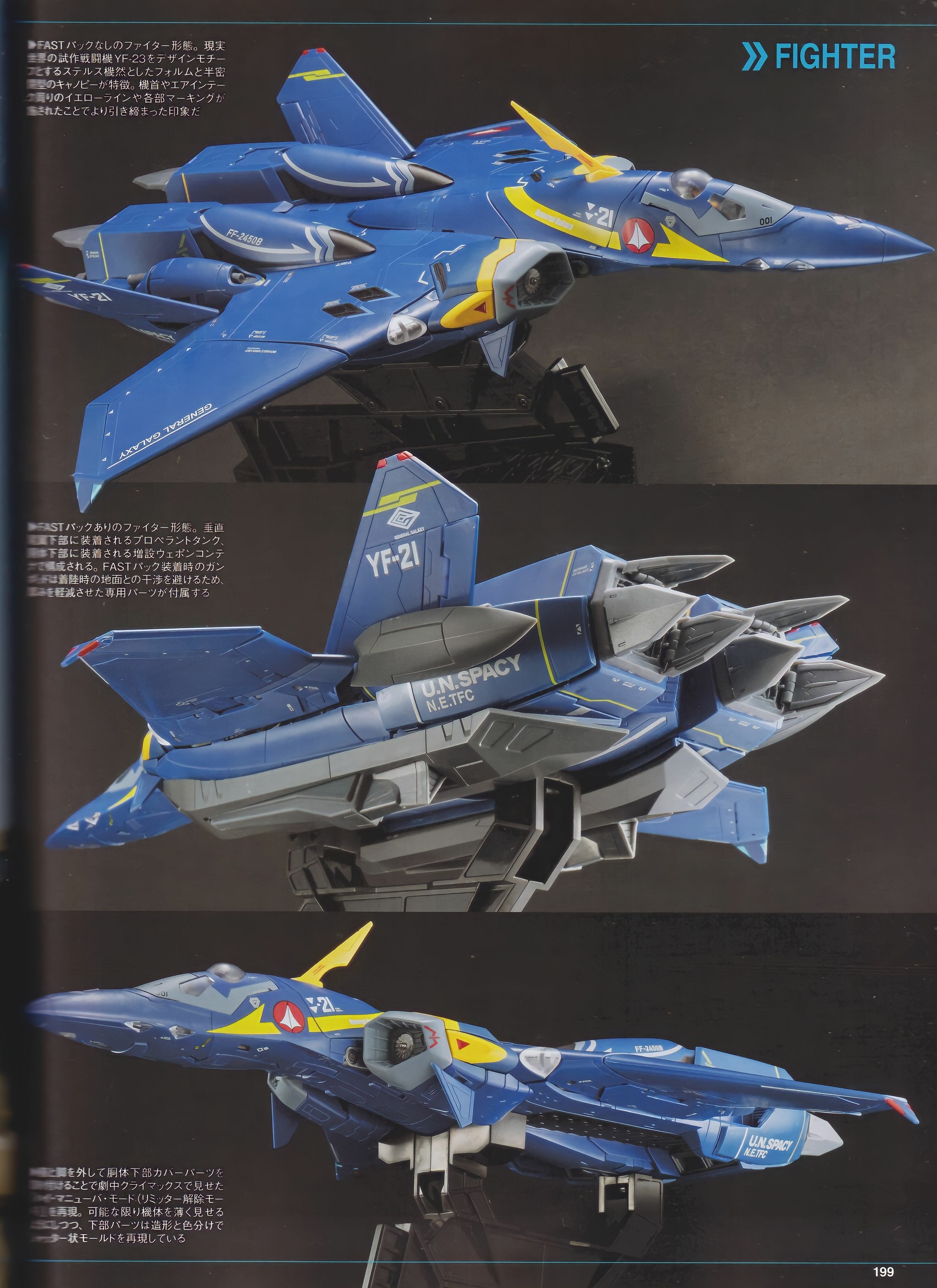
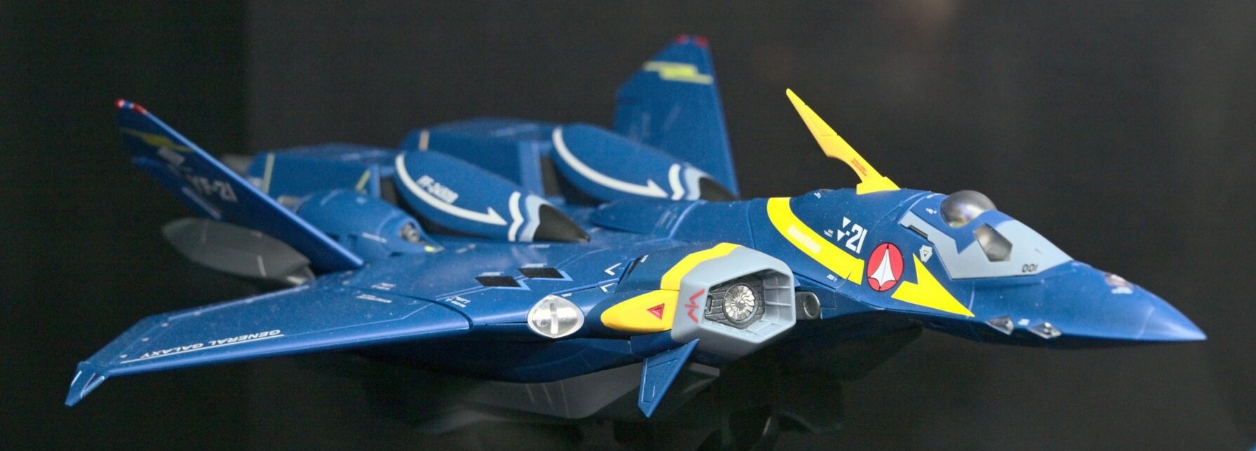
On the contrary, I could leave some of the lettering, but all that striping... In fighter mode, it looks like it wears a kilt:
-
Yeah, I remembered what @tekering did, kid of a bold move but the result was great! There may be a phone call to Mar del Plata to share some ideas... Thank you very much, sir!!!
-
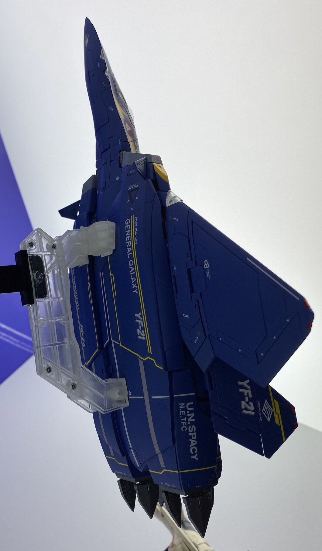
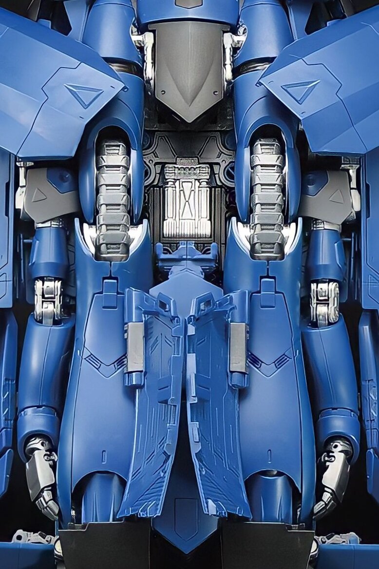
I think it's mostly ok when seen from above, but I really dislike all the mess that's going around the belly plates. I think the design of the lines is very bad, not to mention they're completely uncanonical.
-
I'd also say that the Bandai new version is much more complex than the Yamato one and comes with more extras. It also has an enormous amount of die-cast and tampo, which adds some value. By the way, any advice about how to remove the tampo without affecting the plastic?
-
Double post.
-
Ha ha ha!!! Yeah, dreaming is for free...I myself would like them to completely redesign the belly plates. Oh, and the shoulder plate too!
-
Funnily enough, a bigger face is one of the few changes there's been since the earlier prototypes...
-
IMHO, this fighter looks really good, specially when you disregard its underside by leaving it in the shadows... 😅
-
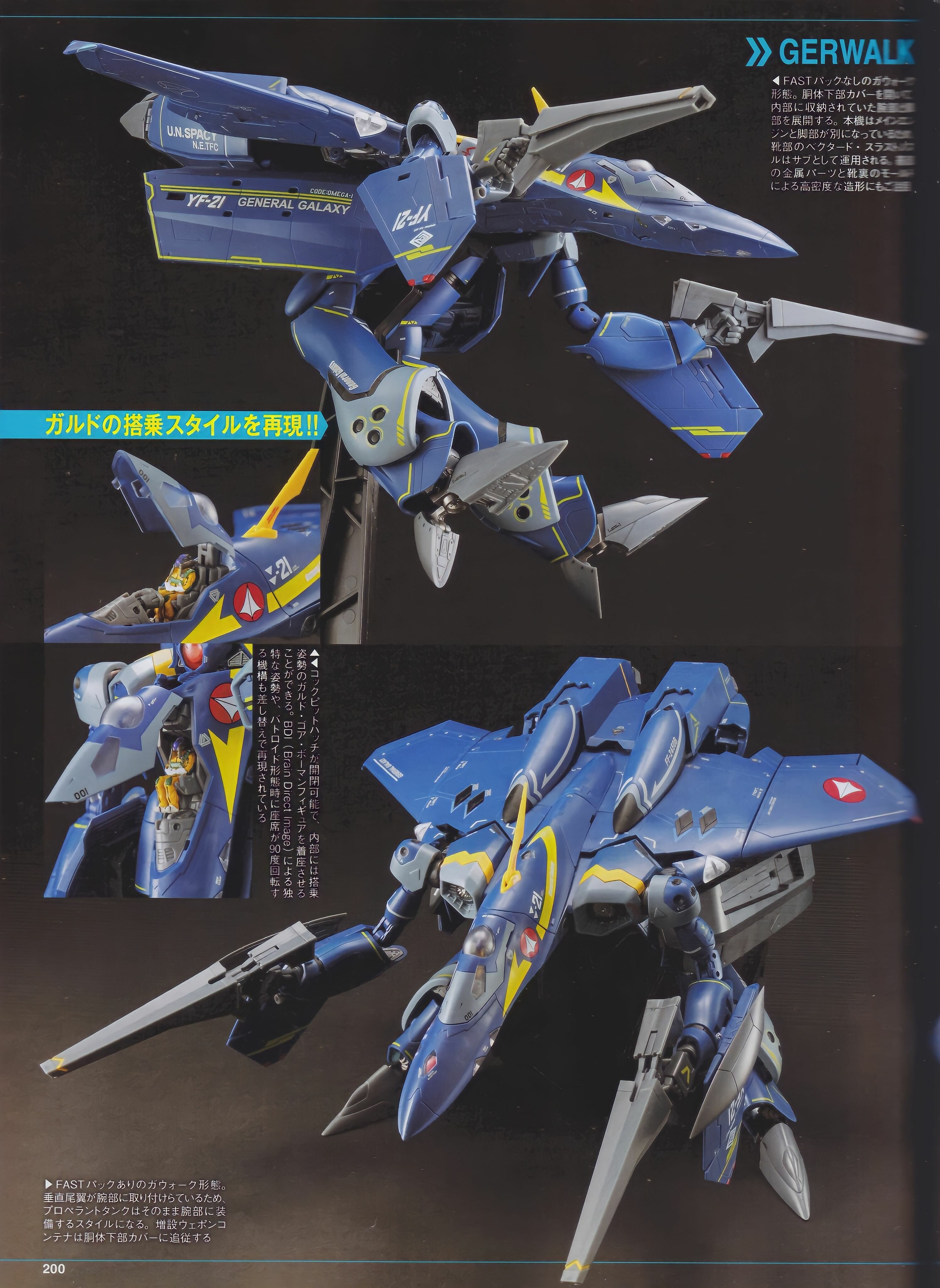
It looks like it's exactly the same feature than the Yamato's. I don't think many people have chosen the limbless configuration to display their valks along these years, that's probably why we haven't heard a lot about missing arms 😆
-
I would like them to offer these parts without applying those colors, it would be more in line with what we see in the anime and, IMHO, much more pleasing to the eye.
-
Your first photograph shows a stage of the transformation. The backpack has to be lowered a little to its final position, which is the one in the second photo. And you're right, there was a modification in the way and position in which the backpack collapses between the first prototypes and the last ones. I'm planning to make some comparisons between all the things that have changed, which are many, I just haven't found the time to put together all the material I've collected.
-
And don't forget to leave the belly in the shadows...
-
Hahaha!!! Funnily enough, from those angles I prefer the looks of the fighter mode over the one of the battroid!
-
It really looks like that.
-
Although I really like the level of detail on the YF-19 - I mean, I think it's used well - I'd like to get my hands on the toy to see if this is used with the same success on this YF-21. And I hope so, because on the other hand I don't really agree with some design decisions...
-
If eventually the tampo gets to be anything as heavy as what we've seen so far, I'm prepared to eliminate a bit of the excess, specially some of the yellow and white lines...
-
-
Wow, I do love that scheme!
-
Gracias, Ignacio!!! This is exactly what I wanted to see!
-
I really hope so, fingers crossed!!!
-
I wouldn't mind a DX VF-11, but hey, this is a wish list, isn't it?
-
Nothing to say here, sorry.

