-
Posts
1623 -
Joined
-
Last visited
Content Type
Profiles
Forums
Events
Gallery
Everything posted by Mercurial Morpheus
-
Actually, all digital codecs have compression artifacts. h.264 is just better at low bitrates than mpeg2. It's the very nature of lossy compression. It makes the file smaller by removing redundant information. It's the very reason why I hated lossy compression so much in my youth. If you want to see this in action, open a gif animation in something like the GIMP. If it's been optimized, you can see just how much image is cut. As far as I know, only the movies are on blu-ray, and the wait was less than a year, so your info is a bit off. If not, WHY WAS I NOT INFORMED!!! I'm well familiar with the XO project and LD rips in general, being one of the Star Wars fans TheLoneWolf mentions. That's precisely the reason we do it. The GOUT is just so buggy. They're LD master themselves. OT.com is the best Star Wars site out there. As for this project, capturing analog to digital is tricky business. Analog does have it's inherent problems, and I love it to death saying that. We've come a long way since the days of VHS fansubs hastily ripped to PC using Real Media and WMV or mpeg1. You might want to talk to some of the fansub groups that specialize in LD rips. For Macross, I don't think you need a godawful expensive X0. It's the best out there, but Star Wars needs it since it's live action. 80s animation has only so much detail to pull out of it. I'd say get a Pioneer, and do a test rip first. See if the video quality meets your liking. Also be ready to clean up the video. Forget 1080p upscaling. There's no point to that except to inflate the filesize. At most, upscale it to 720x480. You're not adding any resolution do this. Don't capture in avi either. No point in doing this with the idea of escaping compression just to look your rips in lossy compression. That's detrimental to the very concept. Use a lossless codec like huffyuv. I know this project was born out of mpeg2 compression, but loading it back to DVD still requires converting to mpeg2. Remember to properly calibrate your monitor. I will admit that i didn't see much of a point to this project earlier. Since I've been comparing restorations though, I have a piqued interest. There was an AMV released about ten years ago called One Day More. It used the 15th anniversary TV set. It looks pretty damn good, and I think the colors might be better than BV remaster. It seems like a happy medium between AnimEigo's soft touch, and Bandai's heavy hand. AMV.org page (ignore the youtube compression). Since I see new worth as a way to better preserve the old color palette, have you considered the histogram approach? Several people have fixed the blue cast on Star Wars using histograms from the LDs.
-
SDF tv animeigo vs new remastered
Mercurial Morpheus replied to boinger's topic in Movies and TV Series
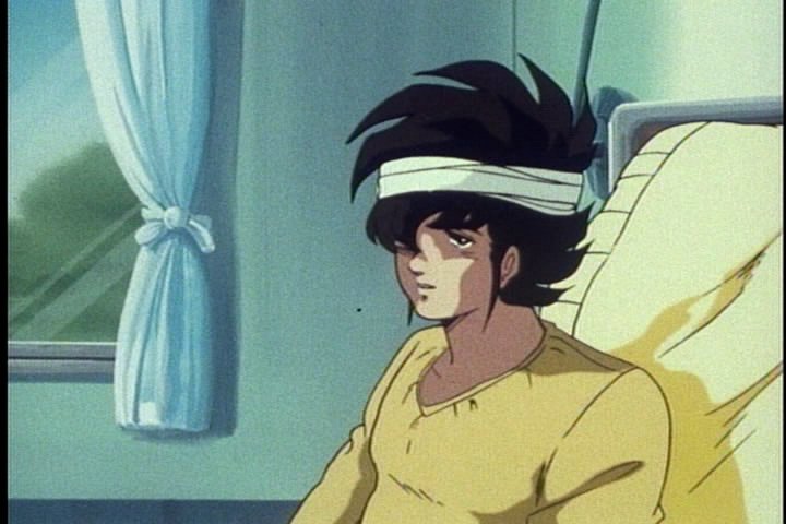
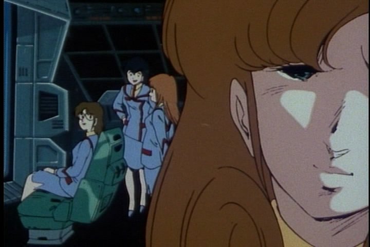
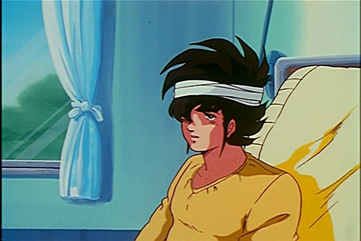
This is a know difference in philosophy. Japanese companies tend to use fewer episodes a disc and higher bitrates. Here, the general idea is a gig a halfhour. I do side with the Japanese thinking, outside of the ridiculous two episode releases. I'm curious to know whether ADV used dual layer discs. I doubt it. The skin tones are one of my biggest problems actually. She's more colorful, but we've gone from a peachy color to a tan one, and I'm curious about that. Worse, while the females have benefited, a lot of the male characters are now so brown as to look hispanic. I just don't think they're supposed to be that rich. I do agree that the highlights tend to washout a bit too much, but the BV is taking a shotgun to a housefly. Then again, the saturation isn't so much the problem I have, outside of some overkill shots, it's the tweaking that makes me wonder. As I've said, it's basically a light touch versus a heavy hand. That's because of the blue tint. I believe it's a bush or tree by the way. At the same time, I can argue that it's through a window, hence a slight cast is no biggie Yes, it's now green, but so is everything else that was once blue-green. The bridge, the walls, Hikaru's headboard, his sky blue scarf is now teal, the blue on the helmet is now a darker blue-green, MAX'S HAIR in this episode. It's all very green, and grey. The bridge shot in particular looks like more than a tint change to me. The monitor was a blue-green, now it's as green as her chair. A tint change maybe, but that doesn't seen right. It's this kind of change that bothers me on this release. It's not too noticeable without a side by side (except the whites and greys being more neutral), but it's there. Don't bet on it. If the Robotech has show me anything, it's to remind me that this is still a relatively modest budgeted TV series from 1982. They probably weren't too careful with the film to start with. It might be more vibrant, but I'd bet it looks a lot more like AE or RT than BV's recolor. Probably just not as faded. I saw an AMV years back that used the 15th anniversary LD, and did remember it looking pretty good (sort of made me wonder what happened in the five years to the DVD release.) Though I was unaware how processed the video was. I remember him changing backgrounds and such. EDIT I looked it up on Youtube. Aside from some added compression, it's what I remember. Here it is. (it's the best Macross AMV ever by the way). Looking at it, if they do look like this, then we've found the happy medium. Color is richj, but not too rich, and the skin tones are pinker. There's still a blue yellow cast (moreso yellow), and I'm beginning to think that's simply what it's supposed to look like. It also depends on how well the video was transferred and so on. The resolution would take a hit, but in Macross' case, it might not affect much. I imagine the audio would benefit just from lack of compression, but it's still 80's mono. You might want to look into threads on the new Sleeping Beauty to get an idea on how a rip might look. There's a lot of factors going into such a project. Part of me thinks it a touch foolhardy given what LD rips I've seen (though I am an analogue purist when it's possible), but if it can be made to look like One Day More, we may have something. Well, having just looked at the AMV, it's starting to look like the happy medium... Heck, I'm curious as to how the old R2 DVDs looked. I remember hearing the AnimEigo beat them hands down, but then again, I'm hearing that the new ones beat the Animeigo hands down, and these last few posts illustrate how much stock I put in that I still have to laugh at that website where the guy enthusiastically gives the detail award to Quantum's smeary DNR'd to death rips. Thanks for the thoughts. I pretty much figured I'd be alone in the preference. The R2 looks more like what most people want I guess, hence why so many restorations go headstrong into the "better than new" mentality (I did it myself when I tried ripping the Gekigangar OAV. I boosted the color too much). I love restorations, but Disney and so on have sort of burned me out on the color meddling (hence why I'm torn on my Sleeping Beauty BD, it's so detailed and smooth, but a lot of times the color is just so wrong). At least they skipped the DNR Hollywood loves. Small edit: Watched a bit on my calibrated plasma through the PC. It looked better. Particularly the hightones. There's stil some oversaturation at times (the wall behind Roy being probably the worst). The tint was a bit more natural in the female skintones. Though none of this really surprises me, as I've said the changes aren't that noticeable unless side by side, and it's now on a television instead of a monitor. Interesting thing I noticed that actually caused me to edit the post: I was watching a parody video using footage from Pine Salad (which looked way more colorful on my plasma than the DVD on my laptop). The paint error on Hikaru is gone, just like the Bandai preview. Seems it was only in the original preview. So it suggests they cut the episode shot into the preview. Interesting approach to things, especially in a meagre preview. I may have to check out the R2 of Pine Salad to see if the error on Max's Valkyrie was fixed. -

Character Art Appreciaton Thread II
Mercurial Morpheus replied to d3v's topic in Hall Of The Super Topics
That never did fit the character's anyway, though I suppose it was based off looks. Michael should be Kaji, dammit. -

Character Art Appreciaton Thread II
Mercurial Morpheus replied to d3v's topic in Hall Of The Super Topics
The age old question of whether that should be considered lesbianism or playing with yourself. Nice one VFTF1. Though no moment is truly happy when Pizza Hut pizza is involved... Ahh, looks like we all missed Sherie's first B-day... Though I think that goes for every character anyway. -

SDF tv animeigo vs new remastered
Mercurial Morpheus replied to boinger's topic in Movies and TV Series
It's Special Bicycle, and you know it. -

SDF tv animeigo vs new remastered
Mercurial Morpheus replied to boinger's topic in Movies and TV Series
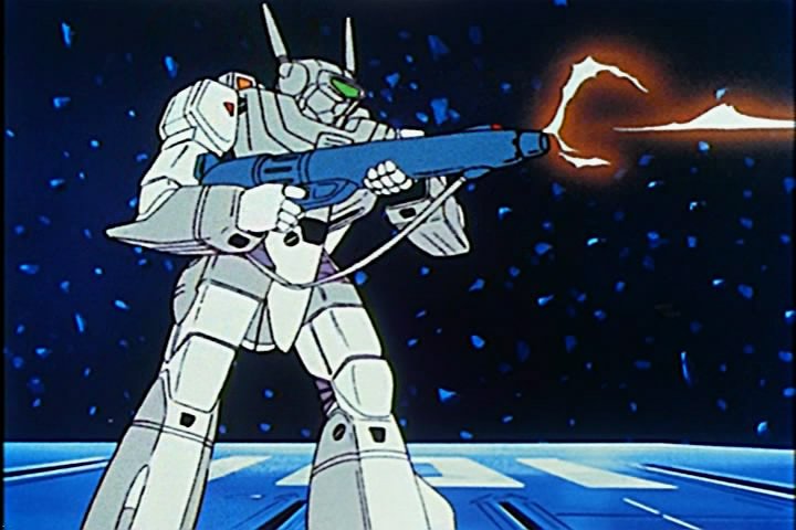
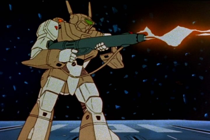
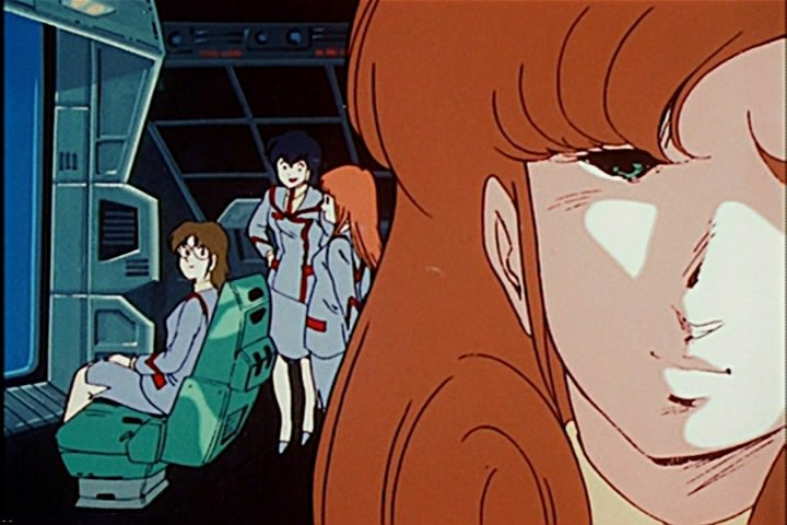
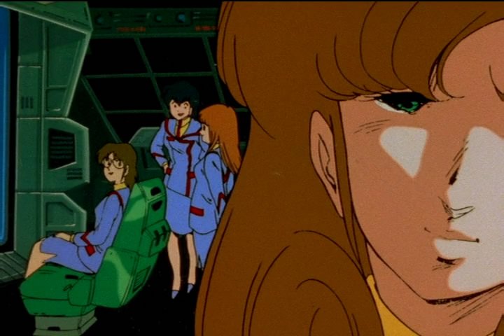
My point on saturation has to do with stuff like the skin tones and that Roy image above. Everything is far more colorful in the R2, particularly backgrounds, with everything exhibiting rich color, while the R1 has a near pastel quality at times. There are also times where they boost it moreso in certain shots, making the saturation look a bit uneven. What you're confusing it for is brightness. Since the midrange is higher in the R2 to pull out shadow detail, it truncates the highrange, makign these richer colors look subdued and mute. Animeigo is a lot brighter in their colors, but the color not as intense in saturation. I should've posted something with more red as red tends to boost faster than other colors. Look at the bridge bunnies to highlight this. The red on their uniform is exactly the same, but the blues are much richer in the R2, exhibiting the more control EV was capable of. The richer blues makes the red look more subdued, when it's actually not. They look like they're bleeding a little bit into the black line as well. Accuracy is debatable, as the AE is still bluer, but the BV definitely did more than just remove that. This is more precise than a tint job. The question is where they got these colors from. As for EE being minor, I was speaking subjectively. I abhor EE in all it's uses, but most times, it didn't really stick out too much. In fact, there were times where the R2 suggests it's own edging in the same places. The ADV caps in the link I provided though show the EE being a lot heavier. CRT's have the best picture balance of all the types by the way. Though an LCD monitor is set sharper than your TV should be. Technically, the brightness issue on AE shouldn't be much a problem on a properly calibrated TV. I never remember having a problem with it. I wonder if I should post some pics of the Robotech episode. That should give a good example of how the HG source used to look. It had definitely deteriorated since that copy was struck, given Animeigo's example, but it might be interesting. Interesting point on Kakizaki, Gubaba. It sounds like ADV was painting him as the big, New Yorker type character. Boss sounds like a factory or mafia nan type cliche. It does provide a distinction, but as you've pointed out, there already is one in his insistence on referring to Hikaru as such. ADV always did try to make things more "colorful" I guess. Thanks for the example. As for the color, the R2 is more mellow thanks to the brightness, but definitely the more "colorful" of the two. One thing I'd be miffed about is the purple striping on Max making my costume inaccurate (though I did select a purplish blue for the striping). YES RICK, ONLY A DREAM... Robotech proves the brown Valkyrie. I'm still guessing AE wasn't certain if it was faded or not, as it's very grey with no hint of brown. Interesting to see the framing is more like AE. AE definitely upped the highrange. It's also yellower. This one actually looks the best of the three. AE is brighter, with more shadow detail. Looking at the three of them, even subtracting the blue cast, the BV is too green. Interestingly, it looks like they were using the Robotech master copy as a bit of a color guide. Seeing as they probably had no access to any color samples, this makes some sense. Even the blue cast is still evident. Main changes seem to be the dirt cleanup, splice removal, an increase in saturation, and grain removal. Even with the color cast, the AE is much more colorful than RT. It really suggests had far gone the master was since the RT copy was struck. What this really shows is just how restrained Animeigo kept themselves when remastering it. It's something I noticed back when I saw an ADV presentation on their work on Mospeada. I remember just how oversaturated that comparison looked (sadly, it's not on the discs). The colors practically glowed. I remember thinking it was ADV trying to one up AE (I still think they only did it because they didn't want to be shown up by a lesser, if older company, though Robotech Remastered's existence suggests it was HG that insisted). ADV went through efforts to make the show look brand new, almost destructively so, whereas Animeigo looks like they were merely trying to make the show look cleaner and less dingy. It's a common case in restorations, particularly animation. That ever existing drive to make it "look better than when it was new". Many restorers seem to feel modern audiences can't handle the sometimes pale, dark look of old animation techniques (given the number crying for a reanimated Macross, and the people that won't touch old anime, this fear seems almost well founded), which is why so many "restored" classics are so damn vibrant (primery colors were more common though, it's it's defense I suppose) In this case, Animeigo's approach is VERY uncommon. About the most destructive thing they did was degrain it, and I remember them saying they artificially reintroduced a grain texture because the end result "was too clean as to flatten the image." Do I get a cookie for dealing with Robotech? You know, I was going to make a joke about how the R2 "at least doesn't look like Robotech now" given my hatred of Roboteck Remastered, but I find it actually resembles unrestored Robotech in the contrast department . -

Macross Frontier Movie 1,YES it is subbed now edition
Mercurial Morpheus replied to sharky's topic in Movies and TV Series
Not really. The biggest being just how much time bathing the characters spend. Unless of course, you listen to his little extra audio file at the end. The whole thing could be called a spoiler. Bold of him... Seen that pic before, and don't really think it belongs in this thread. Not to mention most of the personalities don't fit at all. (though Ritsuko and Grace look a lot alike it seems, and Rei's face goes well with Ranka on the full body shot. Sheryl as Misato is just NO). As for Universal Bunny, I only really liked maybe half the songs on it. Sheryl's songs are really starting to lack variety to me. Though some are growing on me (even Pink Monsoon). Sheryl and Ranka's friendship is a matter of debate in my book. Particularly when it came to Alto... -

SDF tv animeigo vs new remastered
Mercurial Morpheus replied to boinger's topic in Movies and TV Series
I would if I could remember his screen name. ;; Hence why I just credited Galaxy Networks, since I was aware it wasn't your rip. It's still a different translation I suppose. 40% ADV... I though ADV change maybe 2% of the lines at best? Not like I own the ADV to compare. If it's one thing that site showed me was a reminder of why interlaced video sucks, and the EE is more apparent. -

SDF tv animeigo vs new remastered
Mercurial Morpheus replied to boinger's topic in Movies and TV Series
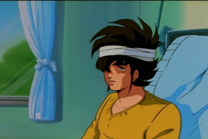
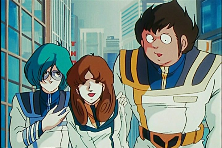
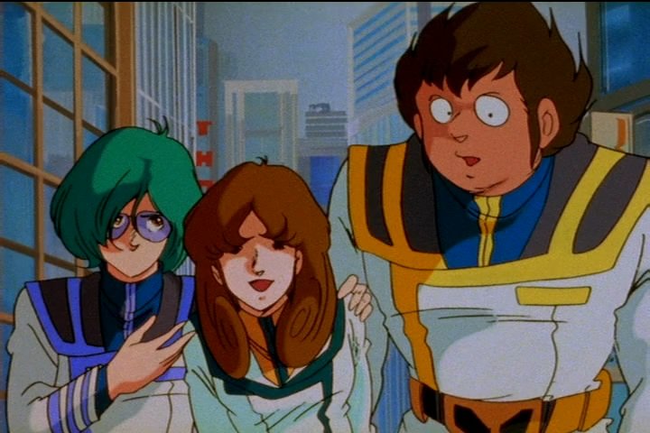
Real helpful there guys. I've actively compared Phantasm now, granted on an improper LCD monitor, but it's better than nothing. The difference is quite remarkable. It really doesn't hit you until seeing them side by side just how much has changed. Watching the R2 on it's own mostly looked like a saturation boost. Together, it shows way more than that. Given the length of this posting, I probably should've just let the issue go, but too late now. ;; I tried my best to keep the comparison as unbiased as possible, though that was easier than I thought given my conclusion. The one thing to remember when judging is that it's not entirely fair. We have a 10 year old restoration from the HG master vs a new one from the BW master. We have no idea how far gone the BW was in comparison to the HG. I've seen the infamous reel and comparisons AE provided, which suggested a heavy purple tint. I'd imagine this was the priority to get rid of. The first thing noticed right off the bat is the AE has a decent blue tint to it. Everything is rather bluish, and it's probably the biggest mark against it (aside from looking perhaps a touch washed out). On the other had, the BV seems rather green, sometimes yellow, though not as heavily. It seems almost as if everything that was blue in the AE is now green (Hikaru's headboard, the stripes on Minmays dress, and so on). The lack of blue tint does give a nicer variety to colors, but does change the look from a cool one to a more smarmy one. There's a lot more grays now. I mean a lot more. Which brings me to perhaps the chief deficiency in the BV, a severe lack of high tones. Having tested the contrast boost on a Nadesico still (not an exact science, but it does suggest how it was achieved), the shadow detail that was gained was done through boosting the midrange. This basically forces them to lower the the high range to compensate. The result is greater shadow detail, and no more washed out look, but it also looks really dinghy, almost muddy. There's seemingly no instance of pure white in the BV version, and makes the very saturated colors still look rather muted. So there isn't a real winner here. the AE looks a touch washed out, and the BV looks muddy. I suppose most will prefer the B here, but that could also be due to the color tweaking. And boy did they tweak. While I initially thought that maybe BV was simply more aggressive when it came to boosting the more desaturated scenes, the preview and Valkyries proved they were actively color correcting on the specific level. All Valks are now grey or greyish. And I'm not just talking about the blue tint removal. Even shot's where Hikaru's was pure white in the AE are now a steely grey. This is most noticeable in the opening, where the AE shows the Valkyrie having a similar hue to the the background, the BV is completely different. It's seems they didn't just want to correct faded colors, but rather add a consistency where there was none before. It seems like they were trying to match the toys better. It's up to the viewer I suppose on whether this is a good thing. Ironically, it took until the preview to prove this mentality true and not just a hunch based on some muted backgrounds now starkly vibrant (which, I most say, just doesn't look right if ever I had to make a statement on gut feeling). The shot of Hikaru in bed has been mildly revisioned. The paint error has been mostly corrected and th pillow is now blue for some reason rather than yellow (I'm guessing the pillow is blue in Pine Salad so they merely redid the preview to match, my box case suggests this). The color boost is particularly noticeable in the skin tones. AE's are more pinkish/peachy, whereas the BV is very tan/brown. The saturation is also overdone in some parts. Again, it's hard to say which is preferably. THe AE is sometimes so bright as to look whitish, particularly in Misa, whereas Hikaru looks like he's been out in the sun too long at times in the BV. I definitely think a little saturation helps, but am not as sure about the hue itself. As washed out as it is, I think the AE looks a bit more natural. If one thing can be said about the colors in the BV it's that they are a lot smoother and consistent. With the tint gone, and certain scenes either resaturated or outright recolored, it looks a bit more uniform. It's not without it's moments, as some shots look oversaturated (as compared to the AE looking washed out), particularly reds and the backgrounds (The shot of Roy in front of a yellow wall in particular strikes me funny). To put it simply, the BV has a better gamut of colors vs the AE's blue (or at time yellow) bias, but it just feels a little too messed with. The lack of a decent high tone doesn't help it either. Moving on (though the color is really my core issue here), the shadow detail is a nice gain. Though Phantasm didn't benefit from it much outside of the "Lynn Minmay" shots. In the AnimEigo's biggest plus side, the picture is considerably better framed. Even though the picture gain is relatively minimal, it gives some shots, particularly closeups, considerable breathing room. The AE also removed the splices. I'm iffy on this one. The purest in me likes seeing them there as it's part of the show's production. On the other hand, some of them are really sloppy, and quite distracting. I'd guess a lot of AE's effort went into removing them. Given the heavy color touchup BV did, leaving the splices in strikes me as a bit odd. Maybe they had their hands full. One more point goes to BV for not using edge enhancement as the AE seems to exhibit (albeit rather minorly). In the end, it's really hard for me to declare a clear winner in this regard. I know most here say BV wins by a fair margin, and with their more modern technology, they certainly were above to do a bit more than AnimEigo in regards to color control. Sadly though, color accuracy, like I said earlier, is really hard to pin down with animation, given the changes with film stock and so on. It's possible BV was even using an official color test guide, and are simple correcting things that never exposed properly to begin with. I'm sure Hikaru's VF wasn't supposed to go from bluish white to white from shot to shot. Though I must question the brownish grey tone. The Grey Valkyrie being made brown is a tossup in the least (could be fading mixed with tint). The grey instead of blue makings on the battle pods another. I think, when it comes down to it, whichever better depends on just how much meddling you can stomach. Animeigo seems to merely have corrected a strong cast, though was stuck with another, and then cleaned up scratches and splices. It's the least messed with, but does suffer from some faded colors they probably weren't sure of needing correction, and a blue cast that's rather common in restorations, and perhaps a slightly too bright image. BV practically repainted the whole damn thing, correcting some errors, and leaving others. Bv is much more hands on. The colors are more consistent, but do seem messed with, and the shadow gain was accomplish by crushing the hightones (I suppose that one isn't as noticeable unless you have the AE showing you just how offwhite everything is). So they each have their strengths and weaknesses. For my money, I think I'm going to have to side with Animeigo (I suppose this works to my favor as I already own it), though I expect to be alone in this. The blue cast is a bit unfortunate, and it can look a bit garish at times, but it looks more like what I've seen in the artbooks and other period shows. While I applaud BV's efforts to give the show a more consistent look, I just can't say I'm liking how saturated and altered the colors are. It looks smoother, and maybe more pristine, even great at times, but I can't help but feel that some of it (maybe even a lot of it) just doesn't look right, particularly skin tones and things like Max's hair (which was green in this episode instead of teal!?). Neither is really ideal in may book, and the BV does go to so far as to highlight AE's flaws. Still, I like the framing better, and while I'm sure Phantasm wasn't the best example, the added shadow detail didn't seem that big to put up with so much meddling to the color palette. While I think the ideal would be a happy medium between the two, I just have to side with the one less messed with for now. I sort of wonder if off the self software might allow fans to correct the AE's problems? Though I suppose those truly bothered with it will be more than happy with the R2. Here's a few screen caps highlighting some of the bigger changes. AnimEigo on the left, Bandai on the right. Source of Bandai is the Galaxy Network release, which looks worlds better than the smeary, overprocessed Quantum Raws. Kudos. While comparing a DVd to a fansub isn't 100% accurate given compression and filtering, the file is only about 200 megs smaller than the episodes on the DVD. AnimEigo's icehouse sucks for using DVD5s (though they're somewhat forgiven for having a rare progressive encode). Sorry for the long post. I just thought it was interesting analysing two very different approaches to "restoration". Keep up the good work on the fansubs, Galaxy Network. I may still wind up grabbing them for completests sake (and new translations are always refreshing). -
Just when I thought that nose art wannabe couldn't get any smuttier, they go and make it clothing optional. Probably gonna wind up with one anyway... Liking the Ranka quite a bit, though I didn't need bikini mode. Thankfully, it's a loss fitting outfit to begin with. The kira wink is a nice touch.
-
Personally, I'm amazed that despite the large number of Frontier cosplayers at Fanime, I've never seen any Frontier photo shoots in San Francisco. It's on my to do list, even if it's just me. I've worn the jacket there at least.
-
The problem with street cloaths is that too often people mistake them just for that - street cloths. And since cosplay is partially about drawing attention, you tend to get dissatisfied from being ignored. A gathering maybe. I've done a lot of plain cloths cosplay. it works best in groups. I even wore a Tenma costume from Monster in front of his seiyuu, and I doubt he got it. It's a shame too as there's plenty of shows I'd like to do. VenomMacbeth, if you're talking about TV UN Spacey jackets, drop me a line. I've spent so much time on Max, it's practically a science now. Just know that the collar WILL kick your @$$. The TV series *(Love Drifts Away is a good reference for it's A animation) and Perfect Memory are your best friends too.
-
So basically rotoscope it and digitally repaint everything then? Because doing it line for line wouldn't even be reanimating it, just slapping on a new coat of paint (which itself would drastically change the look of the show). There's no real point in that. The closest to something like that would be the new Eva movies, since 1.0 used a lot of the same storyboards. It looks kind of cool, but it also looks really different. And that's just a 15 year gap. I agree with JBO, the only acceptable alternative would be fixing up the lesser scenes with stuff that looks like the A material, and that's not going to happen since the techniques used don't even exist anymore. They did something similar to LotGH, and the few screenshots I've seen look nothing like the old show. It's better animated, but rather jarring. They even CG'ed the warships, which was retarded. It's basically just like the Zeta movies, the new animation being gorgeous, but sticking out. So you'd have to do the Eva approach. Rotoscope everything and fix what needs fixing. unless you could actually do something more like the MSG triology. but that was new animation from the same period, hence why it didn't stick out.
-
Voted no. DYRL serves the exact same purpose. Keith's example is also a reason why. Here we have someone adamant about keeping the big things like the vocal track, but allowing for variance in costuming and what not. If he can allow it, imagine a non-fan that's redoing it.I can very well see that happening on such a project. That whole, "how can we make this cooler?" approach. You know they'd go with the DYRL designs off the bat, as those are considered "cooler" for example. The Star Trek remasters are an example of what I'm talking about. It started as an effort to have the effects scenes in HD and cleaner than the optical composites would allow. The "keep the 60s look' idea was a great start too. However, any time left over went into "improving" things and updating stuff like time displays or correcting errors (I don't mind that one so much). Little things sure, but meddling beyond the original mission. Worse, they got bolder and bolder to the point that the new shots started to look nothing like the old ones, which was the original intent(they mentioned something like tripling the exterior angles). Sure, the models were nicely kept to look like the 60s ones, but they definitely moved beyond the concept of only doing what was possible in 66. The plus side is that both versions are on the BluRay, the downside being that i constently have to see the awful CGI Enterprise everywhere now. So yeah, I could see a reanimation of Macross becoming a vastly different looking beast even if they kept the character designs and what not. Oh course, that's the problem with remakes. They have to be different enough to make it worthwhile (I suppose redrawn animation alone would suffice), but faithful enough to warrent keeping the idea to begin with. Then you always have three or four camps. The one's that prefer the new, the ones that prefer the old, those that like both, and those that don't care either way, just give me the Macross. Add in any changes to the plot or characters and then you have debates on reconciling the two. We already have enough of that over the whole DYRL design bit. Not to mention the nice thing that happened with the Star Wars SEs where people think you're crazy for not going gaga over the CGI Valks. ;; Speaking of which, the CGI in those promos looks absolutely terrible. It's well animated and heavily detailed, but it sticks out like a sore thumb. The whole thing looks like the stuff GONZO used to do. Everything's so shiny and digital. It's fluid and detailed, but it looks downright cheap and soulless, like the early digital animations like Sol Bianca: The Legacy or BGC 2040. It's fine for a game (I don't really gamble, but I want that game), but do you guys seriously want Macross to look like that? I know the animation is dated, but part of the enjoyment of an 80s anime is that it's a product of its times. Go watch Frontier or Zero if you want 2000s Macross. Reanimating the whole thing to make it look new would sort of be like the slap in the face Lucas did to the old Dykstra effects (that still look better). Suddenly it's not good enough anymore. So we've already got DYRL. We even have The First taking it's own stab at mucking around with things. While I might allow for a fan redo of Virgin Road (or at least the knife fight), though only if done as seemlessly as possible. CGI Valks are out of the question. The rest is fine as it is. I'm letting a little bit of my anti-SE nature take hold. Maybe I should have left it at a simple, "no".
-

SDF tv animeigo vs new remastered
Mercurial Morpheus replied to boinger's topic in Movies and TV Series
I hate to bump an old thread, but this seems the best place for it. I was looking up info on the Nadesico remaster after comparing the two and noticing some vastly altered lighting. While doing so, I came across one site's comparison photos between the new R2 and the ADV release (which exhibits some nasty aliasing and edge enhancement). The comparison wasn't entirely fair, as the R2 was represented by a DVD rip. This rip, I know from TheLoneWolf's comparison, exhibits an overkill of DNR (which makes the author's exclaims of the R2 having detail superiority look like blindness on his part as, in his pics, the R1 is vastly superior in visible brush strokes on the backgrounds, while the R2 is a blurred mess). It appears to be the same rip veffidas is showing. It looks bloody awful. What astounds me though, is that the color is vastly different. Moreso than I remember from the little I've seen of Gubaba's release. I'm curious if this is another meddling on the rippers part, but if so, it's rather extreme. It's night and day, and not in a good way. The author talks about how more natural and vivid it looks. I can see why this may be preferable, and I concur on the space shots with the absence of the red tint. Otherwise though, it looks way too futzed with. What concerns me are the shots of the characters. Particularly the ones of Hikaru and Minmay. The color is so different that it doesn't imply a mere saturation boost and contrast adjustment, but rather a near digital repaint (the only thing barring that is the error on Hikaru's collar is still there) like what I'm told happened to Cinderella. At the very least, a conscience bending of the color palette. I know colors fade, but these don't even look the same. The sky, blue on the handkerchief and helmet, and Hikaru's eyes are completely different hues, and the reds glow eerily. On Minmay, the subtle pastel background is now a vivid yellow-green and brown, yet her dress is no more vibrant. This is sort of like what I saw in Nadesico, where dark, near invisible parts of a cockpit were now bright and visible, dark grey to light grey, and the shadow in Ryoko's hair now a midtone, the midtone becoming a highlight. Sure, you can see more, but it seems like you might be seeing more than intended. Having testing it in the GIMP after posting, I found this to be achieved by boosting the midrange. With Macross, the whole thing looks creepily smooth and digital (though I know the rip's DNR is partly to blame). It changes the look of the show. Color is a very touchy thing on animation restoration. Entire Disney and Warner releases are known for their mucked up color. The key problem here is that, at least in America, efforts were made to use the correct colors to react with whatever film stock was to be used. The artists knew that the cel would look different on film then on the acetate itself. Hence if you look at a cel from Alice in Wonderland, Alice's hair is very greenish. This was because it would expose as a golden yellow on the film. Colors would also often be oversaturated as the film would tend to mute it. The trouble starts when the restorers, often oblivious to this, don't reference the film tests and instead take the cels as law. The new Sleeping Beauty release shows this off distinctly in the forest segment, where Briar Rose's blouse changes hue from shot to shot for no apparent reason now. Not to mention the desire to make an old animation look like it was brand new. I'm not sure if Japanese artists did such tests, especially given how often dark these films usually look (which are then brightened up in these remasters). Though I'd imagine given the black line in Ryoko's hair, that really was supposed to be shadow. Messing with the levels is a give and takes approach, it seems. Correcting a faded tint is one thing, and it's nice to see more than just a one shift fits all approach (generally why so many restorations come out so damn blue) but the blues on Hikaru and the now grey sky suggest more in the way of active meddling and revisionism than restoration. Does it really look like that? Or is the author using a really weird ripping group's take on what they though it should look like? I don't remember it being like that on the Galaxy Networks sub, and will have to look into it myself (as soon as I clear some HDD space). I know the source for each remaster is different to begin with, so I suppose an even fairer comparison would be with a previous R2, but I can't imagine those blues being right, especially since the helmet's now darker than before. So I simply don't remember so stark a change, and most discussion I've had was that it was a subtle one at best. So these screen caps confuse me, and look like nothing I've seen. I'm not saying the Animeigo is more faithful, but it does seems like it was less messed with. That may be due to the horrible purple cast they had to deal with. The R2 seems more like ADV's Mospeada, with lots of saturation poured on. What do you guys think? http://linkai8424.spaces.live.com/blog/cns...5!304.entry Having now watched Phantasm, I can at least say that the quantum raw looks like utter crap in comparison. Which is a relief, though not unexpected. It Bakawolf DYRL again. The colors still look a touch over-boosted at times, but not like the above comparison. Skin tones are a tad rich (Hikaru looks downright swarthy at times ) It looks a lot better with the grain intact too (interesting to see the splices still there too). At least it doesn't look like the repaint the raw suggested, though some of the colors still seem odd to me. I'll have to compare to the Animeigo later for a more direct episode to episode comparison. I'm reminded again of how Phantasm is the greatest recap episode ever. -

Macross Frontier Movie 1,YES it is subbed now edition
Mercurial Morpheus replied to sharky's topic in Movies and TV Series
Not having to wait the bulk of a year to see it after a deluge of spoilers has already inadvertantly told you everything. It's not ideal, but if you're desperate.... -

Macross Frontier Movie 1,YES it is subbed now edition
Mercurial Morpheus replied to sharky's topic in Movies and TV Series
Thanks for the heads up. I definitely like it better than Pink Monsoon. The Aimo bit is interesting (as much as I abhor spoilers, I figure it'll be awhile until I see it anyway). I'm not sure how I feel about some of the changes, at least on paper. I had a laugh over the "plus for Sheraru fans" in the form of him treating a wound. Ahh shippers, ever so desperate. -

New Star Trek Movie In 2009..
Mercurial Morpheus replied to bandit29's topic in Anime or Science Fiction
Thanks for the pewter shots, Eugimon. It looks pretty nice, though the saucer section looks a touch thin, -

Macross Frontier Movie 1,YES it is subbed now edition
Mercurial Morpheus replied to sharky's topic in Movies and TV Series
Thanks Shiroth, more costume changes and songs I see. I did feel a bit for Gubaba when I read this Hmm, Sheryl heavy yet pleasing for Ranka fans. Interesting boast there. I like the idea that more focus was given to the characters. The series was so story driven, it was nuts. -

Macross Frontier Movie 1,YES it is subbed now edition
Mercurial Morpheus replied to sharky's topic in Movies and TV Series
Thanks for the info. Amazing how much has changed despite it supposed to be most a retrace. -

Macross Frontier Movie 1,YES it is subbed now edition
Mercurial Morpheus replied to sharky's topic in Movies and TV Series
I agree, it's way too busy, and sticks out amongst the simplicity of the others. -

New Star Trek Movie In 2009..
Mercurial Morpheus replied to bandit29's topic in Anime or Science Fiction
I got the Target special myself. At the same price as the Best Buy version, minus the awful cover art, it was a no brainer. I'm actually surprised I wound up watching everything but the commentary. I also think I like it more this time around. -

Macross Frontier Movie 1,YES it is subbed now edition
Mercurial Morpheus replied to sharky's topic in Movies and TV Series
I wouldn't mind a Sheryl/Brera relationship, provided it were done well. I don't think it'll happen though. His new outfit is much improved, though that's not saying much. Apparently Universal Bunny and Sou Da Yo have been leaked I find it interesting that Ranka seems to have a "Why on Earth am I wearing this" look in the Valk pictures. For a girl that took weraing a carrot on her head in stride, she certainly looks uncomfortable. We even get bald Ranka. -

Macross Frontier Movie 1,YES it is subbed now edition
Mercurial Morpheus replied to sharky's topic in Movies and TV Series
I've seen a fair share of Valk girls in art and real life, but that's the first time I've seen a solution for making it transformable. Makes up for the weird magical girl outfit (have to keep the Ranka=cute/Sheryl-sex dynamic going). I really like the new mini figures. Partucularly the Black bunny. Something about combining cute and chibi with evil just works for it. The bi-plane's awesome. Minmay in green is rather nice. -
I got the first six. Haruhi, red Lupin, green Lupin, Eva 01, Dom, Zaku. I should've gotten the next 2, but I'm not a DBZ fan. But then, I'vwe pretty much accepted the Otaku no Video coined title of Ota-King. I remember the old "Pounds of Totoro" test. I wasn't at the max, but I still weighed several tons. ;; Though I'm woefully behind on most trends.

