
TheElf
Members-
Posts
85 -
Joined
-
Last visited
Content Type
Profiles
Forums
Events
Gallery
Everything posted by TheElf
-
-
Thanks paramat, me too. All the same I did tweak her a little and cleaned up some lines. I don't know. Who is Vostok7 and why should he see this?
-
Thanks Peter! you are in luck. Here is my Macrossworld gallery...be careful though you might see some works from the American series that shall not be named ; ) So prepare to avert your eyes!
-
-
Absolutely Stunning...I can't wait to see it lit up and in dim lighting. A great study piece...not that I would ask you to do it, but what would you charge to do one of these for a willing buyer? I'm just curious what you view this project to be worth in terms of time, energy, and money...
-
Huh, I didn't know there was another fan art section. Where is it?
-
Removed by OP.
-
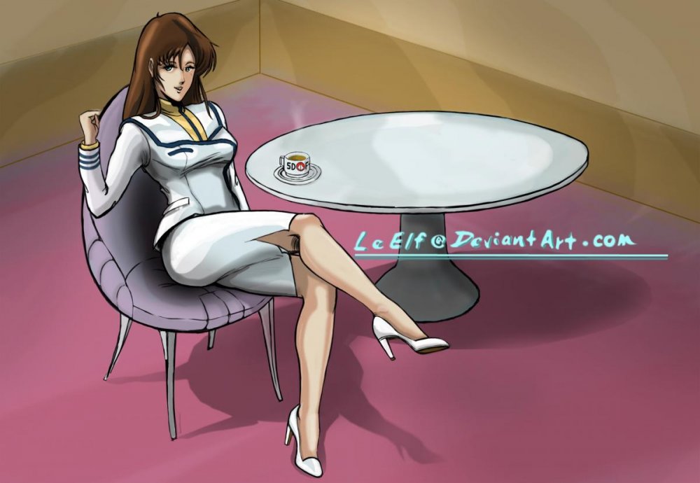
Thanks TWDC. Yes you are right, the thumbnail in this post actually looks like crap...I was disappointed. But the detail and proportion are much better in the full size. I got some feedback that the mouth and nose were a little off, not sure what that means, but I sometimes depart a little from the typical small nose small mouth technique that is prevalent in most anime. But she is really just a proof of concept sketch that I ended up coloring... I've had several requests for a full up Cheesecake work that puts Nova in a more relaxed light. We'll see, if time allows...
-
Yes the pose is an awkward one, as it is from a difficult perspective. I've already shortened her once on Focker's suggestion. But I am happy with her proportions now. As far as her "look" the image that you get here is lower resolution, so it is harder to tell than if you look at it in the full image I see in PS. She is more apparently looking down in the original, though I admit I could make it more obvious. If you had any idea how hard it was to draw a face you might sympathize with my desire not to F with it ; ) . And I never intended for she and Max to be pointing at the same thing as someone suggested. In fact the idea is that he is trying to explain one thing and she notices something completely different and is amazed by the complexity of the Valkyrie's Software. Meanwhile Max iss trying to show her the tweak he put into his own ship's Macros (yes, I meant Macros not Macross)
-

And yet another Max and Millia fanwork...
TheElf replied to the white drew carey's topic in Fan Works
Nice job TWDC!! Yes, coloring mecha can be quite challenging, particularly if you are going for the "lost animation cell" look as you have so ably captured here. Max's pose is perfect, and I dig Miriya's valk pose, it's very dynamic which is tough to pull off with a machine...that is make it seem dynamic and human, yet believable as a mechanical device. You need to join DA and start to post so I can fave your work bro... Is that an original pose for her Valk or did you use a reference? Minor suggestion, I see you used a stock background, or at least it looks like it. I've found some really cool Star Brushes for PS CS4 that are great for painting your own Space Backgrounds. If you are interested I can point you to them or we can chat off line. I'm still working on my own technique, but if you are interested gimme a shout. ~Elf -
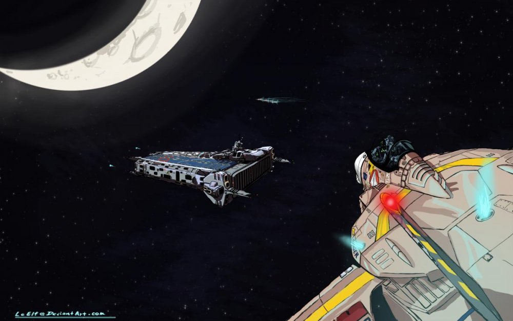
Don't mind at all! I appreciate the honest assessment. One of my goals was actually to make this piece quite a bit darker. I wanted to impress upon the viewer how dark it can be landing on a ship in deep space. I also wanted to capture the look and feel of the DYRL ARMD. Perhaps I should remove the Moon altogether and move the moment in time narrative so just outside earth orbit or...enroute to Mars so as to give the darker lighting justification? Still your points are fully onboard, and I will be keeping them in my toolkit for my next work...
-
Yes, the Sun is illuminating the Moon. Based on the perspective of the viewer I figured the Sun would be somewhere down and to the right of the ARMD and the Valk. But those are areas of the Valk and ARMD that are not visible to the viewer. Or do you see it differently? The moon is of course albedo, but I guess I figured that one of two explanations were at work, either the proximity of this shot to the moon and the angle that the sunlight came from was such that the light reflecting off the moon was perceptibly more intense than the Sunlight. Or...the ARMD and Valk were in the Shadow of the earth on the night side. The intent was to create a sense of darkness where the only natural light came from the moon. oh and I wanted to stay within the typical animation scheme of simple lighting and what I call "shading to the third order". In other words a base color and three levels of shading or highlighting. Anyway, thanks for the constructive criticism! I appreciate your point of view and you DO have a point!
-
I'll admit that the Foreshortening of her arm did give me trouble. I didn't use any reference for her pose! Which is rare for me. On the one hand we are looking down on it and she is pointing, generally toward us. This would mean the arm SHOULD start thicker at her fingertip and narrow as you move toward the shoulder. I tried that and it looked weird. I settled on what we have now as I didn't want to make her look overly muscular. So I sort of compromised. I am open to suggestions, what do you think? BTW cool website in your sig. Is all that work yours?
-
hmm, I'll take a look at that, but even a foreshortened object in intense light doesn't require shadow. Maybe I can come up with something. Thanks for the feedback!
-
There are two light sources, the moon, and the Verniers.
-
Interesting suggestion. I love cockpit views...I'll consider it!
-
Concur my friend, but consider this... If you were a Software designer, such as the guy responsible for programming the Valkyrie for landing, whether aboard ship in atmosphere or in a vacuum, would there not be a benefit to exercising the control surfaces in the same manner regardless of airflow or vacuum? From a simplicity perspective, it matters not whether the flaps are down or not in deep space no? But from a coding perspective if you tell the Valkyrie..."You are landing", then it behaves as such and it takes no extra lines of code. Typically landing configurations in modern aircraft are determined by a couple things. Primary among them is the position of the Landing gear handle. "Up" means the craft is configured for high speed flight. "Down" means the craft is configured for drag and low speed flight with an intent to land. If the primary method of selecting one or the other is gear handle up...or gear handle down, would it not make sense that the configuration is one in the same? Thanks for the insightful commentary! Thanks Schizo...Standard indeed. And then there is always "well....it looks cool" ; )
-
LSO: "107 Call the ball..." Pilot: "107, Valkyrie ball, 2.8" LSO: "Raaaaager Ball...." Valkyrie 107 Of SVF-41 makes it's approach to ARMD-07 During a shakedown cruise following the latter's refit in Lunar orbit. Pilots were expected to maintain proficiency in all types of recovery, in this case the traditional CV Pattern to an arrested landing, similar to the Prometheus. One of the Refits to the ARMD platforms was to replace steel cable arresting gear with gravity control technology from the exploitation of the Super Dimensional Fortress. Additionally the Maneuver Verniers on the Valkyrie figured into the way the Mecha flew a similar 3.5 degree glideslope ingrained in all Naval Aviators on Earth aboard Aircraft Carriers. SVF-41 was one of the many Valkyrie units to be formed as a last line of defense against the feared return of the Zetraedi fleet. Carrier qualifications during their shakedown were a priority while the SDF-1 Was away from Earth on her epic journey homeward from Pluto following the tragic fold that stranded over 70,000 civilians in deep space. Black Ace 107 is a VF-1J in a standard RDF Brown Combat livery, replete with yellow squadron markings and Blue Modex (107) . The CAG jet carries a light gray overall scheme and is typically flown by the Commanding Officer.
-
Petar, are you working on any new models? The world wonders...
-
lol!! is THAT it...? ok, Wow. Tough crowd.
-
ok, what do you agree with exactly? I've fixed the proportion issue. Roy was right about that, and I thank him for being so...matter of fact. But what else needs work in your opinion?
-
Thanks EXO!
-
Hi Neldorwen! Your work is great! Welcome to the forum. Glad to see a fellow Deviant over here.
-
Man, I can't wait to see this thing assembled finally! Anyone know how they are going to paint and mark theirs?


